
-Blackletter-
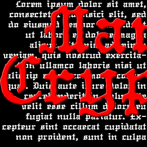

The MANUCRYPT fonts were inspired by an unusual example of “Olde English” (blackletter) typing. Preserving the original texture, these fonts have a look that’s much more “Haunted House” than “Wedding Announcement.” There are Regular (“Proportional”, the red screen above) and Monospace (“Fixed Width”, blue screen) fonts depending on your mood. Once upon a time, kids, there was the typewriter. It was like a keyboard and printer without a computer in between! That was where the typist came in, striking the keys and printing simulaneously. But you were stuck with one style and size per machine, usually Courier and always of… continued
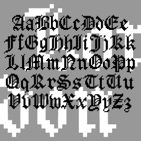
LONDON BITMAP is a recreation of the classic Apple font London, originally designed by the great Susan Kare. (She also designed the wonderful icons at right, so familiar to us old appleheads.) The city-named fonts (Chicago, etc.) were a big improvement over previous computer typography, although they may now seem a bit quaint. Most have made the transition to scaleable fonts, such as my own L.A. fonts; now you can again enjoy London’s contrast between “Old English” style and bitmap texture. While I was at it, I also made a Harlequin, Cross-stitch and Shaded version; the initials at left show… continued

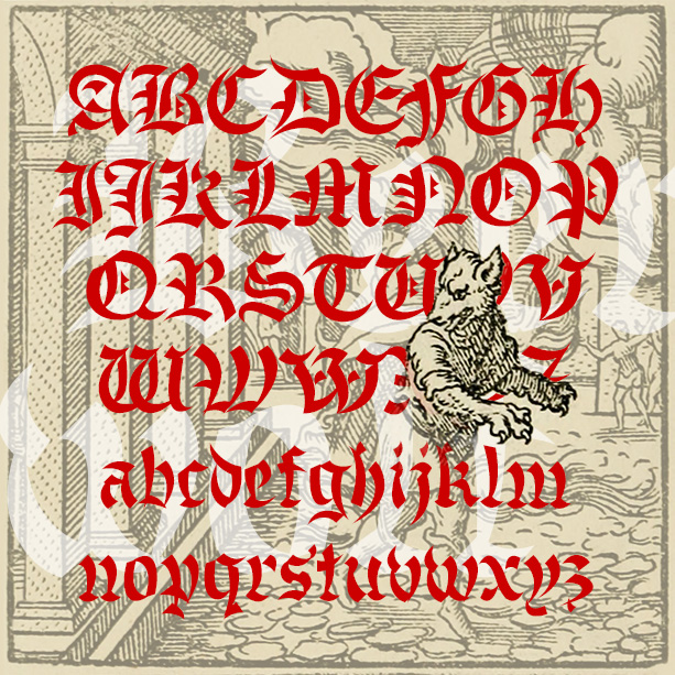
The KOMBINE FONTS are experiments in crossing fonts, font mashups. My inspiration was found in Blackletter: Type and National Identity (Cooper Union, 1998, p.33), a most interesting book for anyone keen on fraktur. There was a small illustration (below) of a font called “Centralschrift (C. G. Schoppe Foundry) 1853, a 19th c. hybrid of fraktur and a neo-classical roman”. The upper parts–those which most enable reading–are the more familiar roman, producing a more legible font for those (like me) unfamiliar with the fraktur. I used as my models a Wittenberger fraktur and various members of the Century family, recognized for… continued
BEERWOLF is a font of transformation, a blackletter that’s in the process of becoming something more dangerous. The wedge-shaped strokes resemble flames, wolf’s teeth and ears giving this blackletter font a curious difference. The Beerwolf is a creature of German folktales like the werewolf; you have been warned!
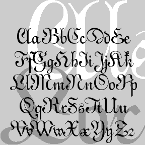
BENIGHTED is my stab at a blackletter font that with a loose, hand-lettered feel, sort of an Old English Casual or Fraktur Frisky. I first drew all the letters with a Sharpie marker, ultimately creating a font with an irregular baseline and a creepy feel. And now there’s a matching font with elongated letterforms and drips suggesting melting candles or blood. Version 1.5 includes an expanded character set and improved spacing.
ALSACE-LORRAINE is an experiment. My idea was to combine aspects of a vertical French script and a German fraktur. For the most part, the top is the German and the bottom is the French. A font “mash-up” before that word was coined. Named for the region from which my father’s father’s family emigrated. Includes caps, lower case, numbers, punctuation, and international characters.