
-Premium-
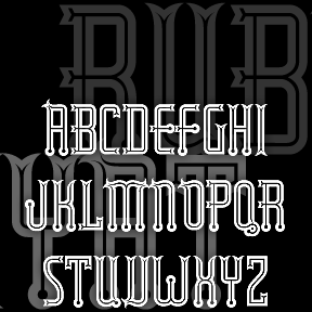

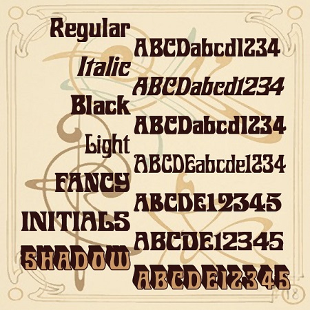
RUBAIYAT is based on this wonderful hand-lettered fruit-crate label with an exotic “Eastern” feel. I redrew the 7 letters, then invented the missing ones and other characters. I also created a set of six fonts–Engraved, Inline, Solid, Thin, Outline, and Shadow–that can be used together or separately.
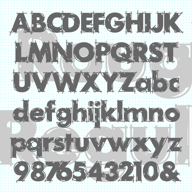
ROUGH DRAFT is designed to look like unfinished lettering; it seems like the outlines need to be cleaned up and the inking completed. A classic geometric sans serif with the hand-drawn elegance of a technical drawing. The Regular font has outlines loosely filled in. Other component fonts in the set—Outlines, Loose Fill, Solid Fill, and Solid—can be used separately or layered in different colors. Suggested in part by “Layout Gothic” in Dan X. Solo’s “100 Grunge Alphabets,” and by Greg Smith. Version 2.0 now has lowercase, an expanded character set, improved spacing and kerning.
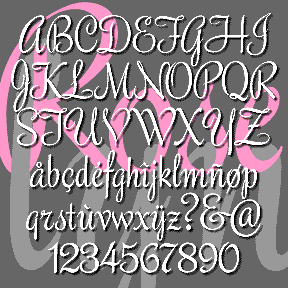
ROSELYN is one of a series of four vertical script fonts, including Scarlet Ribbons, Famous Label and Easter Parade. (As seen in the Script Font Identification Guide!) This one has sharp, pen-like edges, a lighter color, and the most elegance of the three. It’s based on an unnamed style of hand-lettering in Lettering and Alphabets by J. Albert Cavanagh, 1946, reprinted in 1955 by Dover. I’ve named my font after my mother. Includes caps, lowercase, punctuation, numbers, and international characters.
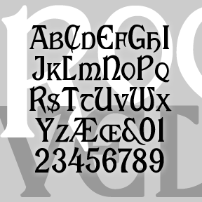
My version of ROOSEVELT began with a request by Rob Case for the font once used on Aeolian pianos and organs. I drew the letters from analog examples, regularizing and filling out the set. Subsequently another correspondent, Richard Vance, told me the history of the design (at right) and showed me more examples of the original font in action, prompting the revised version which now includes small caps and a more conventional T. (The curvy one is now located at | and \.) If you like this font, please see my Celtic Knot Monograms. According to Rollin Smith’s “The Aeolian… continued
ROBERTA is a digital interpretation of Bob Trogman’s delightful Art Nouveau analog original. This classic font suggests elegance and fun, exoticism and friendliness. Bob’s story: “I originally hand cut this font in 1962. It is based on a Belgian restaurant sign. I named it after my daughter Roberta. Many Mexican food companies used this font, but they didn’t know it was from Europe. Dan Solo was going to digitize it for me, but he retired from the font business last year. Just give me credit for the design and it is all yours to do what you want.” And you… continued
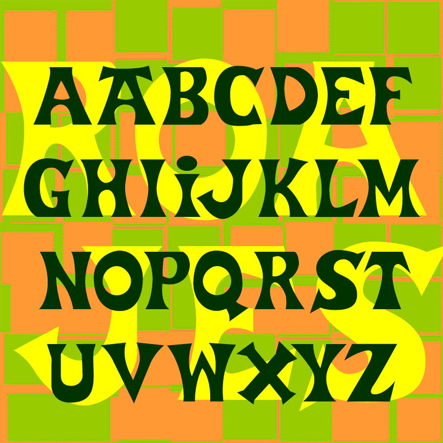
ROAD JESTER is bold and playful, suggesting the hand-lettered signs you might find in a sleepy beach town. Road Jester was inspired by the logo of Trader Joe’s, the offbeat grocery chain; additional characters were inspired by Basque-style lettering. A matching stencil font provides an exotic shipping crate feel. Don’t use this font to create your own Trader Joe’s merchandise as that would certainly be trademark infringement. “Road Jester” is an anagram of Trader Joe’s. ROAD JESTER 2.1 has an expanded character set and improved spacing and kerning.

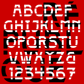
RINGPIN was inspired by the style of body piercing. Not my own style, but interesting to observe. In designing this font, I was rather limited to geometric components, and drew each with a crisp highlight. Most letters take the lowercase form, sometimes with alternates. The letters did not want to align neatly, so they assume a variegated arrangment. Includes 1-3 versions of each letter, plus numbers, punctuation, international characters, and many fanciful extras.
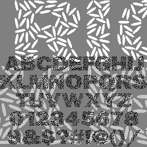
Obviously, RICECAKES was designed to look like grains of rice arranged to form letters. It was my very first font design, planned for an event at Albany’s Rice Gallery, but was not completed in time. The letterforms are patterned after the classic Franklin Gothic, although I did alter the 1 (not gothic enough!) Use it big, reverse it, color it to suggest flower petals, overlap it. Now there’s a second font with white grains on black. Each font includes caps, numbers, punctuation, and international characters. Another one of Dennis’ Font Play creations
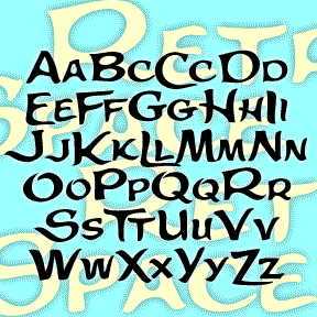
The Retrospace font was inspired by the hand-lettered opening credits of the film Some Came Running (1958). The Long, Hot Summer (another 20th Century Fox production from 1958) has similar credits; the films do not share directors or art directors. Font includes large and small caps, numbers, punctuation, and international characters.
The 4 RÉPUBLIQUE fonts were inspired by the lettering on this style of Paris Metro sign, designed by the architect Adolphe Dervaux and first installed in 1924. This design coexists with the more famous Art Nouveau “Metropolitain” signs, designed by Hector Guimard in 1900 and made of sinuous wrought iron. The “Candelabra Dervaux” uses simpler Art Deco letterforms, cut out of red metal, and illuminated from the back. The double row of stencil-style supports resembles train tracks. For fun, I’ve included a few alternate characters in the lowercase positions and created a Solid font without the horizontal lines, and two… continued