
-Premium-
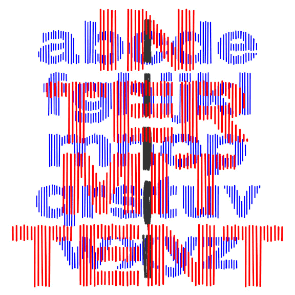

INTERMITTENT was inspired by some of the titles for the movie “West Side Story,” designed by the legendary Saul Bass. Bass’ titles take several different turns; this style was used for the title and intermission cards. Composed of slightly irregular parallel lines that suggest a bold, wide sans serif, Intermittent is like a sketch of a font, bold and wide but with a gentle sparkle. This font can be condensed, expanded, layered, and negatively spaced to great effect. This font can be condensed, expanded, layered, and negatively spaced to great effect.
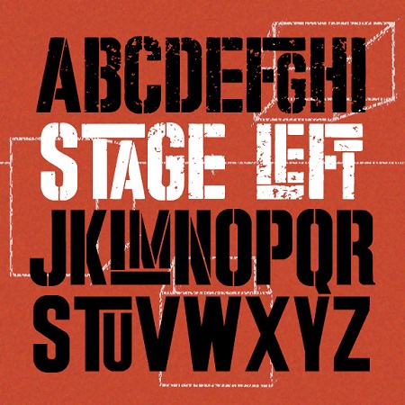
STAGE LEFT was inspired by the iconic poster for the movie version of “West Side Story.” Designed by Joe Caroff—not Saul Bass as is often stated—the poster suggests a gritty but playful urban energy. It’s basically large and small caps but I’ve designed it so the big T, L, and F interlock with other small letters.And it comes in three finishes: Solid, Stencil, and Stressed, the latter most resembling the original.
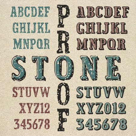
The Stone Proof fonts are weathered and worn, suggesting primitive typeset, rough paper, and aged surfaces. The set includes Regular, 3-D, and a special Fill font to work with the 3-D. Its cousin, Handbill, has the jumbled style of rubber stamps, if you prefer that. A stone proof is a simple proof made without a press, using a mallet and composing stone. Thanks, Vista Bill, for the name suggestion!
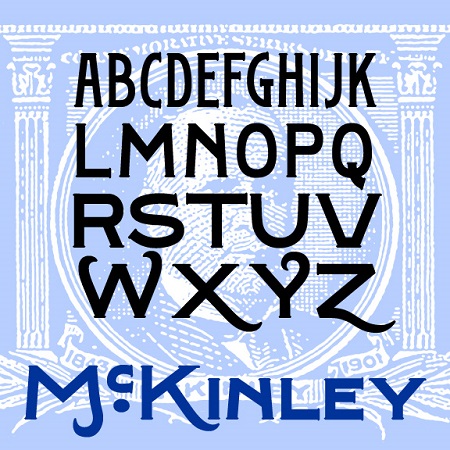
McKinley is a series of fonts with the bold but graceful style of hand-painted signs, inspired by the titles of several early silent films, including The Great Train Robbery, The Kleptomaniac, and others directed by Edwin S. Porter for Edison Studios. Available in Narrow, Regular, and Wide, with a separate Swash Caps font.
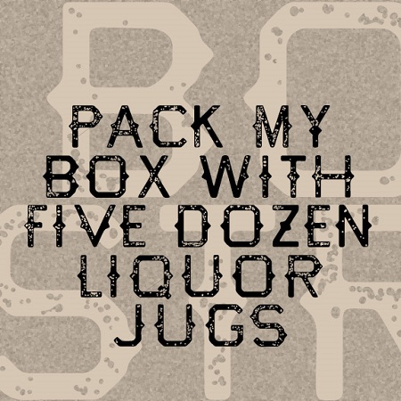
Bootstrap has a rough-hewn Western feel, like letters were made by an old-time blacksmith. The letterforms are bold and simple, with spurs and a rough texture. Bootstrap’s roots are in my Tapeworm font, reimagined for a new old look.
Old New England is a bold and stylish script font with a speckled texture reminiscent of a well-worn T-shirt or salvaged sign, comfortably worn. It’s a companion to New England, the lighter and smoother original.
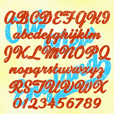
SCHNAPPS is a lively calligraphic font that captures a jolly German character. Could be used to suggest Oktoberfest, Christmas, or Old World tradition. Bolder and more legible than many blackletter fonts. SCHNAPPS was inspired by the hand-lettered titles of Carol Reed’s 1940 film “Night Train to Munich,” art directed by Alex Vetchinsky. Version 1.5 includes an expanded character set, improved spacing and kerning.
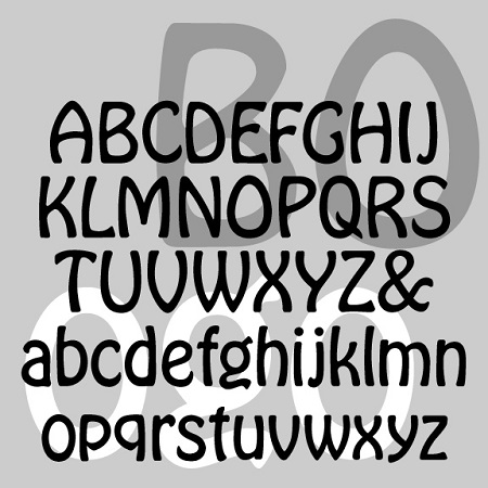
BOGO is a friendly and graceful font with an Art Nouveau feel. It was inspired by the light variant of Morris Fuller Benton’s classic Hobo that appeared in 1915 and seems not to have digitized. I completely redrew the typeface from historic examples, maintaining its curvy lines and descender-free lowercase. BOGO has a lightness and elegance that is sometimes lacking in Hobo and its many imitators.
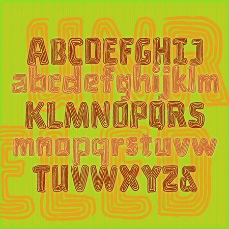
Unraveled is a fun font that looks like a craft project made with yarn or string. Each letter is a single fuzzy line wound round and round. Perfect for color and layering. Unraveled was inspired by the hand-lettered titles of Roger Corman’s 1959 horror comedy “A Bucket of Blood”, art directed by Daniel Haller. The film is set in a world of Beatnik artists and poets in San Francisco and is ripe for adaptation as a musical à la “Little Shop of Horrors.”
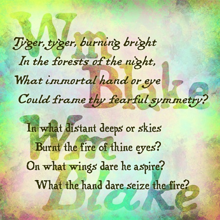
The Wm Blake fonts were inspired by the work of the great English poet and artist. William Blake (1757-1827) wrote, illustrated, lettered, printed, and hand-colored his “Songs of Innocence” and “Songs of Experience”, inventing a new form of printmaking along the way, all very inspirational to me as a printmaker and font designer. These fonts maintain the romantic charm of Blake’s original hand lettering—quite different from typeset—in both roman and italic forms as he used.