
-Premium-
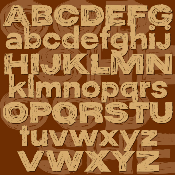

WOOD SHED is a bold sans serif inspired by examples of hand lettering from the 1940s, familiar with just enough unusual letterforms to make it distinctive. I’ve created 2 companion fonts with texture: a bold woodgrain and scratchy dry brush. Either can be used alone or layered with the solid font to create additional color effects.
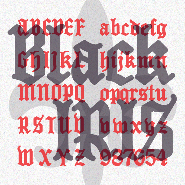
BLACK IRIS is a bold blackletter font with rounded strokes for a unique texture. The lowercase follows conventional letterforms, but I’ve designed the uppercase to be more legible to modern eyes. And it works great in ALL CAPS.
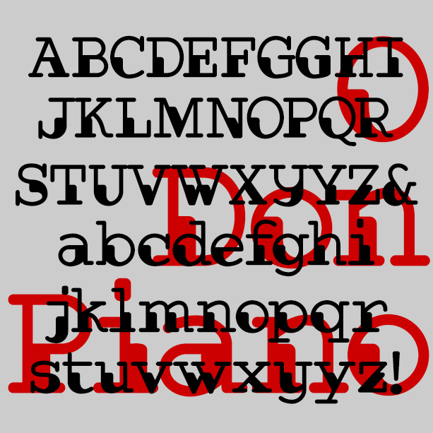
Don Piano is an unusual font that combines the look of two 20th-century technologies—punch cards and typewriters. Its dark shapes and lighter strokes give an interesting syncopation to the words, almost musical. Available in Regular, with proportional spacing, and Monospaced. Don Piano was inspired by a sketch in a lettering book from 1954 with this caption: “The authors were at a loss to give this alphabet a name except that it is different. It was made with a ball-point pen.” The name comes from this famous talking cat video that always makes me smile.
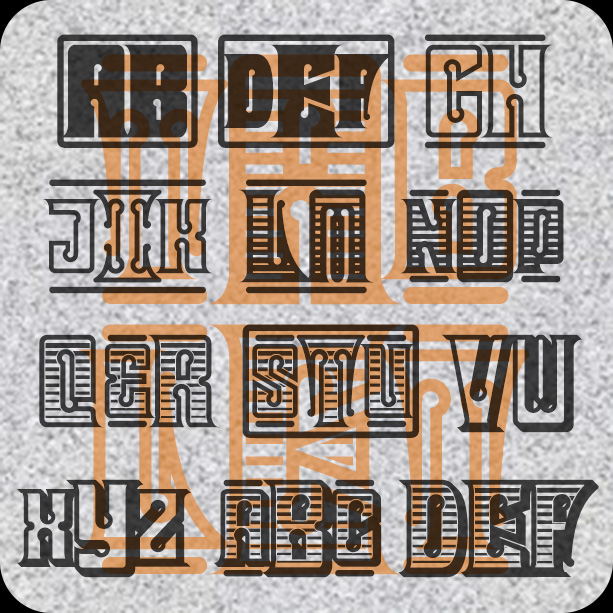
BANKROLL was inspired by fonts used for 19th-century banknotes, stock certificates, and the like. Completely reimagined and redrawn, BANKROLL combines the Victorian mix of solid construction and decoration that people like about steampunk. In four varieties: Solid, Shaded, Outline and Engraved. If you want this look in an easy-to-use monogram format, check out Tablet Monograms.
Tablet Monograms have a bold and commanding look. Inspired by the kinds of lettering often found on old stock certificates and bank notes, Tablet Monogram come in 6 varieties including Solid, Outline, Shaded, and Shadow. It’s easy to type your own custom monogram using any combination of large and small initials and a choice of decorative elements.
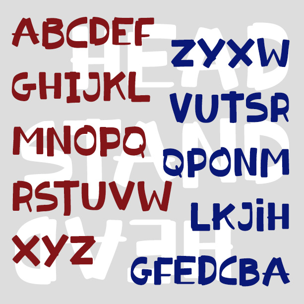
HEADSTAND is a playful font that looks like it was written for kids—boldly and deliberately—with a marker on a dry-erase board. Stroke weights vary in unexpected ways as the letters bounce along the baseline. All caps, but OpenType features replace double letters and numbers with alternate glyphs for a real hand-lettered feel. Headstand was inspired by the logo for Melania Trump’s “Be Best” campaign, reportedly designed by the First Lady herself.
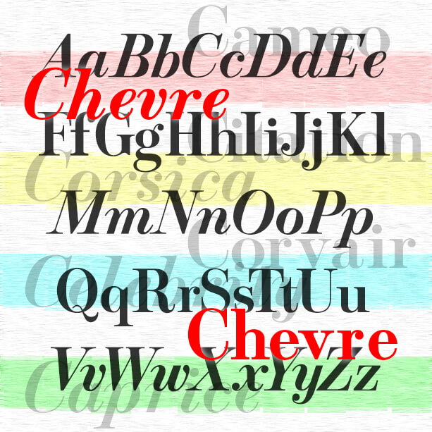
Stylish and graceful, the Chevre fonts are my digital interpretation of roman and italic fonts designed by Mortimer Leach for use by Chevrolet in print ads about 1957–1960. Leach borrowed aspects of Bodoni, Century Schoolbook, and Century Expanded to make his new creation and documented its development in his 1960 book “Letter Design in the Graphic Arts.” The beautiful italics, including a condensed version, seem to have found greater use at the time, particularly in magazine ads. I chose not to make condensed italics as Leach did, but did make bold versions to round out the set. Thanks, John, for… continued
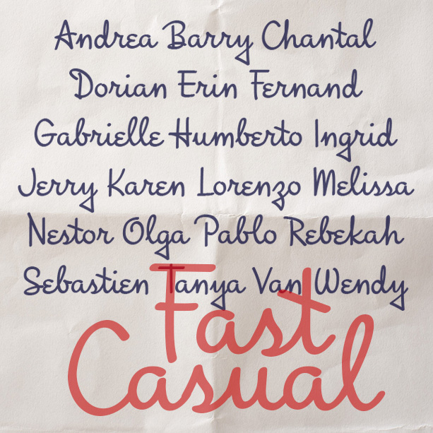
Fast Casual looks like the cursive handwriting of a smart and creative individual who takes pride in their writing, but they also include many quirky touches to show their personality. Fast Casual was inspired by the hand-lettered titles of the trailer of the classic 1940 Bette Davis film “The Letter”. I’ve kept many of the quirks—the triangular descenders, the epsilon e’s, the diagonal crossbars—while modernizing and harmonizing it altogether.
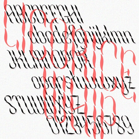
Licorice Whip was inspired by an example from a 1920 book: “A most novel alphabet by Mr. G. E. Gustafson, Penman, Inter-State Commercial College, Reading, Pa.” It was once important for a professional to use the pen well, the visual equivalent of elocution. The neat thin-thick strokes show good control of the pen; along with the gaps, a shimmering effect is created, or perhaps the look of twisted ribbon. A full-alphabet companion to Cascade Monograms.
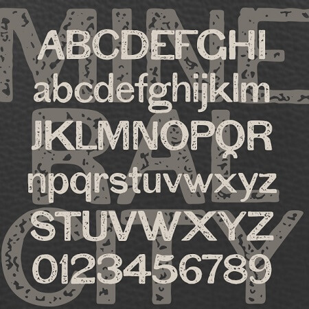
Mineral City was inspired by an example of 19th-century sans serif typography. Around that time, type designers took a cue from sign painters, omitting the finicky serifs and making the strokes more uniform. These early sans serifs fonts were categorized as “grotesques” or “gothics” and this is a particularly awkward one. (Later these would be refined into fonts like Franklin Gothic, and then neo-grotesques like Helvetica.) I’ve added more texture to give it the rustic flavor of crude printing, rough paper, worn surfaces, or even a hand-panted sign.