
-Premium-
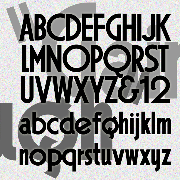

GAINSBOROUGH is a bold geometric font in a high Art Deco style. I was attracted to the extreme distortion in some of the letters, emblematic of the style, and preserved that in my design. Gainsborough was inspired by the hand-lettered titles of the 1938 Alfred Hitchcock film, The Lady Vanishes, “A Gainsborough Picture,” produced by a sister company of Gaumont-British, namesake of Gaumont. Version 1.5 includes an expanded character set and improved spacing and kerning.
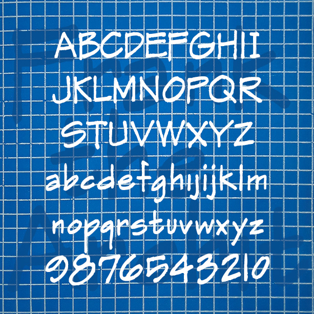
FRANK THE ARCHITECT was inspired the hand lettering in Frank Ching’s classic book Architectural Graphics (1975) that influenced so many draftspeople. In these fonts I’ve tried to evoke the idiosyncrasies of Ching’s beautiful original, including the texture. Version 1.5 combines the separate regular and alternate fonts into single fonts that use the stylistic alternates function of Opentype. Version 1.5 also features and expanded character set and improved spacing and kerning. More information I started this font years ago, then set it aside, releasing only the Markerman variant. Then I really needed a convincing “architect’s hand” font for a design project… continued
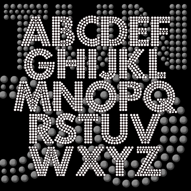
FORTUNA DOT gives your words the effect of being written with tiny lights or beads. This revival of a “lost” analog font was suggested by Bruce Baryla, the bold geometric letterforms were inspired by Paul Renner’s classic Futura®*. The open structure of the font makes it ideal for layering and laser-cutting, available in three weights. Version 1.5 includes an expanded character set, improved spacing and kerning. *Futura® is a registered trademark of Fundicion Tipografica Neufville S.A. The name is used here for reference only; my font was completely redrawn from analog sources. This is NOT a Futura® font.
The FLORENT fonts are bursting with beautiful, floral detail. The four fonts are designed to be used separately or layered together in different colors and combinations. Florent A (green in the animation at right) is bare branches or vines. Florent B (yellow) has white flowers on the branches. Florent C (blue) is the flowers alone, perfect for use alone or as a “fill” with B or D. Florent D (red) has the branches full of light and dark flowers. Florent was inspired by an analog font called “Garland” in Dan X. Solo’s 100 Ornamental Alphabets. I’ve completely redrawn the font,… continued
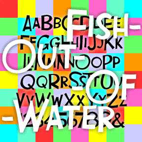
FISH OUT OF WATER is the perfect comedy font, inspired by the opening titles of Billy Wilder’s Some Like It Hot (1959, art direction by Ted Haworth). Loose-shaped large and small caps suggest unpredictable fun. In 3 weights for greater flexibility. The FISH OUT OF WATER fonts include large and small caps, numbers, punctuation, and international characters.
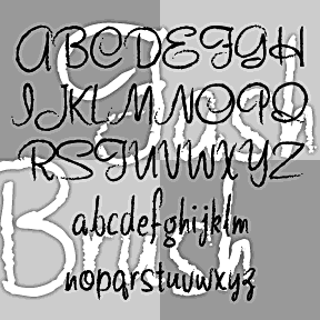
FASHION SCRIPTS are fraternal twins. The letterforms of each were inspired by an example of 1940s department store lettering. FASHION BRUSH has a rough, art brush texture; FASHION MARKER has the smooth line of a Sharpie®. The inspiration was this example of wood type formerly used by Thalheimers department stores. From examples in the collection of Virginia Commonwealth University, Richmond, VA. According to their information, “The type follows handlettering styles of the 1940s and is unique compared to 20th-century script typefaces in metal.” My Pen Script Monograms were also inspired by this wood type. Each font includes upper and lowercase,… continued
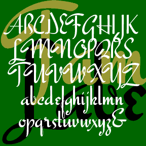
FAMOUS LABEL is another vertical script with the retro-posh feel of a department store logo. Inspired by a style of pen lettering illustrated in Alphabets: Ancient & Modern, compiled by J. B. Russell and published in 1945 by Padell Book Co. A number of letters were altered to make a more consistent and complete font. As seen in the Script Font Identification Guide! Includes caps, lowercase, punctuation, numbers, and international characters.
ESQUIVEL is a sleek near-script inspired by an older Esquire magazine logo. Working from this December 1968 issue (with Lauren Hutton on the cover) I had only the title and one short heading inside to work from. The title evokes the original source, but pays homage to Juan García Esquivel, the Mexican emigré “multi-threat talent: quirky composer, eccentric arranger, enchanting performer, dashing showman” according to the liner notes (by Irwin Chusid) of Esquivel’s 1995 greatest-hits CD Cabaret Mañana. Works well italicized too. And there’s also the Engraved and Condensed versions too. Each font includes upper and lowercase, numbers, punctuation and… continued
ESPANGLES is a bold and stylish cursive font that makes a bold statement. It was inspired by the logo of the great, ubiquitous Spanish department store, El Corte Inglés, in the tradition of other great store logos (i. e. Harrods, Marshall Field, Neiman-Marcus) that suggest fashion and flair. Version 2.0 features improved linking for a more realistic script, making use of the discretionary ligatures feature of Opentype. There are also some alternate characters and an expanded character set.
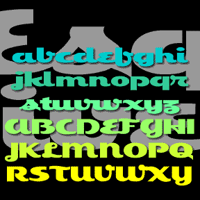
EPICURUS was inspired by Roman manuscripts on papyrus from Herculaneum. I’ve modernized the forms of the distinctive capitals, adding the “new” letters, lowercase and non-Roman numerals. Epicurus has a clean stroke and the feel of a contemporary sans serif. The example is just for reference. The texts I actually used are in Oxford’s Bodleian Library and cannot be reproduced here. The font is named for the Greek philosopher, not the recipe website. Includes upper and lowercase, numbers, punctuation, and international characters.