
-Premium-

COMFY has the bold but friendly look of cutout letters. Inspired by an example of “Pinselschrift” (brush lettering) by Wilhelm Dechert*. Has the feel of a handlettered version of a 20th-century geometric font like Paul Renner’s Futura* or Rudolf Koch’s Kabel. *Reproduced in Iron Fists: Branding the 20th-Century Totalitarian State by Steven Heller (thanks, John, for bringing this to my attention.) This font, of course, is much more gemütlich (comfortable, homey, informal, cozy, approachable, good-natured) than that title suggests. Includes upper and lower case, numbers, punctuation, and international characters.
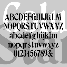
COLUMBIA STAMP was suggested by my correspondent Marsha, who sent me scans and lots of encouragement. It’s based on her set of vintage rubber stamps and has a smoother edge and straighter alignment than my other stamp fonts. Upper and lower case, numbers, punctuation, and international characters.
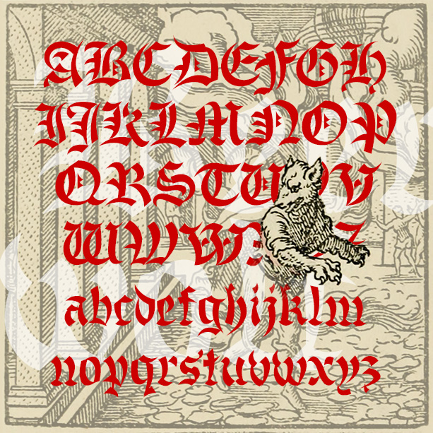
BEERWOLF is a font of transformation, a blackletter that’s in the process of becoming something more dangerous. The wedge-shaped strokes resemble flames, wolf’s teeth and ears giving this blackletter font a curious difference. The Beerwolf is a creature of German folktales like the werewolf; you have been warned!

CHELT PRESS was made from scans of my own hand-carved rubber stamps, carved way back in the 80’s to simulate Morris Fuller Benton’s classic Cheltenham Bold. Looks just like stamping but also suggests crude letterpress. Four fonts in all: light and dark, aligned and variegated. Mix and match for a totally random, hand-printed look. CHELT PRESS v2.0 is extensively reworked and extended. Better spacing and expanded character set. Includes upper and lowercase, numbers, punctuation, numbers, and international characters.
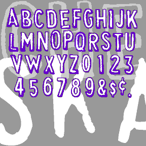
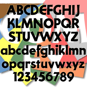
CHEAPSKATE is based on my first rubber-stamp alphabet. I purchased it in a toystore in the 70s and threw out the packaging. I used these A LOT. Love the slight shadow effect and the awkward letterforms. The outline font is the way the stamps look, the fill font can be separately or underlapped to fill in the letters with another color or percentage. This updated version has improved letterforms and greatly expanded character set, including 2 of each letter, plus lower case, numbers, punctuation, and international characters.
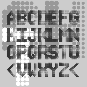
The CHASER fonts are designed to look like those on electronic signboards, using a 9 x 13 “LED” grid for each character. Unlike the similar fonts, mine use weighted dots to imply movement, as if the text were scrolling to the left or to the right. Each complete font includes uppercase, numbers, punctuation, and international characters. Accented letters are each included in two variations: 13 lines high with shorter letters, and 15 lines high which extend above the regular characters
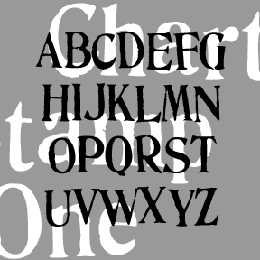
The set of four CHARTER STAMP fonts were inspired by two sets of vintage rubber stamps (Thanks, Jeff!) Each set is a wooden-boxed treasure. One is labeled “Fulton Chart & Sign Marker” which makes it related to my popular ARTISTAMP series. I’ve married the two sets of stamps (One is narrow, Two is wide) and each has a Regular and Rough variety for an authentic rubber-stamp feel. Each font includes upper- and lowercase, numbers, punctuation, and international characters.
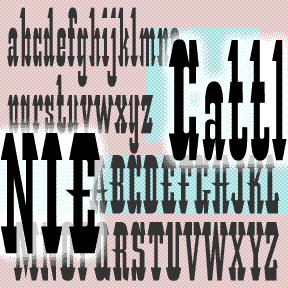
CATTLE ANNIE is my unauthorized digital interpretation of the analog font “Les Catalanes.” According to ABZ: More alphabets and other signs by Rothenstein and Gooding, it was designed n 1952 by Enric Crous-Vidal (1908-1987) but was never produced. Other Crous-Vidal fonts include Paris, Flash, and Ilerda from Fundición Tipográfica Bauer. The original source (with an incomplete character set) says Crous-Vidal’s Paris show was “the graphic hit of the ’52 season” and refers to Les Catalanes as “this flamboyant character of Mediterranean inspiration.” You may imagine hooves, horns, heels, hats and moustaches in its distinctive features. Many such wood-type fonts have… continued
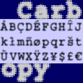
CARBON COPY is a dot-matrix take on Courier, the invisible classic with roots in typewriter style. Could be used to suggest the effect of screen display or of blurry old carbon paper. Includes 3 weights, plus one font with a full background of dots. Each font includes upper and lower case, numbers, punctuation, and international characters.

CAPTAIN HOWDY was inspired by the font often seen on classic Ouija® boards. Yet another woodtype, “circus,” or “Western” font. Cleanly redrawn using my 70s-vintage wooden Ouija® board as a model. I never cared much for playing with it, I just liked the way it looks! Includes caps, numbers, punctuation, and international characters.