
-Premium-
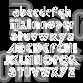

BARRIL is my digital interpretation of a “lost” analog font called Barrio. I started with a scan from a dry-transfer catalog (thanks, Jeff). I know it was produced originally by Neufville, but that’s all the information I have. Totally 70s! For my own amusement, I made a second inline version called Barril Doble. Great for layering. Each font includes caps, punctuation, numbers, and international characters.
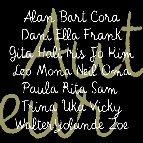
AUTEUR was inspired by the work of Jean Cocteau (1889-1963), the French writer, filmmaker, and artist. At left, he can be seen handwriting the opening titles of his fantastic film Beauty and the Beast (1946) on a blackboard. He also made many drawings and paintings, often including a variation of this expressive, whimsical script. In researching this font, I looked at hundreds of pages of his drawings and letters. There was a range of clarity and character-formation; I’ve patterned this after his more deliberate lettering rather than that of his correspondence; the latter was useful for numbers and other characters…. continued
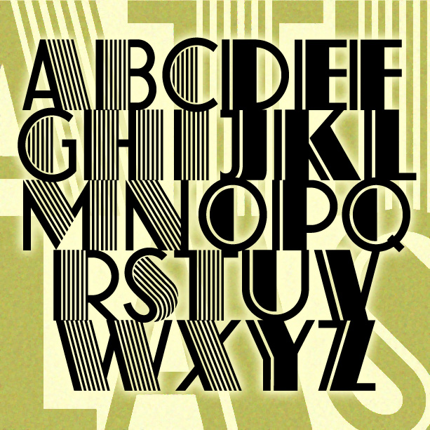
ATLAS captures the bold glamour of the Art Deco period. Inspired by a classic analog font, ATLAS comes in two varieties: original with dazzling pinstripes and solid with just the one. Since originally creating these in 2001—under the name Farouk as I’d seen it identified—I have learned much more about the original design that “goes back all the way to 1933…when it was designed by K[arl] H[ermann] Schaefer for the German type foundry Schriftguß AG… as Fatima Versalien [Versalien = uppercase]. In the same year, Fonderie Typographique Française published their version of Fatima Versalien under the name Atlas.” His grandson… continued
The ARTISTAMP fonts were derived from scans of a vintage set of rubber stamps I had long admired. Four fonts altogether: “wet” and “medium”, each both aligned and somewhat jumbled as in the animations above. Formerly called “Fulton Artistsamp.” Each complete font includes uppercase, numbers, punctuation, and international characters.

The 2 ALÚMINO fonts were inspired by font designed for Alcoa, the aluminum company. Sleek, clean, modern, light and flexible. I’ve also made a narrower version with the same stroke weight, although it appears somewhat darker overall. Bob Trogman writes, “I worked on the Alcoa font while working for Saul Bass. The Alcoa project lasted over a year and a half. Half way through the project a presentation was made to the board in Pittsburgh and one of the board members said the logo looked too much like ALCAN’s logo and we started all over. Don Handel did the actual… continued
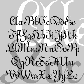
ALSACE-LORRAINE is an experiment. My idea was to combine aspects of a vertical French script and a German fraktur. For the most part, the top is the German and the bottom is the French. A font “mash-up” before that word was coined. Named for the region from which my father’s father’s family emigrated. Includes caps, lower case, numbers, punctuation, and international characters.
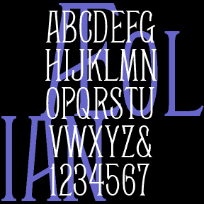
AEOLIAN is a narrow, elegant font that was inspired by the lettering on a pipe organ manufactured by the Aeolian Company. My friend Nelson got me started with scans of the various stop labels, like the one at left, found on the amazing Longwood Gardens Aeolian organ which he has worked to restore. I invented missing letters and numbers, then created two additional weights, Demi and Bold. Always grateful for posts like this: “Thanks for digitizing Aeolean for posterity. The original tradename was Façade, and it was introduced by the Boston Type Foundry in 1881. John F. Cumming cut certain… continued

TAPEWORM was inspired by the work of the great L.A.-based American artist Ed Ruscha. His characteristic work includes drawings and paintings of words: a single word, found language, and the like. This is one of the styles he’s used, which he has referred to as “Boy Scout utility modern.” It’s precise but awkward and looks like the letters an obsessive amateur sign painter would make with masking tape, of uniform weight but curious formation. Version 1.9 features and expanded character set.
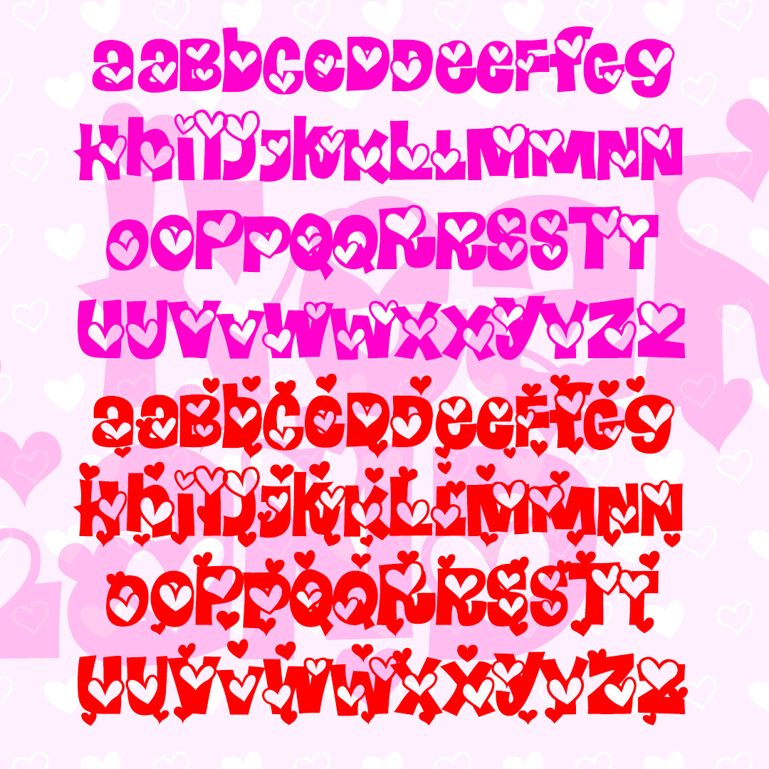
HEARTLAND is a fun and playful font full of heart. The Regular font has outlined hearts on each character, the Extra font adds even more hearts and can be layered together. These mixed-case fonts have 2 versions of each letter for even more bounce. Inspired by the letterforms of the classic font Daisyland. Version 1.5 has an improved and expanded character set and improved kerning.
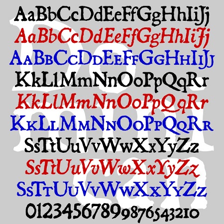
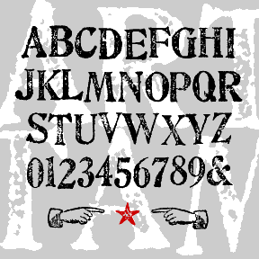
The Dominican fonts are designed to look like old letterpress printing. Originally inspired by a font from Dan X. Solo’s books, I expanded the series to also include Italic and Small Caps. Version 3.0 now contains lining figures with the old-style figures still available as stylistic alternatives. All 3 fonts have been expanded and refined, making these a fine alternative to the overused Caslon Antique.