
-Premium-
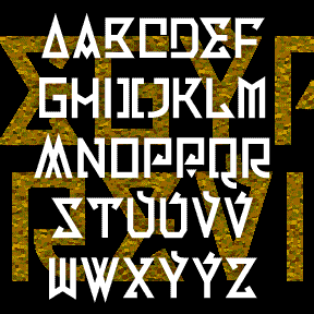

EGYPTIAN REVIVAL is an exotic retro font with geometric flourishes. It was inspired by the single word EGYPT on an old book, sketched at left. It’s named for a style of European decorative arts that uses Egyptian motifs. I imagined I was an early 20th-century designer, influenced by Art Deco and the discovery of King Tut’s tomb. There are regular and inline versions, each including some alternate letterforms. I made this sketch from the cover of a book of 19th-century photographs in the Dallas Museum of Art. Includes caps and some alternates, punctuation, numbers, and international characters.
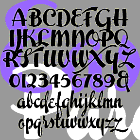
EASTER PARADE is one of four vertical script fonts, along with Scarlet Ribbons, Roselyn, and Famous Label. As seen in the Script Font Identification Guide! This one has the most contrast in stroke weight and some crazy swashes. It was inspired by a sample of hand-lettering called simply “Modern Brush Script” in Alphabets: Ancient & Modern, compiled by J. B. Russell and published in 1945 by Padell Book Co. Includes caps, lowercase, punctuation, numbers, and international characters.

DYNAMOTOR is my hand-drawn take-off of the classic font Dynamo. Dynamotor has the texture of diagonal crayon strokes which complements the bold, active letterforms. Looks great reversed for a chalk or scratchboard look. Dynamo was designed by K. Sommer and first released in 1930. Its distinctive “fins” give it a touch of machine-age deco. Dynamo is available from many sources online; Dynamotor is NOT a Dynamo font. Includes uppercase, numbers, punctuation, and international characters. Dynamotor was inspired by this book cover, designer unknown, found on the delightful blog Awful Library Books.
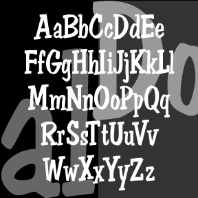
DON SEMIFORMAL is a little joke about the font Dom Casual.* I’ve added serifs to my approximation of the handwritten-style classic, which was originally designed by Peter Dombrezian for American Type Founders in 1952. Somewhat more formal than the original, but with the same lively quality. The “formal” would be then be a straight serif font, I suppose. Includes upper- and lowercase, numbers, punctuation, and international characters.
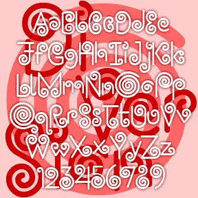
DIVERSION is a little amusement, all swirls and spirals. It was inspired by this handlettered logo for an Italian restaurant in Mexico. Could add a lot of whimsy if used carefully; may cause dizziness if overused. Includes caps, numbers, punctuation, and international characters.
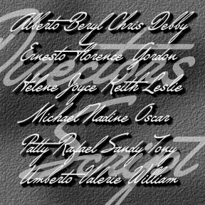
DIRECTORS SCRIPT was inspired by the sort of dramatic hand-drawn script used in 1940s film credits. As seen in classics like Crossfire, Laura, and Gilda, a very sloped cursive (about 45 degrees) is paired with a heavy roman. To approximate the style at left (from Crossfire), you could use Directors Script paired with my National Debt, Impact or similar. Add a drop shadow, and voilà. A second font has capitals that are 50% larger than the regular caps, re-weighted and aligned to harmonize with the lowercase for an even more dramatic look. Includes upper and lower case, numbers, punctuation, and… continued
DENNEY SALTY and DENNEY SPICY are playful, comical, and quirky fonts, inspired by the work of Alan Denney for the Barker Greeting Card Company of Cincinnati, OH, circa 1969–74. DENNEY SALTY (formerly Denney One) has the bumpy edges and whimsical letterforms of hand lettering done with a crayon. DENNEY SPICY (formerly Denney Two) is more dynamic, like bold pen or brush lettering. Both fonts are essentially unicase, but have alternate letterforms in the upper-and lowercase positions for more variety. Version 2.0 of both fonts includes an expanded character set and improved spacing and kerning. Alternate characters are now accessed as… continued
DAD’S RECIPE is derived from my father’s hand printing. I used a recipe he had written out for me (for cole slaw specifically, simulated above) and rounded it out with other samples from my cookbook. Dad almost always used a blue ballpoint pen on lined tablet paper, so these shared recipes had a very consistent look. V1.5 has been rescaled and fleshed out with my usual character set. Includes two versions of each letter, punctuation, numbers, and international characters. DAD’S RECIPE as featured onthe back of bags of Sun Chips. DAD’S RECIPE as used in the “Words in Transit” program… continued
CURATOR is a handwriting font that’s both precise and quirky, tighly spaced with a high x-height. It is a collaboration with my friend Corinna Ripps Schaming who has maintained this immaculate hand since I met her in college. She is Associate Director/Curator at the University Art Museum, Albany, NY. In Light, Regular and Bold.
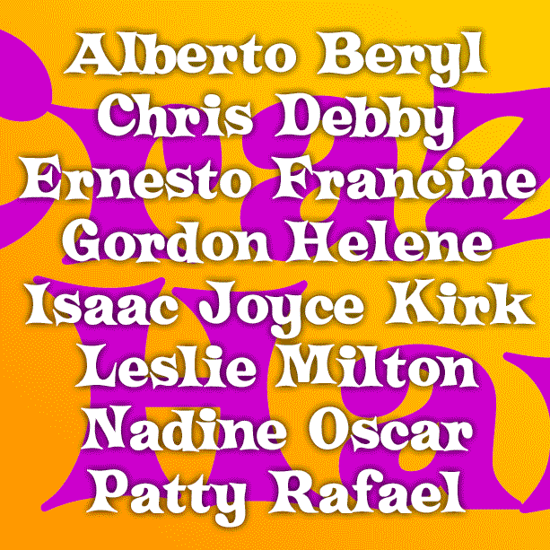
CRAZY HAROLD is a fun, retro-festive font. Inspired by an example of this name, as reproduced in Paul E. Kennedy’s 1974 Modern Display Alphabets, I’ve redrawn the font and expanded the set to include useful Condensed and groovy Flair varieties as well. And Condensed Flair too! Version 2.0 uses the Stylistic Alternates feature of Opentype to make the alternate characters easier to access, and includes an expanded character set and improved spacing and kerning.