
-Premium-
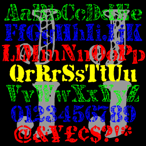

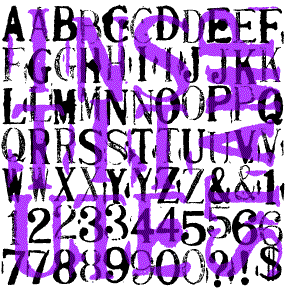
JJ STENCIL was inspired by the work of the great American Pop artist Jasper Johns. Perhaps best known for his flag and target series, Johns has also used the “found” look of stencils in many drawings and paintings, including “0-9” at left. My fonts were not made directly from Johns’ work, but from scans of my own similar stencil scratchings. There are four complete fonts, each with a different treatment of the letters. The fonts are designed to be mixed or layered or both. JJ STENCIL 3.0 now includes upper and lowercase. I finally found an appropriate lowercase stencil and… continued
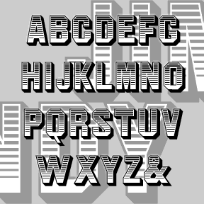
JIM DANDY is my interpretation of a font that originated in the 1850’s as Gothic Shade from the Dickinson Type Foundry. It boldly suggests a political broadside, a circus poster, or a Western sign. Later this font would be known as Tombstone and Jim Crow as it was subsequently issued by other foundries in other formats. Jeff Levine jogged my memory with a scan of this gem from a 1970s dry-transfer catalog; thanks, Jeff. The Regular font is equivalent to the original. I’ve also created component fonts for the shading, shadows, and other elements that can be used separately or… continued
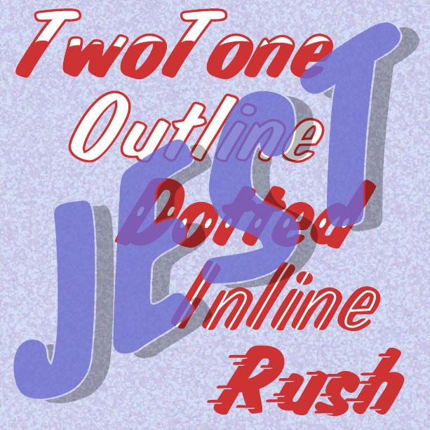
JEST is bold and gestural, as if painted with a brush by a skilled signpainter. It was inspired by a “lost” analog font, Jet, available in the 1970s as dry-transfer lettering. The original had a white inline; in recreating the font I added Solid, Dotted, TwoTone, and Shadow varieties. And now the newest member of the family, Jest Rush, uses another signpainter’s trick to suggest urgency.
JANUARY is my digital interpretation of the analog font Jana. The concave shapes of most characters and the notches on many give this sans-serif an elegant sparkle. There’s another digital version of Jana out there, but mine has been entirely redrawn and is very smooth. I’ve added two weights, Demi and Bold. People send me wonderful suggestions and information; the Jana story is no exception. Janet got me started with a scan which jogged my memory. Bill suggested it was released by Visual Graphic Corp. Now Philippe has confirmed that Jana was created by Richard D. Juenger (b. 1928, Illinois)… continued
INSTITUTE STAMPS is a pair of monospaced rubber-stamp style font that emphasize the primitive nature of the medium, suggesting a telegram or oher early machine print. Working with a set of cheap, imported toy stamps, I deliberately printed them to include variation and accident. The Bold font has dark inky letters, the Regular is lighter and drier looking. These can be used separately or mIXed, depending on your taste. Named for the Albany Institute of History & Art with which I was working at the time I made this. Includes uppercase, numbers, punctuation, numbers, and international characters.
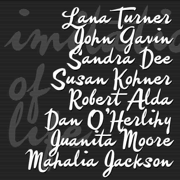
IMITATION is a free-spirited brush script, more a fashion statement than the work of a diligent signpainter. Imitation was inspired by the credits of two soapy Lana Turner films, Imitation of Life (1959) and Madame X (1963). They are credited to different art directors so I don’t know who originated the style. IMITATION includes many alternate characters so you can do an all-lowercase look that looks more hand-lettered, or choose from two sets of caps. VERSION 4.0 uses Opentype features to make these useful alternates easier to use, as well as an expanded character set and improved spacing and kerning…. continued
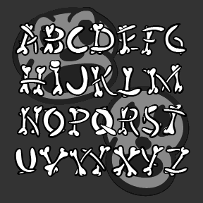
HUMERUS is a spooky/funny font with letters formed of loosely arranged bones, more in the spirit of a Halloween party than real horror. Think of “funny bone”, “rib tickling” and “numbskulls,” all appropriate to the inspiration for this font, the opening credit sequence of Abbott and Costello Meet Frankenstein (1948, directed by Charles Barton, art directed by Hilyard M. Brown and Bernard Herzbrun, with animated sequences by the great Walter Lantz, who may have had a hand in the credits as well. The Regular font has the bone shapes defined by calligraphic outlines; there’s also a Solid font that can… continued
HONEYMOON is a retro, backhand script with a hand-written feel. It was inspired by the classic logo of the Holiday Inn hotel chain. Uniform weight, almost completely linking. Italicized it becomes a vertical script. Includes upper and lowercase, numbers, punctuation, and international characters.
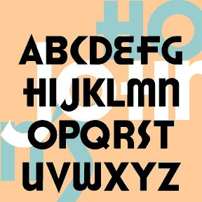
The HONEST JOHN’S fonts are based on the old logo of the Howard Johnson’s restaurant chain. For missing letters, I consulted similar Deco fonts. There’s a solid Regular and outline Shadow version. Includes large and small caps, punctuation, numbers, and international characters.
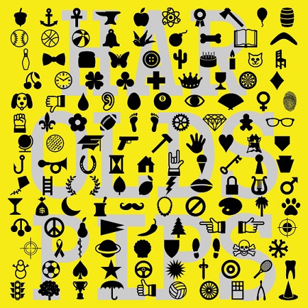
HAROLD’S PIPS is a dingbat font of 52 symbols that could be used to create a special card game or in any other way you use dingbats. It was inspired by an episode of The Simpsons* in which Fat Tony’s gang play cards with a special deck only aces in extra suits such as cherries and stars. So with this font (and perhaps my Card Characters letters) you could make a deck of 52 aces!The new OpenType version of has over 130 cool and useful dingbats. In applications that support the ligatures feature, now you simply type the name of… continued