
-Premium-


NATIONAL DEBT is a bold, squarish design with the solid curves of a vintage car or a retro refrigerator. I originally designed this back in 1998 for a 1940s-themed event when I couldn’t find quite what I was looking for. Now there are three versions: the solid original, Hilite, and ThreeD that can be used separately or layered together. Version 1.5 includes an expanded character set, improved spacing and kerning. Another one of Dennis’ Font Play creations.
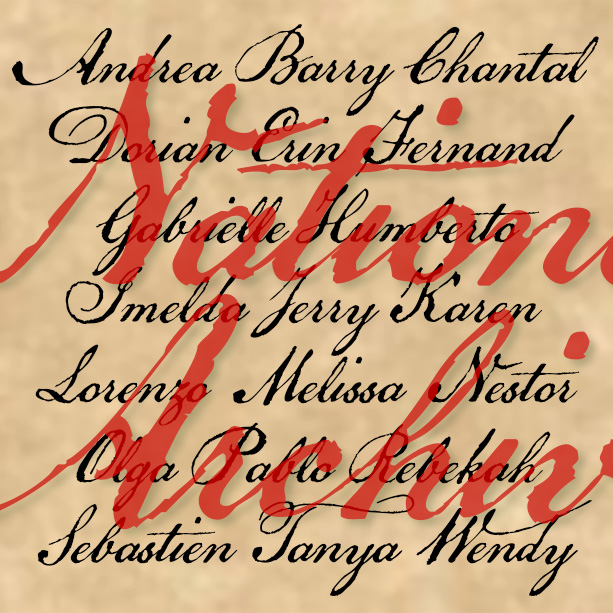
NATIONAL ARCHIVE has the feel of a historic script: elegant penmanship paired with the roughness of quill on paper. National Archive was inspired by the familiar look of the Declaration of Independence. Although the text was composed by Thomas Jefferson and others, Timothy Matlack is the person who inscribed it on vellum so beautifully, creating an indelible symbol of our nation’s founding. Version 4.0 includes all new numbers as well as an expanded character set and improved spacing and kerning.

MOCKINGBIRD was inspired by the opening title for the classic film, To Kill a Mockingbird (1962), designed by Stephen Frankfurt. A child’s hands browse a cigar box of treasures and make this crayon rubbing that forms the title. I modeled my letterforms on Franklin Gothic as the closest match. I didn’t fake the texture which comes from an actual rubbing of a photopolymer plate. Includes upper-and lowercase, punctuation, numbers, international characters, plus special end-caps and space for a complete look.
MILKY WAY was inspired by an Art Deco alphabet seen in late 1930s Speedball lettering books by Ross F. George. A “future past” look, like the 1939 Worlds Fair and Tomorrowland. Originally, George directed that the distinctive white dots were to be made by spattering white ink with a toothbrush. The degree of detail in the Regular version of this font means it should be used fairly big, and that it’s a big file. At Jeff Levine’s insistence, I’ve added a second font without the stars but retaining the rings. Both fonts include caps and lowercase, plus numbers, punctuation, and… continued
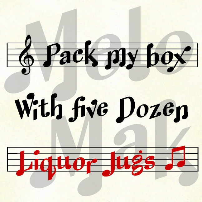
MELODY MAKER lets you set type that looks like musical notation. The set includes 3 fonts that you can use separately or together. Melody Maker Regular includes both notes and staff, like the top line in the graphic above. Melody Maker Notes includes only the notes, as in the second line. Melody Maker Staff includes only the staff and can be layered behind the same text set in Notes in a different color. Version 1.5 has an expanded character set and uses Opentype features to enable alternate characters and pairs, for a more “musical” look.

MARKERMAN is comic-book style font that is highly legible and able to be italicized and bolded. Its inspiration is the same as my Frank the Architect fonts, if you’re looking for something more formal, less “comic.” Version 4.5 has an expanded character set that includes a few special comic glyphs in place of ^ ~ { } and improved spacing and kerning.
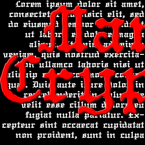
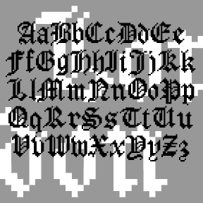
The MANUCRYPT fonts were inspired by an unusual example of “Olde English” (blackletter) typing. Preserving the original texture, these fonts have a look that’s much more “Haunted House” than “Wedding Announcement.” There are Regular (“Proportional”, the red screen above) and Monospace (“Fixed Width”, blue screen) fonts depending on your mood. Once upon a time, kids, there was the typewriter. It was like a keyboard and printer without a computer in between! That was where the typist came in, striking the keys and printing simulaneously. But you were stuck with one style and size per machine, usually Courier and always of… continued
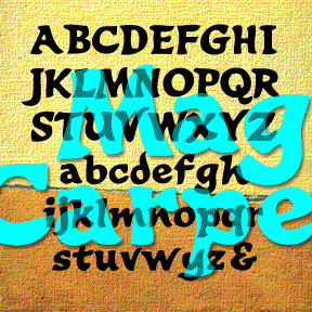
MAGIC CARPET is a calligraphic font with a lively, brush-like style, even vaguely exotic. It was inspired by the hand-painted titles (below) of the film Lust for Life (1956), a biography of Vincent Van Gogh, directed by Vincente Minnelli, art directed by Cedric Gibbons, Hans Peter and Preston Ames. Includes upper and lowercase, numbers, punctuation, and international characters.
LONDON BITMAP is a recreation of the classic Apple font London, originally designed by the great Susan Kare. (She also designed the wonderful icons at right, so familiar to us old appleheads.) The city-named fonts (Chicago, etc.) were a big improvement over previous computer typography, although they may now seem a bit quaint. Most have made the transition to scaleable fonts, such as my own L.A. fonts; now you can again enjoy London’s contrast between “Old English” style and bitmap texture. While I was at it, I also made a Harlequin, Cross-stitch and Shaded version; the initials at left show… continued
LE FILM is a classic Art Deco design of 3-D geometric letters set against a pattern of bold dots. This is my digital interpretation of the classic analog font of the same name, designed by Marcel Jacno and released in 1927 by Deberny & Peignot of Paris. The Classic font presents white letters with black sides against the dots. I’ve also made separate Letters and Shadow font that can be colored differently and layered with or without the Classic font. Pro tip: These characters ^ < > \ { } _ have been replaced with lines of dots. Use them… continued