-Premium-
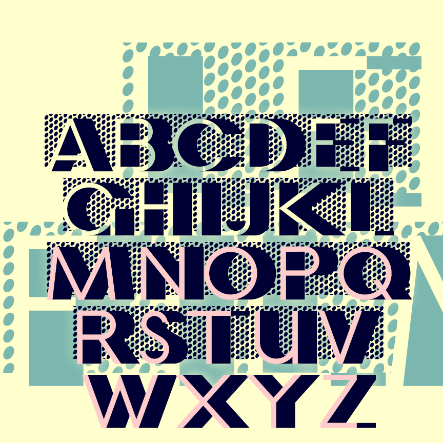
LE FILM is a classic Art Deco design of 3-D geometric letters set against a pattern of bold dots. This is my digital interpretation of the classic analog font of the same name, designed by Marcel Jacno and released in 1927 by Deberny & Peignot of Paris. The Classic font presents white letters with black sides against the dots. I’ve also made separate Letters and Shadow font that can be colored differently and layered with or without the Classic font. Pro tip: These characters ^ < > \ { } _ have been replaced with lines of dots. Use them… continued
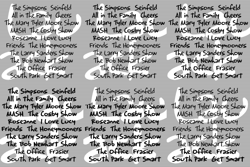
LAUGHTRACK is a set of 3 fonts in a quirky, cartoon style that says “funny”. Inspired by the work of Jerry Robinson, whose “True Classroom Flubs and Fluffs” was a highlight of the Sunday News comics section when I was a kid. Robinson also did a panel called “Still Life” in a similar humorous drawing and lettering style. Although he’s better known for his work in superhero comics, the “funnies” interest me more. His papers are archived at Syracuse University. Each font includes caps, lower case, numbers, punctuation, and international characters.
LAPIS LAZULI is a set of 3 calligraphic fonts. Inspired by a simple, elegant font called “Papyrus” in one of Dan X. Solo’s great font books, but unrelated to the familiar ITC font of the same name. Any additional information would be appreciated. In completely redrawing the font, I’ve regularized and expanded it and added 2 more weights, Demi and Bold. Each font includes caps, lower case, numbers, punctuation, and international characters.
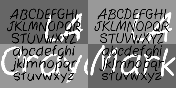
LA Marker and LA Crayon are big friendly handwriting fonts. They were inspired by the Apple Classic bitmap font “Los Angeles” which disappeared with the transition to TrueType fonts. Marker has a smooth edge, Crayon is rougher, suggestive of the original bitmap jagged edge. Includes caps, numbers, punctuation, numbers, and international characters.
The KOMBINE FONTS are experiments in crossing fonts, font mashups. My inspiration was found in Blackletter: Type and National Identity (Cooper Union, 1998, p.33), a most interesting book for anyone keen on fraktur. There was a small illustration (below) of a font called “Centralschrift (C. G. Schoppe Foundry) 1853, a 19th c. hybrid of fraktur and a neo-classical roman”. The upper parts–those which most enable reading–are the more familiar roman, producing a more legible font for those (like me) unfamiliar with the fraktur. I used as my models a Wittenberger fraktur and various members of the Century family, recognized for… continued
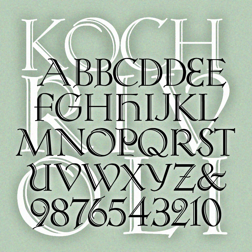
KOCH RIVOLI is a strong and graceful titling font. It was inspired by Rudolf Koch’s original “Zierbuchstaben” (decorative book initials) intended as a companion font to Koch Antiqua. If you like Koch, see also Koch Quadrat and Bride of the Monster. Version 1.5 has an expanded character set including numbers and punctuation not in Koch’s original design, and improved spacing and kerning.
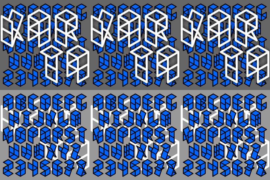
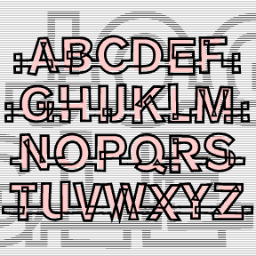
KARTA was inspired by the 2-letter logo of the Johnston Paper company (below. I was stopped behind their delivery truck and quickly jotted it down.) Looks like folded paper or a paper construction. The set includes Regular and Bold which are outlines of the planes, and Solid which can be used separately or layered to create a color fill. Includes uppercase, numbers, punctuation, and international characters.
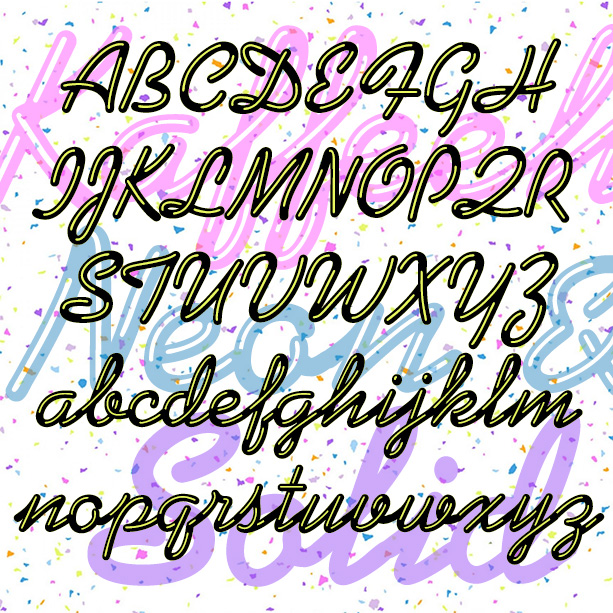
KAFFEEHAUS NEON looks like sleek retro neon cursive, linked and highlighted. And there’s a Solid version that you can layer with the Neon in an accent color, or use separately perhaps with your own effects. The basic letterforms were inspired by the classic script font KAUFMANN®, which was designed by Max Kaufmann in 1936 and remains popular. For my interpretation, I completely redrew the font to make the letters better resemble neon tubes with open loops and rounded ends. I have adapted the basic letterforms to better resemble tubular neon lettering. The ends of characters are all rounded, and there… continued
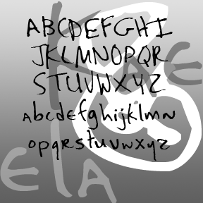
KAELA was one of my early fonts and was “retired” a while back. After a couple requests and a major sighting, I’m bringing it back. Expanded character set, slightly heavier weight for better appearance on screen, and a few other improvements. Originally derived from the handwriting of one of my students. KAELA as seen in use in the opening credits of My Name is Earl, an NBC comedy starring Jason Lee. Includes upper- and lowercase, punctuation, numbers, and international characters.
JOGGLE was inspired by a book jacket that I once saw, half remembered, and couldn’t find again. The illustration was a colorful 50s, jazz-style composition, and the hand-drawn, outlined letters joined up. Couldn’t find it again; hope I did it justice. The letters link up as you type. There are end caps, blank spaces, and flourishes to finish up names and headings, and two of each letter so you have a little more variety. A second font (the pink part of the illustration above) provides a loose fill that be placed behind the outlines for another effect. Includes 2 of… continued
