
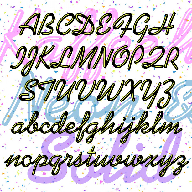

KAFFEEHAUS NEON looks like sleek retro neon cursive, linked and highlighted. And there’s a Solid version that you can layer with the Neon in an accent color, or use separately perhaps with your own effects.
The basic letterforms were inspired by the classic script font KAUFMANN®, which was designed by Max Kaufmann in 1936 and remains popular. For my interpretation, I completely redrew the font to make the letters better resemble neon tubes with open loops and rounded ends.
I have adapted the basic letterforms to better resemble tubular neon lettering. The ends of characters are all rounded, and there are more open loops. The highlights give it a glassy or metallic shine and a bit of three-dimensionality.
Version 1.5 includes an expanded character set, improved spacing and kerning.
![]()
![]()
