-Premium-


IXAT is a pair of bold sanserif fonts that look like they are in motion or affected by glitches. IXAT MINUS has white streaks removed from the letters as in the top 3 lines above; IXAT PLUS (bottom 3 lines above) adds black streaks for even more of a good thing. All caps, but there are 2 of each letter for a more random feel, and the two fonts can be intermixed. Version 1.5 has an expanded character set and improved spacing and kerning.
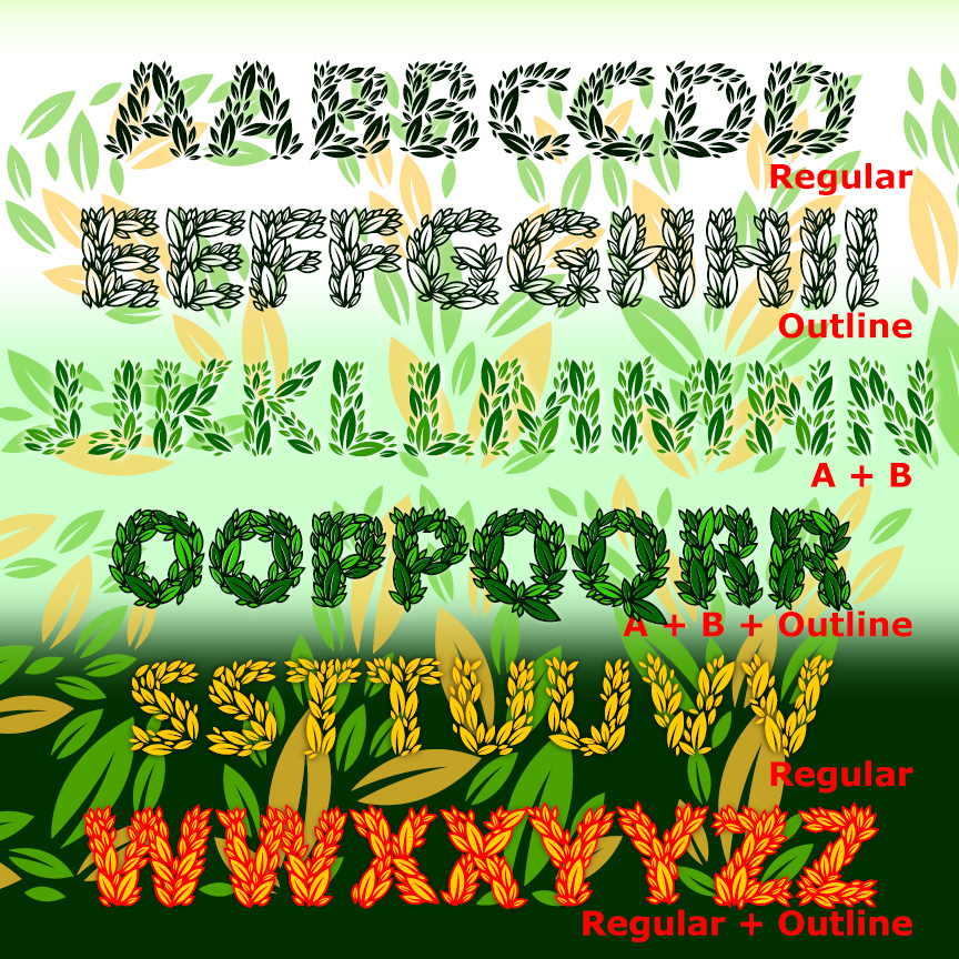
SWEET BAY is a family of plant-based fonts: the letters are made completely of leaves for a fresh, natural feel. The Regular and Outline fonts have all the leaves and can be used together or separately. Component fonts A and B each have half the solid leaves and can be layered together in different colors to create richer and deeper effects. All caps, but two versions of each letter for a more hand-lettered look.
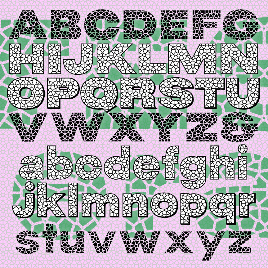
TESSERA is a big bold sans serif that looks like broken-plate mosaic. Separate Tile, Grout, and Deep Grout fonts make realistic mosaic effects easy, and there’s a companion Fill font that can be layered behind the Grout fonts in a contrasting color or a colorful photo. You can type ^^^ in any of the fonts to make a continuous matching pattern. If you need a matching font without the mosaic effect, please check out my Wood Shed font. If you want a more formal mosaic style—serif, square tiles, please check out my Subway Mosaic font.
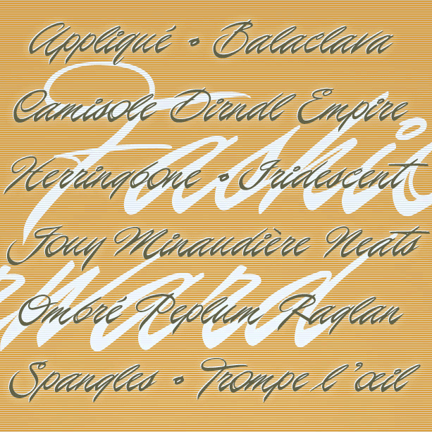
FASHION FORWARD is a slick and stylish cursive with a very strong incline. Inspired by classic brush lettering, this font combines glamour and energy.
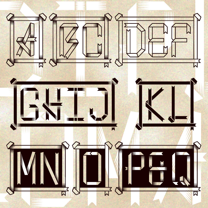
DIPLOMA MONOGRAMS are a unique style of letters that looks like folded ribbons. With the simplicity of a bookmark and the formal elegance of an official seal, this set of 3 fonts lets you make distinctive custom monograms of 1-4 letters. The possibilities include White, Black, and Cameo, a striking mix of contrasts. And each font includes the letters with and without shading, your choice depending on the scale and medium of your project.
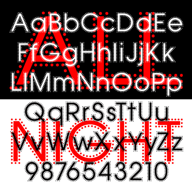
ALL NIGHT is a geometric sans serif with a twist: the characters are all bordered by a line of little dots giving them an eye-catching “glow.” ALL NIGHT was inspired by an example in a 1950s guide to hand lettering and a shop sign in Turkey.
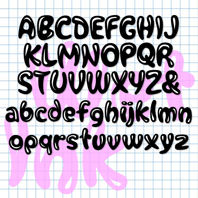
WET INK is a playful font that looks like you spilled a shiny liquid and the droplets formed letters. There’s a solid version without highlights; layer it behind the first in a different color for more effects.
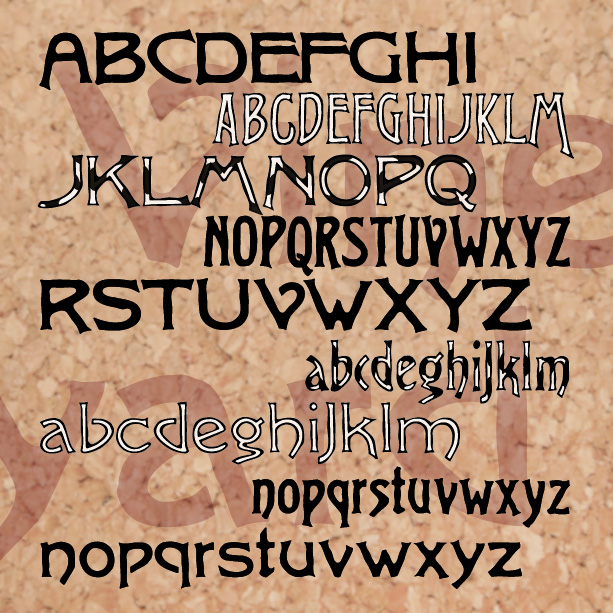
VINEYARD is a pairing of fonts with a rich, woody character. Featuring notes of bark and an earthy finish, Vineyard can be served at most any occasion. The Solid fonts can be used separately or, in a contrasting color, as a fill for the Regulars. And now there’s a third variety, Graft, a dynamic blend of outline and solid. Vineyard was inspired by two early 20th-century analog fonts from American Type Founders, Virile and Erratic Outline. I’ve married the two designs, expanding and refining them. At one time I offered my version of Virile; it has since been revised, and… continued
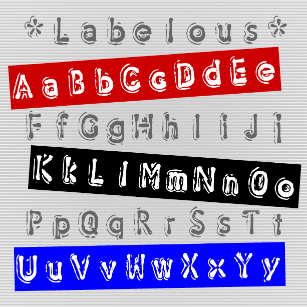
LABELOUS looks like embossed tape labels, a low-tech classic. But unlike other such fonts, Labelous is narrower and includes upper and lowercase, full punctuation, and international characters. There are two versions of the font, one with black letters and the other with black tape and white letters. For the look of continuous tape, just type an underscore for blank tape between letters.