
-Premium-
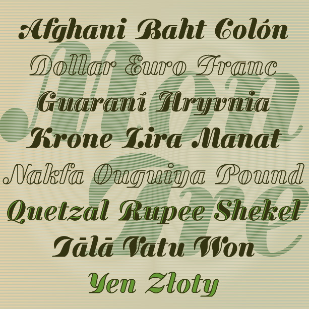

MONEY TREE is a bold and graceful font that mixes formality with forward motion. Inspired by “Currency,” an early 20th-century type by A. D. Farmer foundry, I’ve slightly modernized and expanded the letterforms, and created Outline and Hilite varieties.
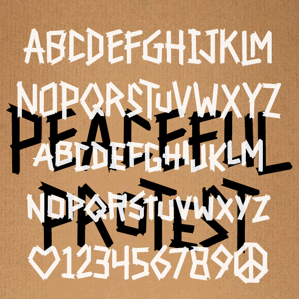
PEACEFUL PROTEST is a bold, impactful font. The straight lines and strong verticals are reminiscent of runes, but were inspired by this poster designed by the Milwaukee-based artist Francisco Ramirez. Using quickly torn masking tape and assembled with urgency, his poster captured both the message and the moment, and has now been acquired by the Whitney Museum of American Art. So grateful he let me make this font! Use this font to say your own message loud and proud. It has LARGE and small caps. You can use all of one or mix and match for a more hand-lettered feel…. continued
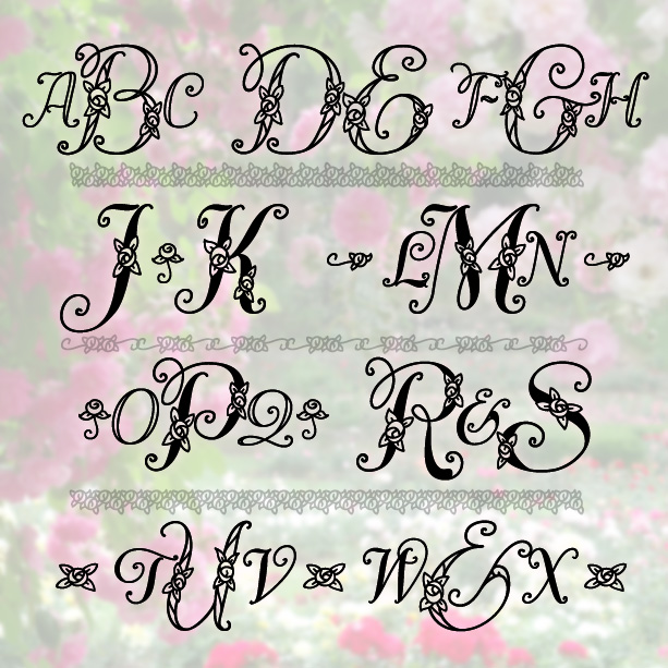
DIVINITY ROSE MONOGRAMS is a set of 4 fonts that produce monograms in a delicate and graceful style studded with dainty roses. A choice of solid or open letters and an assortment of coordinated decorations allow even more flexibility in creating your own custom monograms. Inspired by the work of Ross F. George, circa 1935.

BUCKET is a bold and bouncy geometric sans serif, familiar with just enough flair to catch the eye. And then there’s a second font, BUCKET SPATTER, where the letters each have a strong dot texture on the right side, as if sprayed or spattered. The fonts can be used separately or layered together in contrasting colors. The spacing of the Spatter font can adjusted so the letters overlap and remain legible. These fonts were inspired by early 20-century showcard lettering in which ink spatter, shading on rough paper, and other techniques were used to add texture and dimension.
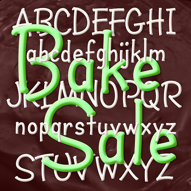
BAKE SALE is a fun font that feels like marker lettering. With the rhythm of handwritten “ball and stick” letters, Bake Sale could suggest a kid’s writing or writing for a kid: simple, direct, and fun. Instead of serifs, Bake Sale has little dots, like you get when you pause with a permanent marker.
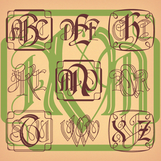
A new branch of the popular Vine Monograms® family, Nouveau Vine Monograms® bring the beautiful, organic curves of Art Nouveau to any custom monogram. While inspired by classic designs of the Art Nouveau period, these initials are all new and available in several styles—Solid, Outline, Inline, and Engraved—that can be mixed and matched for more effects. A choice of optional frames completes the look.

VINEYARD is a pair of fonts with a rich, woody character. Featuring notes of bark and an earthy finish, Vineyard can be served at most any occasion. The Solid fonts can be used separately or, in a contrasting color, as a fill for the Regulars. Vineyard was inspired by two early 20th-century analog fonts from American Type Founders, Virile and Erratic Outline. I’ve married the two designs, expanding and refining them. At one time I offered my version of Virile; it has since been revised, and expanded, and renamed to become Vineyard.

Pheather is a fun font that suggests graceful feathers or plant fronds. Energetically inclined, Pheather elegantly balances frilly strokes with solid end caps. Pheather was inspired by en example of 19th-century calligraphy. In making this available for modern use, I’ve redrawn, regularized, and expanded the original design.
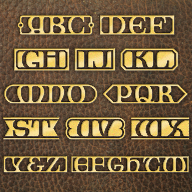
LIBRARY MONOGRAMS gives your custom monogram the warm, cozy feeling of old leather-bound books with gold-stamped titles and marbled endpapers. Inspired by lettering by the architect Robert Louis Trudeau, each monogram is neatly contained within its own cartouche, with Black or White letters, and finished with your choice of endpieces. There are even some alternate letterforms for more fun. Trudeau’s original lettering for the Albany Law School campus is reminiscent of the style called “Collegiate Gothic,” drawing upon forms from history for their beauty and gravity.
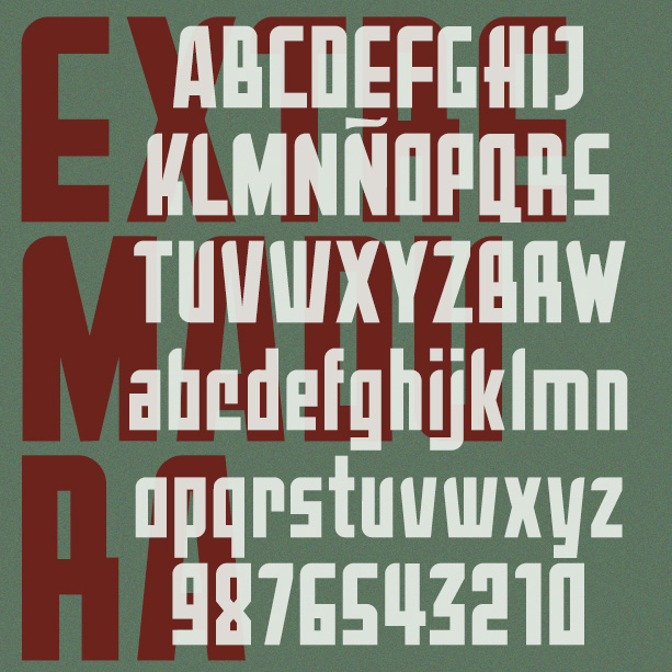
Extremadura is a bold geometric font. Straight lines and minimal curves give it a distinctive style. Extremadura was inspired by an example of vintage Art Deco lettering called Aragón; there are many fonts with that name so I picked a different region of Spain.