
-Premium-
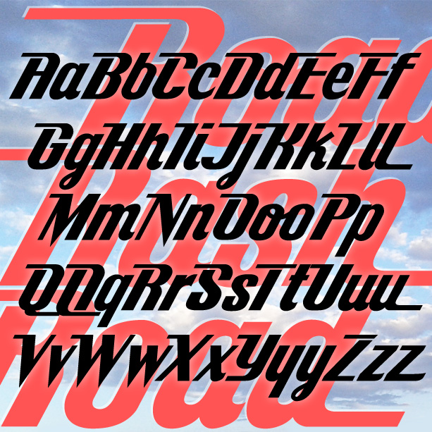

ROAD RASH is bold font with aspects of a cursive. The strong incline suggests forward movement; the contrast of thick and thin strokes gives it a distinctive style. Alternate letterforms allow more customization.
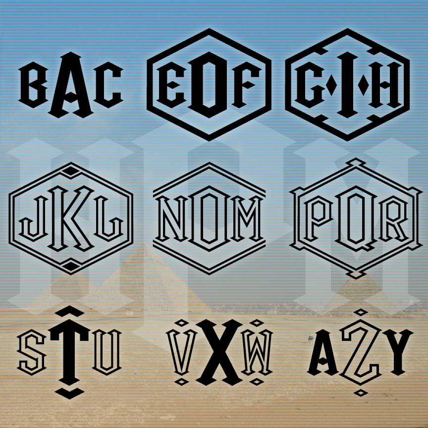
PYRAMID MONOGRAMS is a set of 3 fonts that lets you make custom 3-letter monograms in a bold and distinctive style featuring diamonds and triangles. The set includes Solid and Outline fonts and 2 mixed fonts. Each font has a choice of decorative frames and other elements you can use to further customize your monograms.

CLEAN TITLE is a bold and crisp titling font. It was inspired by the classic font Copperplate Gothic, originally designed by Frederic W. Goudy in 1901. I have completely withdrawn the letterforms, now with tiny Latin serifs and a complete lowercase for greater flexibility. There’s also a companion Outline font for more variety.

LYRIC TENOR is a condensed font with the contrasting strokes and unbracketed serifs of a Didone or modern font. And it has a graceful and elegant matching italic that can be used together or separately. LYRIC TENOR was inspired by an example of an analog font simply called Tenor that apparently existed as an italic only.

PASTA FAZOOL is a fun, bold, and bouncy font. With lots of alternate characters, PASTA FAZOOL works well in all caps, all lowercase, or mixed. There are two versions of the font; PASTA FAZOOL EXTRA has even more letters that fit in and around the others, as in the top lines of the graphic. These fonts were inspired by the hand-lettered titles of the 1966 Italian film, “The Christmas that Almost Wasn’t,” with an animated title sequence by Emanuele Luzzati.
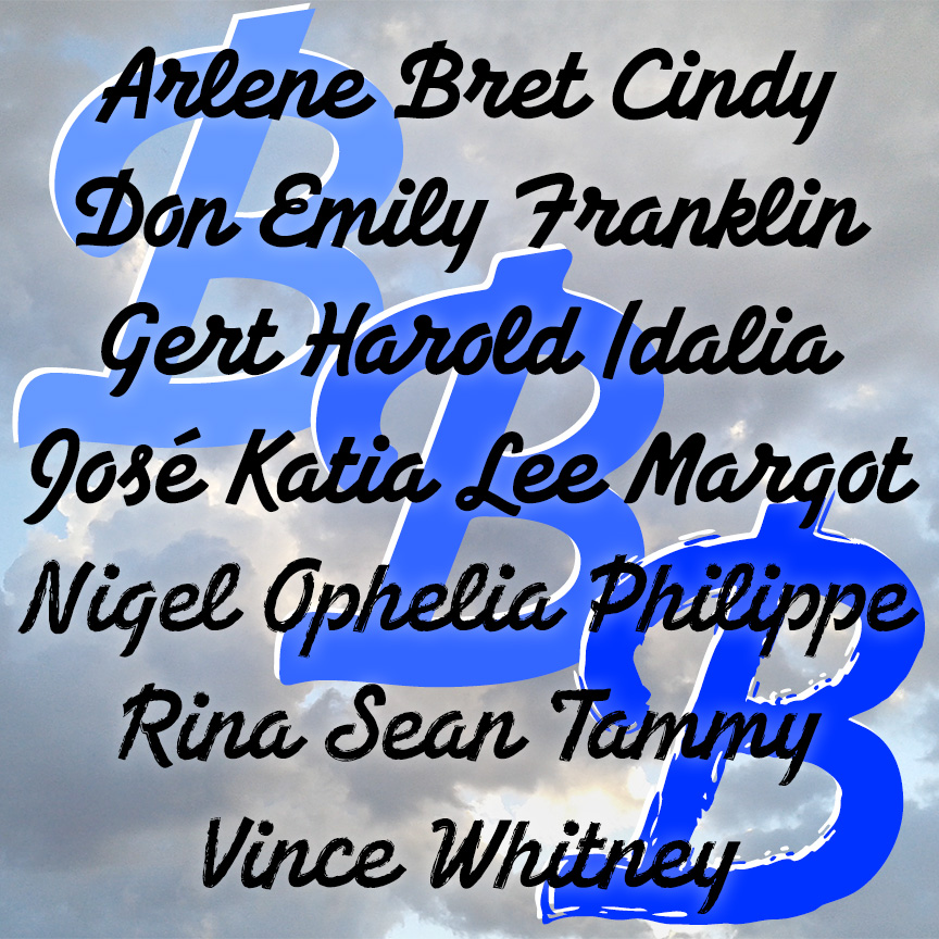
BREEZEBLOCK is a bold cursive font with the feel of hand-painted sign lettering. The Regular font has sharp corners; the Rounded and Brush varieties offer softer corners and edges. BREEZEBLOCK was inspired by film trailer lettering of the 1930s.
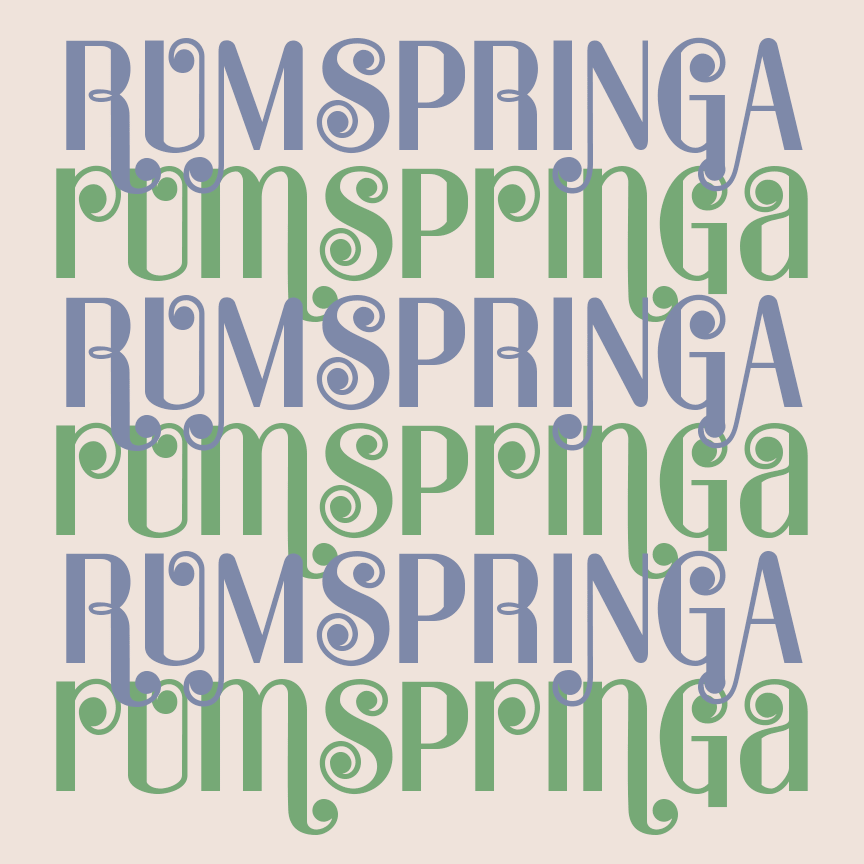
RUMSPRINGA is a bright and cheerful Modern font with energy and versatility. Contrasting thin and thick strokes are combined with bouncy ball terminals for a musical feel. And there are lots of alternate characters so you can determine how much bounce you want and discretionary ligatures to add variety automatically. RUMPRINGA PRIME is an alternate version of the font with some uppercase letters taking on lowercase forms, as seen in the bottom row, a popular mid-century typographic trope. RUMSPRINGA was inspired by an analog font of the 1960s called Spring.
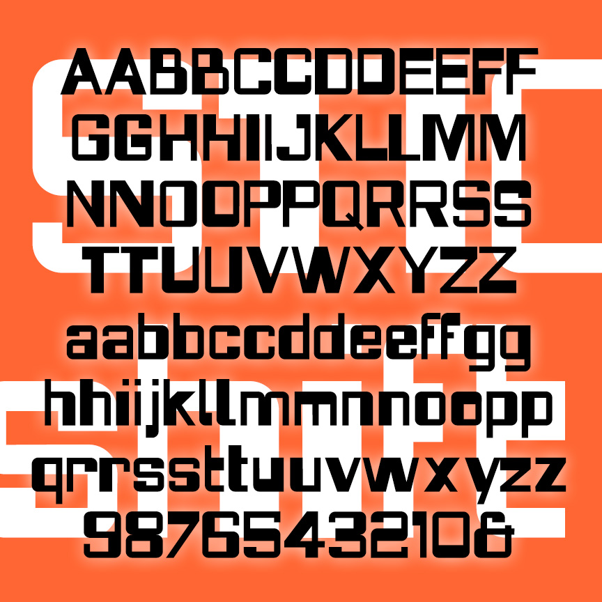
STICKSHIFT is a playful but unsettling sanserif. Apparently square and controlled, STICKSHIFT switches from thick to thin in unexpected ways. Combines aspects of folk-inspired lettering like BENSFOLK with a punch-card design. Lots of alternate characters and discretionary ligatures to keep the shift quality going. Inspired by the logo of the 1967 film “In the Heat of the Night.”
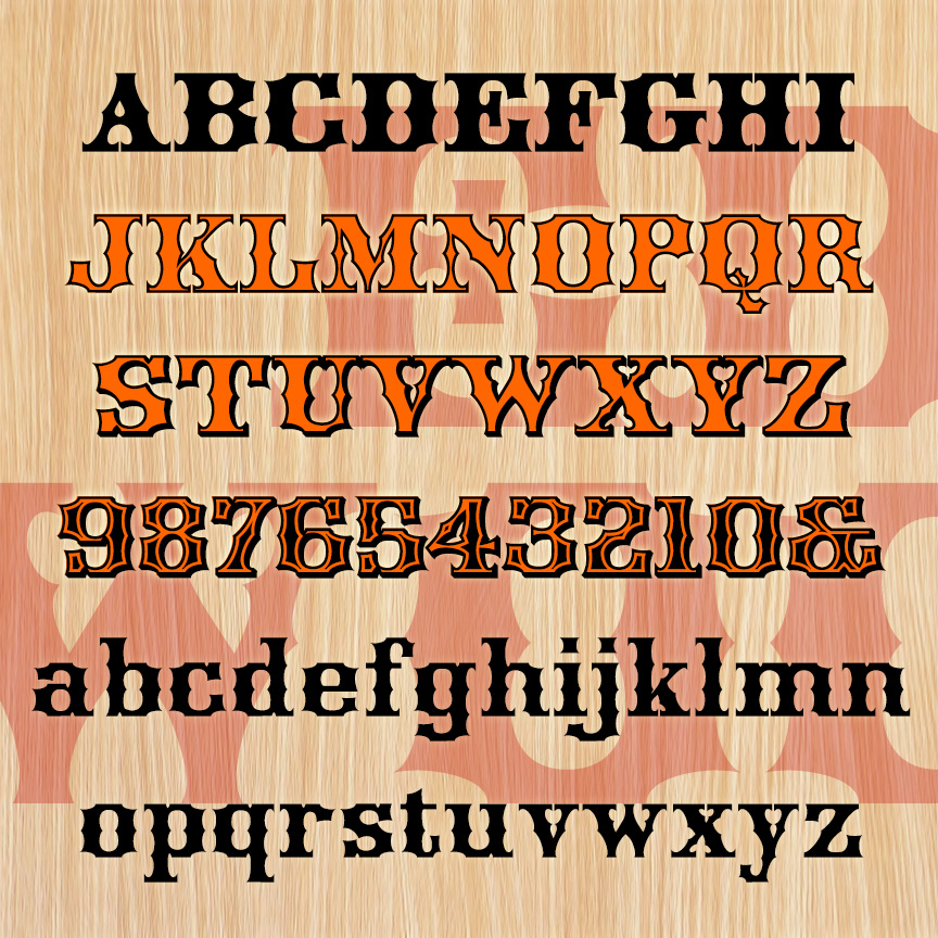
EDGEWOOD is a bold and fancy woodtype style font. It has unique concave styling and more spurs than a rodeo. EDGEWOOD was inspired by 19th-century examples with some characters revised for modern reading. The set of 4 fonts includes Regular, Outline, Shadow, and Ultra varieties (rows 1-4) that can be mixed and layered to capture the ornate design sensibility of the period, with full lowercase and character set throughout.
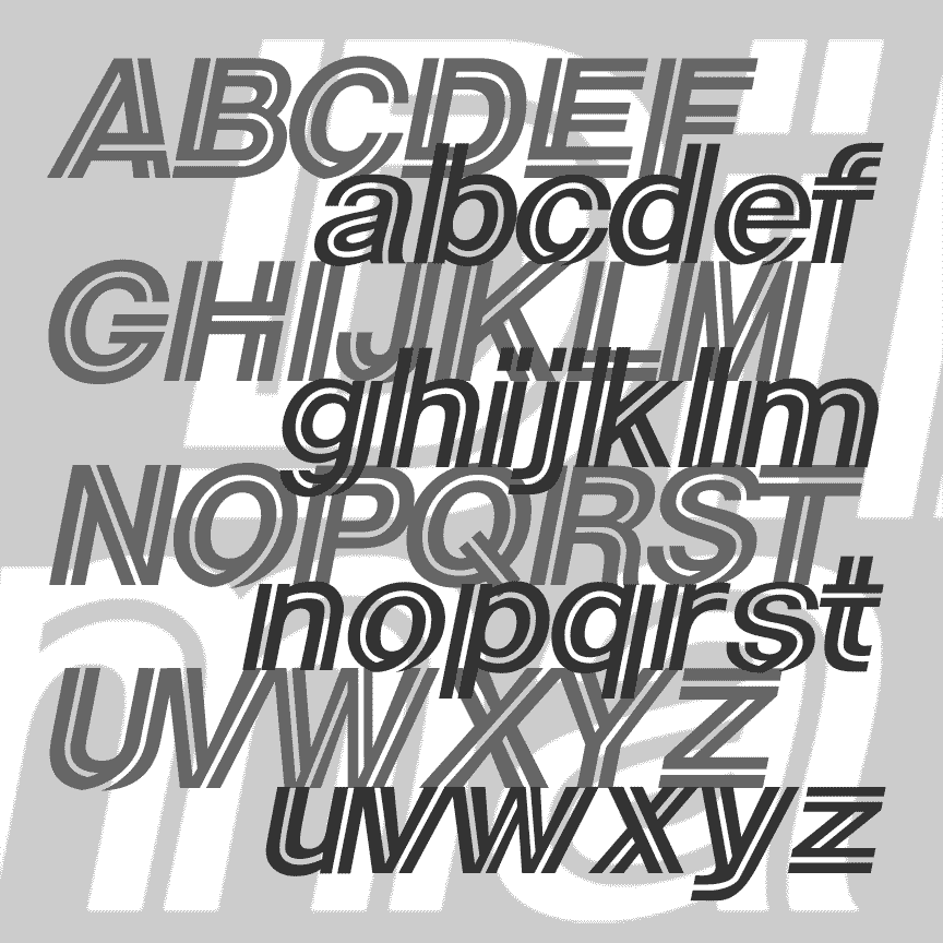
DILEMMA is a bold oblique sansserif font with a dynamic inline that twists in and around each letter. The Regular font has black letters and white lines; a pair of companion fonts each have half of each letter. Set your type in each font and layer them in different colors to get the red, white, and blue effect above. DILEMMA was inspired by Sears’ 1984–94 logo. Version 1.5 includes an expanded character set and improved spacing and kerning.