
-Premium-
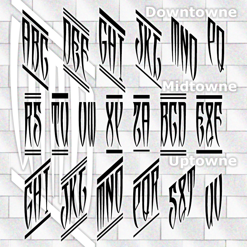

UPTOWNE, DOWNTOWNE, and MIDTOWNE MONOGRAMS are 3 fonts designed to create custom monograms in a unique narrow and spiky style. Inspired by 1940s elegance, you can choose to make 2- or 3-letter monograms along a diagonal or straight across. A choice of bars at the top can link your monogram visually.
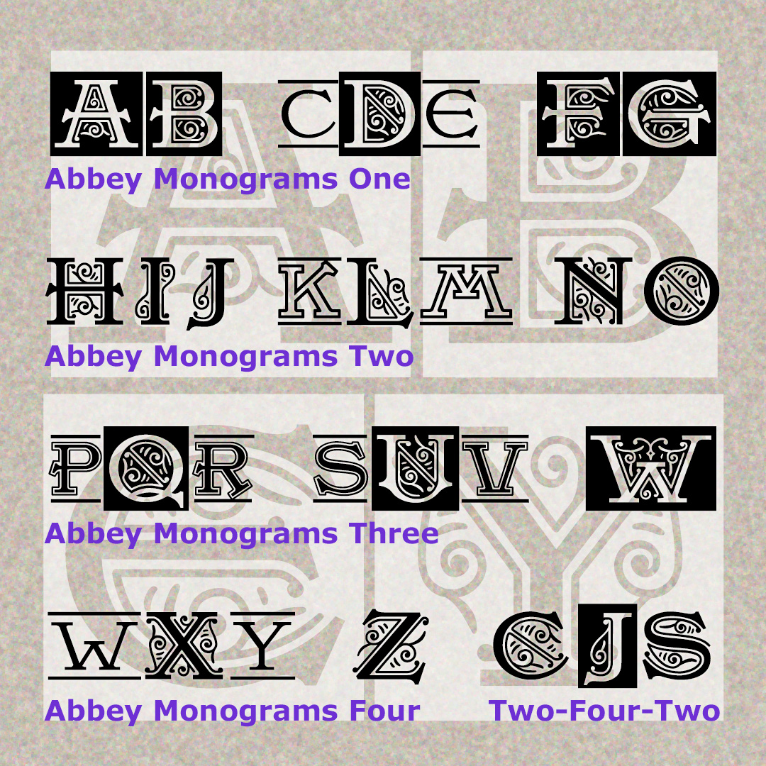
ABBEY MONOGRAMS combine stately initials with graceful decoration. Inspired by vintage typography, each letter is crisply drawn and richly detailed, perfect for display at any size in any medium. Each font includes illuminated caps in the uppercase positions and plain, inline or outline caps in the lowercase positions. And you can mix and match the fonts for more variety. Very simple to use: just type!
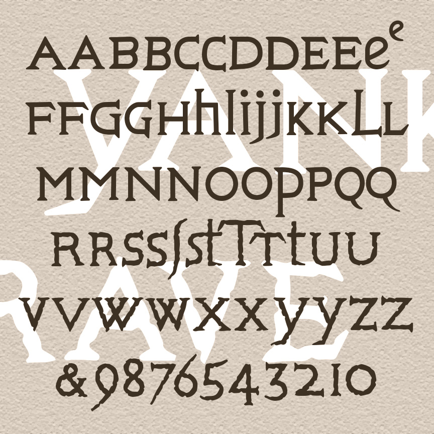
YANKEE GRAVE is rustic and quirky, with potential effects ranging from historic to horrific. YANKEE GRAVE was inspired by the engraved inscriptions on a number of gravestones in northern Connecticut, circa 1700. The carver used a mix of upper- and lowercase forms; each letter in my fonts has at least two forms as shown for a more hand-carved look. And there are other old-time goodies to give your work 300-year-old style. The Regular font has smooth outlines, the Rough has extra texture.
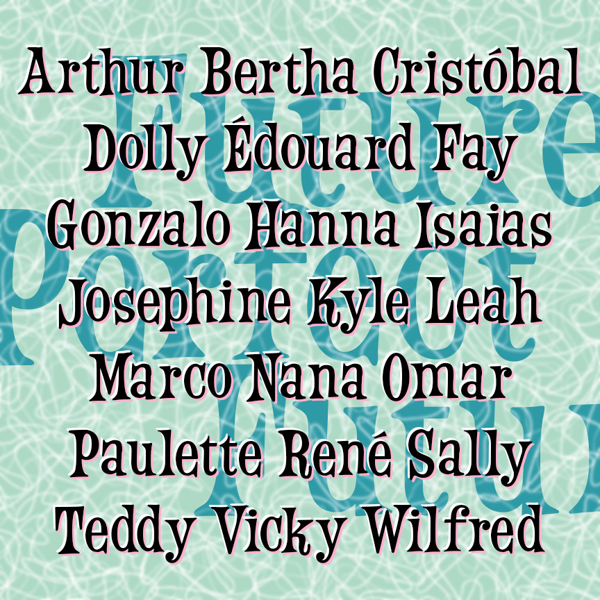
FUTURE PERFECT is a fun and bouncy font. This bit of retro futurism was inspired by an analog font reproduced in a book. I was attracted to its relatively condensed form; so many similar display fonts are limited by their width. Future Perfect is a grammatical tense, but it makes me think of time of the Space Needle and The Jetsons when the future just seemed full of big bright possibilities. The names here are the 2025 hurricanes; by 2026, we will have experienced one or more of them.
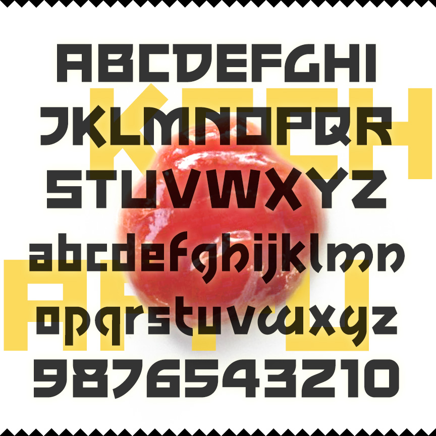
KECHAPPU is a bold font with squarish letters, monoweight strokes, and some unusual features that compare to modern Asian typographic styles. The fusion of East and West produces tasty results. For example, ketchup, that all-American food, began as a Malay (or maybe Chinese) sauce and word; kechappu is the Japanese translation. Kechappu was inspired by the print advertising for the 1959 film noir, The Crimson Kimono.
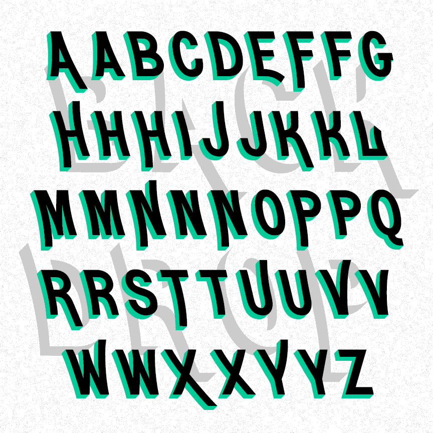
BACKDROP is a pair of fonts with dimension. The graceful caps of the Regular font lean back. The Shadow font suggests 3-dimensional letters. Use them separately or layered together in different colors or patterns. Inspired by a pair of analog fonts, Erebus and Hades, from the 1892 Central & Boston Type Catalog.
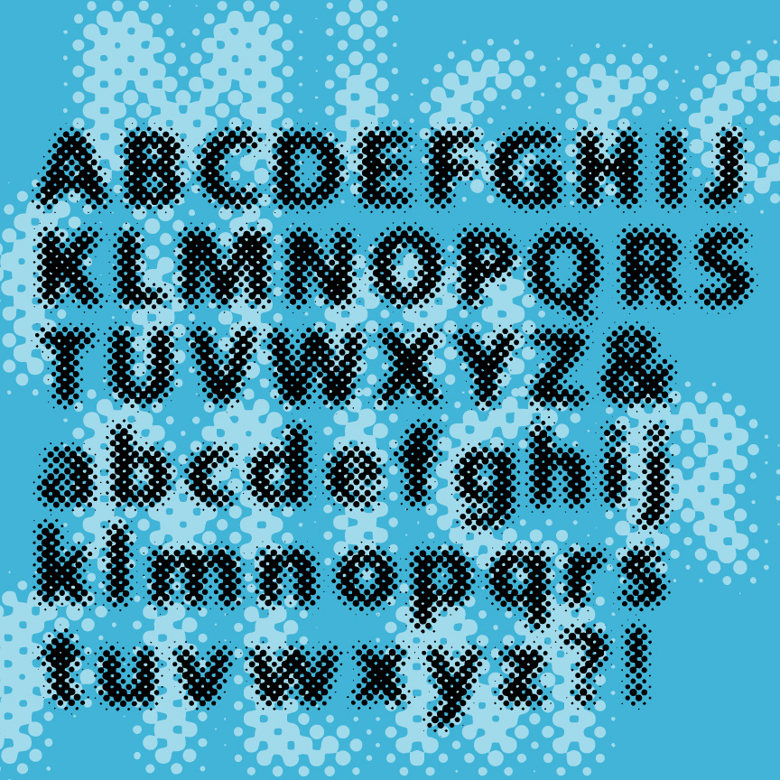
MICROFILM is a special effects font with a strong dot screen texture, a mix of past and future. It resembles a bold sans serif font that’s somewhat out of focus.
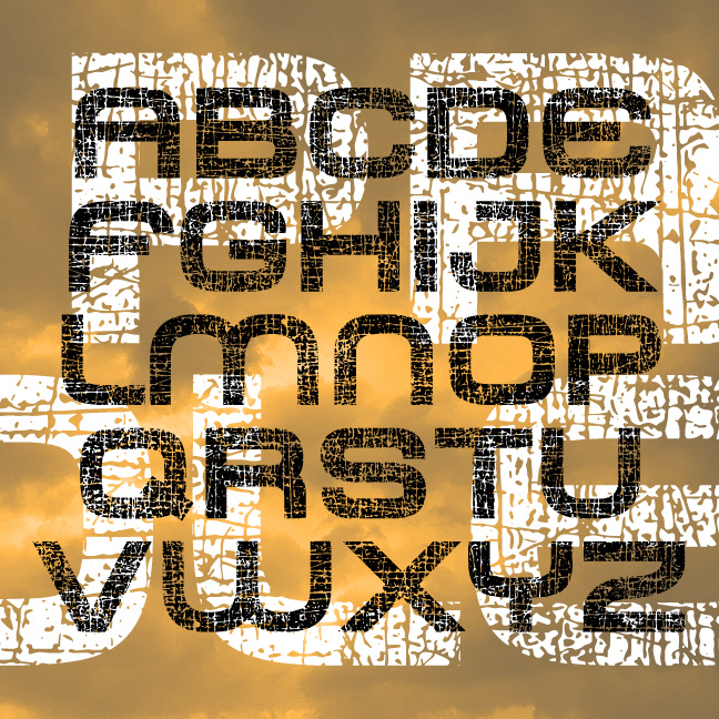
It is after the apocalypse. All that was shiny and new is scratched and broken. The future has passed. This is a world of PROLE. Sleek lines and modern shapes now bear the evidence of deterioration. What will be your message?
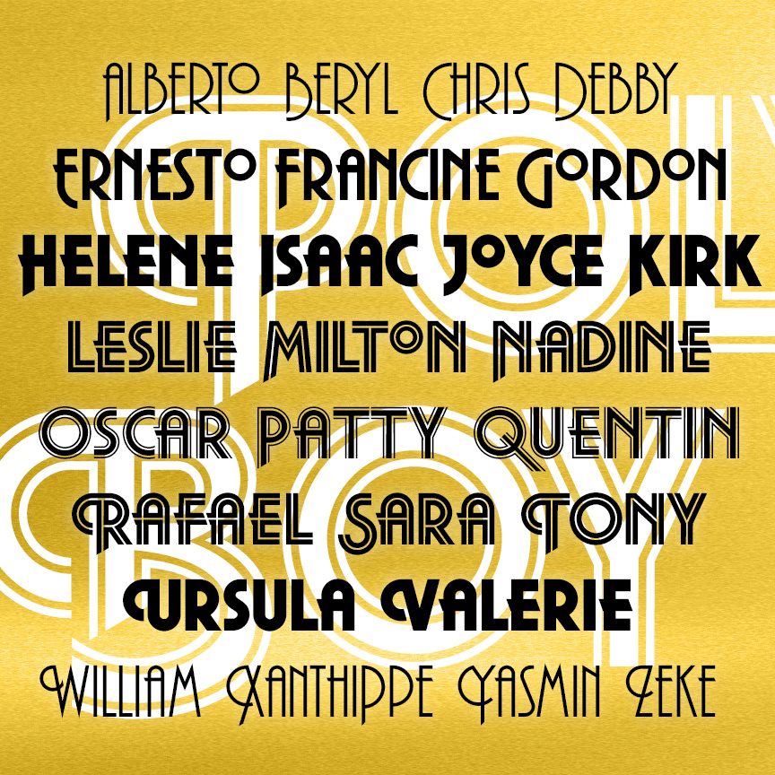
POLYBOY is a strong and stylish set of geometric fonts with roots in 1970s design. The set of 5 POLYBOY fonts includes 3 weights (Regular, Demi, and Ultra) and 2 striped variations (Inline and Double Line.) Most letters appear in 3 forms—lining caps, descending caps, and swash caps—taking your design from day to evening and beyond.
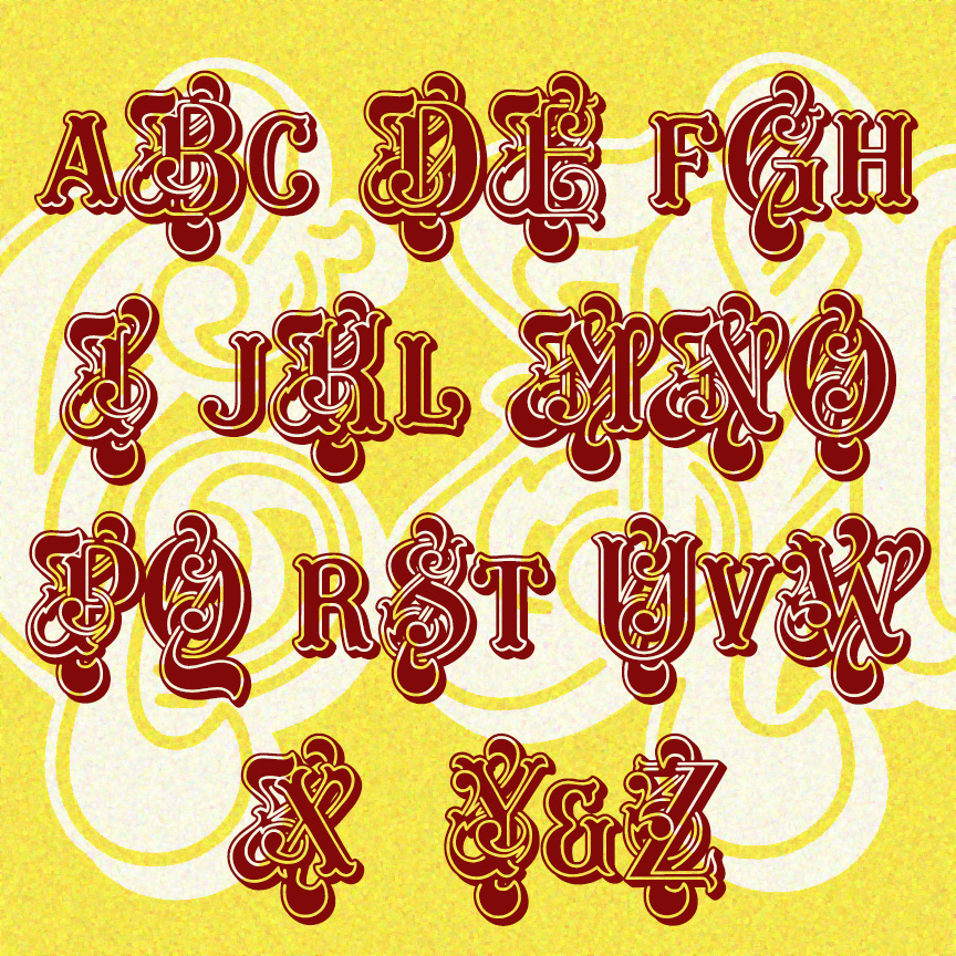
CAROUSEL MONOGRAMS may be my fanciest monogram font yet. With elaborately intertwined swashes and flourishes, a single letter can make a strong statement. The font includes large ornate letters in the A-Z positions, and smaller, less fancy letters in the a-z positions. Mix and match to suit your custom monogram needs. The letterforms were inspired by the analog font Masquerade designed in 1977 by Martin Wait (1942-2012).