
-Distressed + Rustic-


HANGOVER SQUARE is a set of 3 fonts with an early-1960s style. They were inspired by the handlettered titles of the 1964 mad-ventriloquist thriller Devil Doll, set in London as it was beginning to swing. The Regular font is a smooth sans serif with offbeat details. Hangover Square Stones has the same distinctive letterforms, with a rocky edge suggestive of horror or decay. Hangover Square Sticks is a condensed version, composed of rough vertical lines with a hand-drawn feel. Each font lends itself to all-caps or mixed-case usage.
XOXO was inspired by a shopping bag I picked up in Tlaquepaque, México. The quirky lettering and imperfect printing on plastic were irresistible. With two versions of each letter for a more random feel as you can see in “XOXO” in the image on this page. XOXO is, of course, the way you type “hugs and kisses.” But if you prefer, you can pretend it’s an exotic word and pronounce it “sho-sho.” Includes uppercase, punctuation, numbers, and international characters.
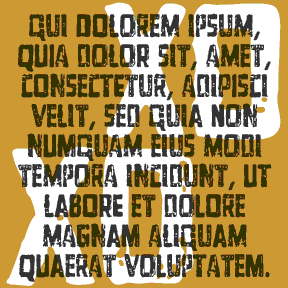
SONNET is a set of fonts with the look of early letterpress printing; the bold and beautiful letterforms contrast with the roughness of the technology and paper of the time. This would be a good alternative to the overused and ahistoric Caslon Antique. Sonnet was inspired by a facsimile of Shakespeare’s First Folio as published by Thomas Thorpe in 1609. The full series includes many typographic features of the original, including italics, swash italics, small caps, old-style figures, long s, and more. Version 2.0 makes use of Opentype features for easier use. Now the Regular font also includes the Small… continued
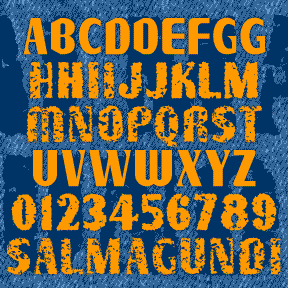
SALMAGUNDI is a quirky font, a tasty melange of various typestyles, tossed together for homemade flavor. SALMAGUNDI was inspired by the sign on the left, on the bus line between Oakland and Berkeley. After staring at it every day, intrigued by the earnest signmaker’s combination of various fonts and his own imagination, I had to get a picture of it and later expand it to a full font. The Regular is very clean. I’ve also made Chewy and Crispy varieties for those who like some texture. I should have named this after a Mexican dish, but they’d all been used… continued
RUDE GOTH began with a set of “Old English” stencils. I used a natural sponge to print them and get an authentic texture. Goth, but also for perfect for a Halloween, pirate, or rough historic feel. Includes upper and lowercase, numbers, punctuation, and international characters.
REPENT was inspired by the work of Jesse Howard (1885-1983), a folk/outsider/naive artist. I first saw his work in Self-Taught Artists of the 20th Century, published as an exhibition catalog by the Museum of American Folk Art. What is striking to me about Howard’s work is the intense effort contained in his paintings-as-rants, and the overall texture of their deliberate lettering. Howard’s work can be seen in the collection of the Kansas City (MO) Art Institute. Jesse Howard’s obsessively lettered paintings and sculptures are the cousins of these signs (left) which appear from time to time nailed to telephone poles… continued
QUINCE is a brush script with a different attitude. The basic letterforms were inspired by Murray Hill (Emil J. Klumpp, 1956). I’ve completely redrawn the letterforms with a rough “art brush” to produce an expressive, painterly line, rather than a pen line. Could be crayon, lipstick, of graffiti. More “Bratz®” than “Barbie®”. Includes upper and lowercase, numbers, punctuation, and international characters. Although Linotype says Murray Hill was named for a “small town in New Jersey”, I’m certain it was named for the Manhattan neighborhood of the same name (as was the NJ town.) To me, the original Murray Hill font… continued
GUADALUPE is based on the architectural lettering at the Basilica of Guadalupe in Mexico City. The current building was built in 1974-1976 and was designed by the architect Pedro Ramírez Vásquez. What really appealed to me, of course, was the lettering inside and out. Rustic and random, it’s very different from the usual metal letters I’d seen on buildings. Suggests early Christian texts and incorporates Greek forms: the phi-like Q, the chi-rho Rs, the cruciform Ts. For my version, I redrew the letters and added missing characters. Then I carved and printed a linoleum cut; this added a hand-crafted texture… continued

DYNAMOTOR is my hand-drawn take-off of the classic font Dynamo. Dynamotor has the texture of diagonal crayon strokes which complements the bold, active letterforms. Looks great reversed for a chalk or scratchboard look. Dynamo was designed by K. Sommer and first released in 1930. Its distinctive “fins” give it a touch of machine-age deco. Dynamo is available from many sources online; Dynamotor is NOT a Dynamo font. Includes uppercase, numbers, punctuation, and international characters. Dynamotor was inspired by this book cover, designer unknown, found on the delightful blog Awful Library Books.

PESSIMA combines elegance and corrosion. It was inspired by the opening titles of the film Invasion of the Body Snatchers (the 1978 version, my favorite, directed by Philip Kaufman, titles by Pacific Title). It appears to be a corroded, bold version of Optima*, Hermann Zapf’s classic “serifless roman” from 1958. In the film, the corrosion varies from letter to letter and cleverly suggests the biologic horror to come. This is not the original Optima* of gentle curves, but my jagged re-drawing of it. Despite the battering, the overall shapes are still somewhat recognizable. My font is more striated, less randomly… continued