
-Free-
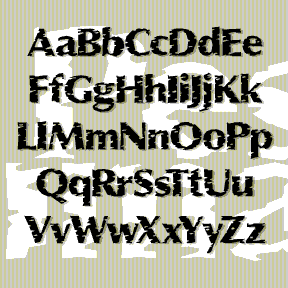

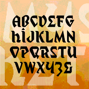
PESSIMA combines elegance and corrosion. It was inspired by the opening titles of the film Invasion of the Body Snatchers (the 1978 version, my favorite, directed by Philip Kaufman, titles by Pacific Title). It appears to be a corroded, bold version of Optima*, Hermann Zapf’s classic “serifless roman” from 1958. In the film, the corrosion varies from letter to letter and cleverly suggests the biologic horror to come. This is not the original Optima* of gentle curves, but my jagged re-drawing of it. Despite the battering, the overall shapes are still somewhat recognizable. My font is more striated, less randomly… continued
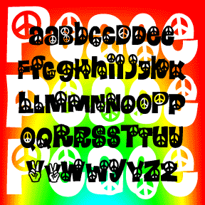
Like its predecessors Calaveras and Heartland, PEACE is a take-off on the classic 60s flower font Daisyland*. Includes 2 versions of each letter, plus numbers, punctuation, and international characters. Inspired by Albany’s 15 minutes of fame; read about it at thesmokinggun.com. *The Daisyland font appears under that name in the Dan X. Solo font books from Dover. There is a nice shareware version called FLORALIES by Keith Field and a free but bumpy adaptation (called Daisyland and uncredited) in FontPak1.zip. (Thanks to Frogii for the information!)
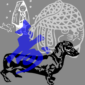
These are derived from a pattern sheet provided with a set of Japanese wood-carving tools. The only thing I could read on the page: ’82 New Year. There are 22 charming graphics, including a few nice dogs, some handsome calligraphy, and some cute cartoony stuff. Julie tells me the blue character at left means “long life”; any help with the others?
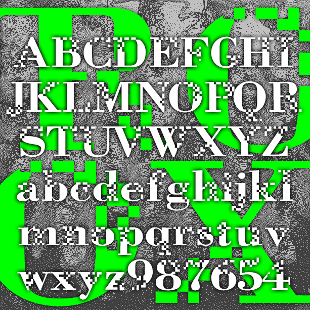
NEUROTOXIN is designed to look like the letters are breaking up or forming from pixels. It was inspired by the Xerox Corporation’s former X logo, designed in 1994 by Landor Associates. The basic letterforms are modeled after a bold Didone-type font. Pairs with a nice Bodoni or even Times Roman. Version 2.0 includes an expanded character set with lowercase and improved spacing and kerning.
Exotic, “Egyptian” MYSTIC PROPHET is my third font inspired by Ouija boards, or, strictly speaking, talking boards. (This one is from another company, Haskelite, from the 1940s.) My friend Wink first brought it to my attention. The planchette (the divining tool) is shown here; you can find much more information at the Museum of Talking Boards. My other talking board fonts are Captain Howdy and Sideshow. Includes caps, numbers, punctuation, and international characters. Planchette image courtesy of the Museum of Talking Boards.
MEAN 26 was inspired by Alphabet 26, Bradbury Thompson’s famous 1950 proposal for redesigning the alphabet. The idea was that there would be just one case, favoring the uppercase forms except for a, e, m and n, totaling 26. There would be a large and small version of each to use as capitals. Thompson used the distinctive Baskerville for his prototype, and Alphabet 26 owes it much of its beauty to that choice. For my fonts, I’ve retooled public-domain versions of 3 popular text fonts and adjusted the weights in an attempt to balance the big and little letters. Avoid… continued
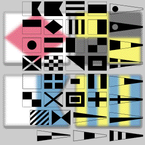
The MARITIME FLAGS fonts are based on the international flag code. Each flag represents a letter or number. These would be flown on board a vessel, not printed. However, the monochrome font can be used to add a decorative or nautical motif. The set includes the single-color font as shown in black on this page; plus separate red, yellow, blue and black fonts. It’s not possible to make a real color TrueType or OpenType font. But you can fake it by layering separate fonts! In a program that allows layering, type your text, then change it to the Black flag… continued
MADFONT was one inspired by the great MAD magazine logo, the older, un-italicized one of course. It was one of my first fonts, released back in 1998, the work of a fan who grew up reading MAD and loving its parodies and graphics. MADFONT was retired but now it’s come back and brought two friends: Bars and Thorns. The two previously unreleased fonts are standard wood type variations that increase the value of this cheerful, circus, Wild West design. Each font includes caps, numbers, punctuation and international characters. Check out this fun furniture commercial. It’s worth watching all the way… continued
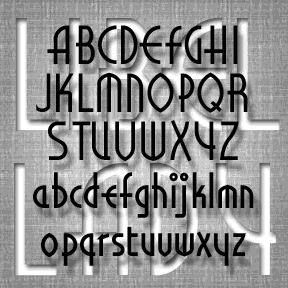
LIBELED LADY was inspired by the hand-lettered titles of the film of the same name (1936). It’s an enjoyable romantic comedy directed by Jack Connolly and starring Jean Harlow, William Powell, Myrna Loy, and Spencer Tracy, art directed by Cedric Gibbons , William A. Horning, and Edwin B. Willis. The opening titles are a fine example of Art Deco lettering, appropriate to the style and tone of the film. Somewhat regularized and fleshed out, the font remains faithful to the original. Dan X. Solo laments the scarcity of period Art Deco fonts; consider this a reconstruction of one that never… continued
Rudolf Koch designed these nature-inspired images to coordinate with his rough-hewn classic Neuland. I’ve recreated them as a companion to my BRIDE OF THE MONSTER fonts. I’ve included all the available images, flipped and rotated some for easy use, and the original German accented characters–Ä, Ö, Ü–styled to match the “Bride” varieties.