
-Free-
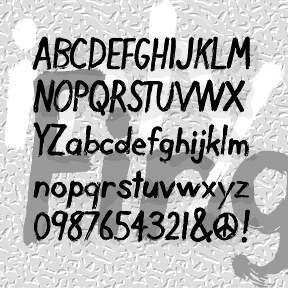

DIRTY FINGER is a deceptively simple font, based on my own hand printing. It was begun by inking a Plexiglas plate, then drawing the letters backwards into the ink with my finger and a rag, the same way I draw my monoprints. Then I scanned, reversed, and flipped it to make what you see here.
COMET was inspired by the (former) logo of Country Music Television. Clicking past this cable channel, I was attracted to its logo and set out to make a font that would allow you to type anything with that back-and-forth-within-blocks look. There are really two fonts: Negative with white letters, and Positive with black letters, each with black outlines. In both fonts the uppercase letters are turned to the left, and the lowercase to the right, So YoU hAvE tO tYpE lIkE tHiS tO gEt tHe RiGhT eFeEcT. The fonts can be used separately, or layered together. Now includes numbers and… continued
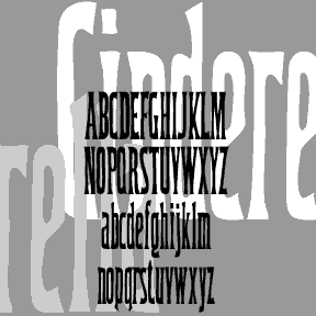
CINDERELLA was inspired by a font in one of the great Dan X. Solo 100 font books. The lowercase g first caught my eye; it’s ultra-condensed which can be very useful. The font has been retired for a number of years now. I had reason to use it recently and thought it was time to dust it off and round it out. Includes upper and lowercase, numbers, punctuation, and international characters.
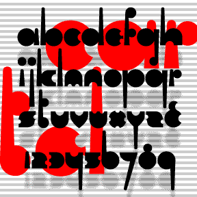
CARTEL was inspired by the logo of OPEC, Organization of the Petroleum Exporting Countries. Rigorously geometric to the point of near illegibility, Cartel could add an exotic touch in a futuristic or retro context. Includes lowercase (including long and short ascenders and descenders), numbers, punctuation, and international characters.
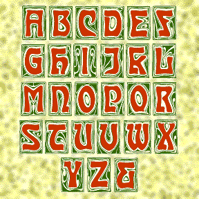
CARMEN CAPS is my digital interpretation of an Art Nouveau font of the same name, as illustrated in the Dan X. Solo books. The swirly backgrounds have great detail; use big as drop caps!
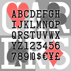
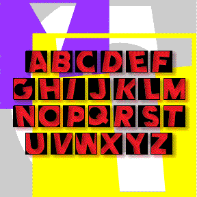
CARD CHARACTERS, as the name suggests, was derived from the characters on standard Bicycle playing cards. Starting with the K, Q, J, A and numbers 1-10, I completed the set, maintaining the somewhat clunky monospace slab-serif look of the original. Includes uppercase, numbers, punctuation, international characters, a 1-stroke 10, and the four card suit symbols. And because Mark Taylor suggested it, there’s a second font with half-width numbers, so you can compose numbers 11-99 to match the letters.
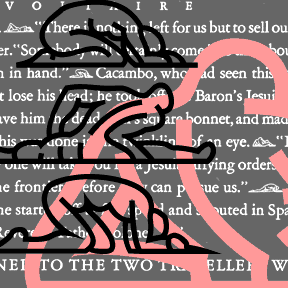
So Voltaire wrote this book called Candide. The beautiful 1928 edition was illustrated by the artist Rockwell Kent. Beside full page drawings and decorative drop caps, there were eleven tiny dingbats used, instead of indenting, to separate paragraphs. Each is a posing figure. Although my drawings are very clean, don’t use them too big; they’re best as small details. Two weights contained in one font.
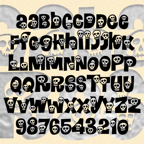
CALAVERAS is a take-off of the classic 1960s flower font Daisyland. In redrawing the letters, I’ve kept the basic shapes, added more variants, and swapped out the flowers for cartoon skulls to create a mix of happy and spooky. A memento mori font: great for Halloween, Día de los Muertos, or any time. Version 1.5 features an expanded character set. *The Daisyland font appears under that name in the Dan X. Solo font books from Dover. There is a nice shareware version called FLORALIES by Keith Field and a free but bumpy adaptation (called Daisyland and uncredited) in FontPak1.zip. (Thanks… continued
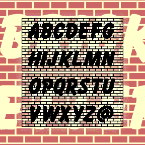
BRICKLETTER was inspired by Jeff Levine’s interlocking all-brick font “Off the Wall.” I took the brick idea that and added letters based on Max Kaufmann’s classic font Balloon. Each letter fits with the next to create a brick wall emblazoned with bold graffiti. The brackets and underscore can be used to create square ends and bricked space. Parodied on Something Awful as “Bricks of Failure…What could make a font read better than putting a bunch of bricks behind it? Absolutely nothing! It’s perfect!” This font contains caps, numbers, punctuation, and international characters.
BEND IT is a my fourth and final take-off on the classic 60s flower font Daisyland*. The others are Calaveras, Heartland, and Peace. One of my font correspondents (Nancy, the soccer mom) suggested this and it was a nice diversion. Parodied on Something Awful as “Clipart Clutter…An excellent choice for the proud mom with more free time than things to say.” Includes 2 versions of each letter, plus numbers, punctuation, and international characters. And a few extra balls in the { } | [ ] \ ^ positions. *The Daisyland font appears under that name in the Dan X. Solo… continued