-Free-

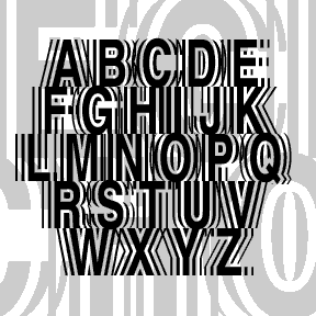
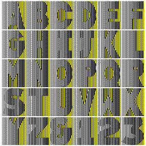
KING XMAS is a versal, or Lombardic, alphabet inspired by a small sample in a 1930s Speedball book. The current version combines two fonts in one: solid in the uppercase positions, white-starred letters (like the words above) at the lowercase position. It pairs nicely with a bold blackletter font like Fette Fraktur. Now with Arabic numbers in v2.5.
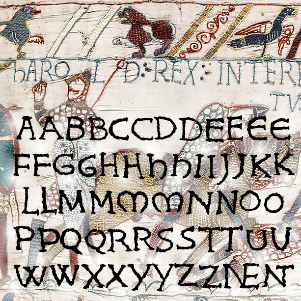
KING HAROLD looks like hand-embroidered lettering and was inspired by the Bayeux Tapestry. To get it just right, I drew, embroidered, and scanned all the characters. Version 1.5 makes use of Opentype features for alternate letterforms and ligatures, an expanded character set and improved spacing and kerning. The Bayeux Tapestry was made c.1073-83 and records King Harold’s adventures and loss at the Battle of Hastings to William the Conqueror, with a special appearance by Halley’s Comet. It measures 230 feet long (69 meters) and is one of the great examples of Romanesque art.

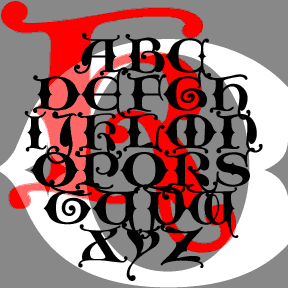
HARLEQUIN was inspired by this poster from the 1953 film Kiss Me Kate (detail at left). It has a jolly jester’s hat feel and also resembles turned wooden spindles. Includes caps, numbers, punctuation, and international characters. As seen in use in these “personalized totes for the eco-check girl,” from Label Me Lisa.
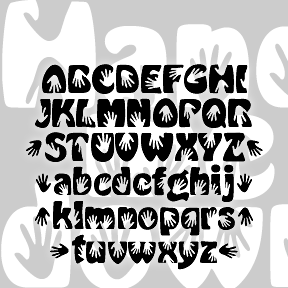
A fun little font with a second-hand history. The basic idea came from my recollection of a rough sketch.* The handprints are combined with a knockoff version of Morris Fuller Benton’s classic Hobo font. Besides the hands, it differs from regular Hobo in that it is much bolder and has descending lowercase letters. Includes caps, lowercase, numbers, punctuation, ligatures, international characters, and several pairs of black handprints. *A proposal for a “hands on” event, the sketch came from a brainstorming session of the “Young Turks Committee” at The Arts Center of the Capital Region, which included Lisa Roche, Donna Brunig,… continued
GOOD VIBES is my digital version of the Letraset font “Good Vibrations” designed by Trevor Hatchett and released in 1973. Janet Wilson, one of my dear font correspondents, sent me a scan of an unused sheet of the Letraset original. In redrawing the font, I’ve maintained the same number of lines per character and the uniform width of the Hatchett design. Not entirely successful here–the gradient stripes can turn to strobing, dithering detail onscreen. It’s much better used BIG in print (>60 pt.) With rub-down Letraset you would have been able to choose to use parts of letters; I haven’t… continued
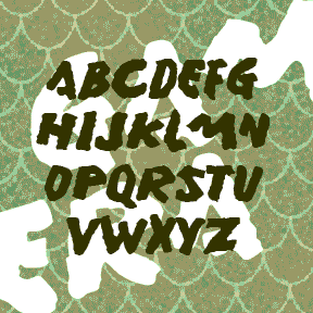
GAMERA was inspired by the hand-lettered titles of the English-language version of certain Gamera films. The font is emphatic and primitive with a rough organic edge, rather like its giant mutated namesake. Gamera was Daiei Studio’s answer to Toho Studio’s Godzilla. At the start of the series, the giant mutated turtle was a grave threat, but then became “friend to all children.” To me, all these such monster movies are just awful, but with the MST3K treatment they become good for a few laughs. Of course the atrocious dubbing and other attempts to sell the films in the West may… continued
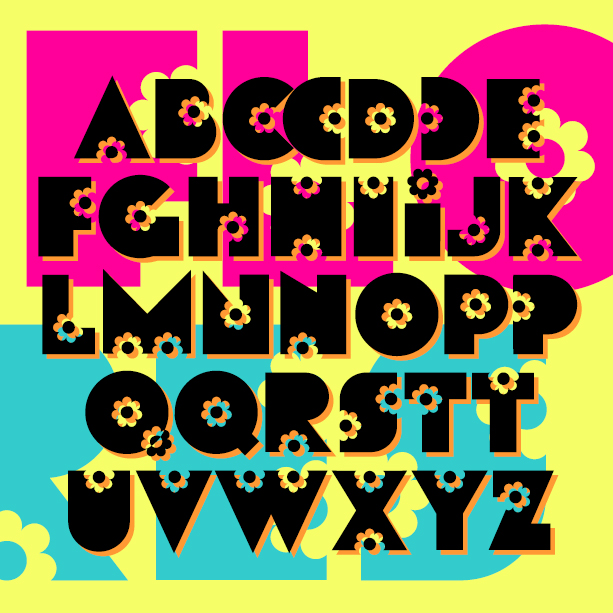
FLORES is my digital creation of a “flower power” style font from the late 60s or early 70s. I started this in 2001, inspired by a florist’s sign in Valencia, Spain. I had only the letters F L O R E S and made up the rest; later I was given examples FLEURDON and SACHET DISCRET and expanded the font accordingly. But I still have not tracked down the original font or its name. Version 1.5 has an expanded character set and improved spacing and kerning.
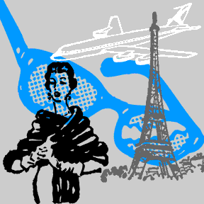
Like my Rebus Font, these images were culled from the parts of a long lost game. 15 stylish images ranging from the gag prize broken eyeglasses to the grand prize trip to Paris. Not recommended for commercial use as the owner of the images, if any, is unknown.
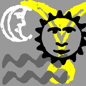
These 16 mysterious dingbats were culled from a small text called Ecce Orienti or Rites and Ceremonies of the Essenes. Published in 1894, this appears to be a ritual manual of a defunct, quasi-Masonic order. The symbols were integrated in the heavily contracted text to make it nearly unreadable to an outsider.