
-Movie-Inspired-
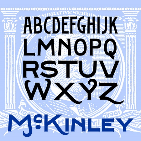

McKinley is a series of fonts with the bold but graceful style of hand-painted signs, inspired by the titles of several early silent films, including The Great Train Robbery, The Kleptomaniac, and others directed by Edwin S. Porter for Edison Studios. Available in Narrow, Regular, and Wide, with a separate Swash Caps font.
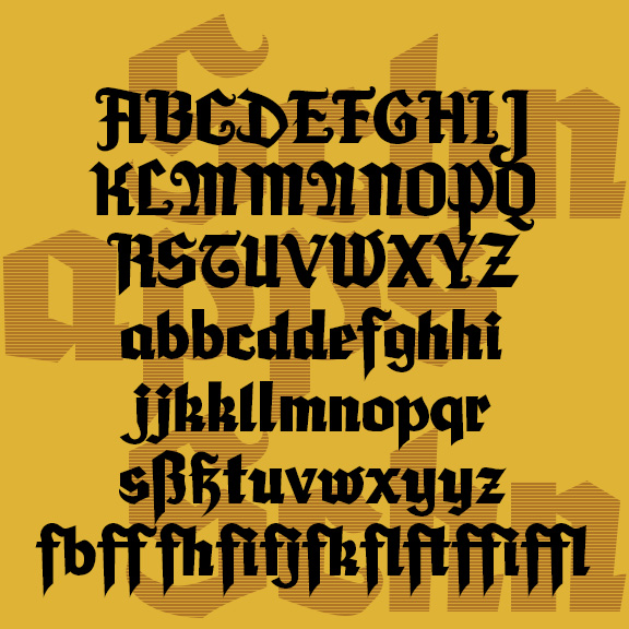
SCHNAPPS is a lively calligraphic font that captures a jolly German character. Could be used to suggest Oktoberfest, Christmas, or Old World tradition. Bolder and more legible than many blackletter fonts. SCHNAPPS was inspired by the hand-lettered titles of Carol Reed’s 1940 film “Night Train to Munich,” art directed by Alex Vetchinsky. Version 1.5 includes an expanded character set, improved spacing and kerning.
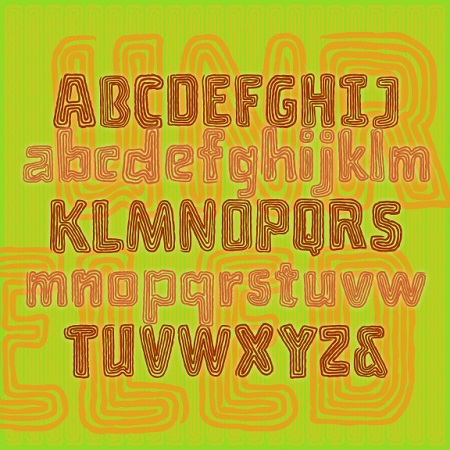
Unraveled is a fun font that looks like a craft project made with yarn or string. Each letter is a single fuzzy line wound round and round. Perfect for color and layering. Unraveled was inspired by the hand-lettered titles of Roger Corman’s 1959 horror comedy “A Bucket of Blood”, art directed by Daniel Haller. The film is set in a world of Beatnik artists and poets in San Francisco and is ripe for adaptation as a musical à la “Little Shop of Horrors.”
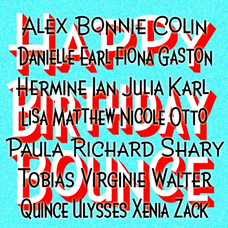
BIRTHDAY is a bright and lively sans serif available in three widths. Version 2.0 now includes upper- and lowercase as well as separate small caps fonts. BIRTHDAY was inspired by the hand-lettered titles of the film “The Band Wagon” (1953), directed by Vincente Minnelli, art directed by Preston Ames and Cedric Gibbons.

The Gilded Age is a set of ornate fonts with decorative details reminiscent of that period, the late 19th century in the US. Tricked out with “mustachio” serifs, spurs, and inlines, the Gilded Age captures the flashy ornamentation the name suggests. The set includes upper- and lowercase, with and without the engraved lines, and a large and small caps version including extra fancy large caps. Gilded Age was inspired by the titles of the film “Casque d’Or” (1952, directed by Jacques Becker). The film is set in La Belle Époque, the French equivalent of the Gilded Age.
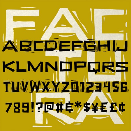
Factura is a set of fonts that looks hand-carved. The letters are drawn almost entirely with straight lines, with offbeat shapes and jagged edges that can seem alternately playful or sinister. Inspired by Saul Bass’s classic poster for “Vertigo,” Factura has two widths and full upper- and lowercase. The “Rough” version of each font reproduces the block print technique I used in the design process.
AFFICHE is a set of fonts that resemble hand-painted signs, somewhat casual but with a distinctive and professional style. The direct inspiration for AFFICHE is the hand-lettered titles of François Truffaut’s classic 1959 New Wave film “Les Quatre Cents Coups” (The 400 Blows). I love the squarish shape of the Q and O and the slight incline. There is no lower case; use small caps as they did in the film. These fonts contain an extended character set to accommodate most all the languages of Europe that use the Latin, Greek and Cyrillic alphabets. Available in Regular, Light and 3-D.

HANGOVER SQUARE is a set of 3 fonts with an early-1960s style. They were inspired by the handlettered titles of the 1964 mad-ventriloquist thriller Devil Doll, set in London as it was beginning to swing. The Regular font is a smooth sans serif with offbeat details. Hangover Square Stones has the same distinctive letterforms, with a rocky edge suggestive of horror or decay. Hangover Square Sticks is a condensed version, composed of rough vertical lines with a hand-drawn feel. Each font lends itself to all-caps or mixed-case usage.
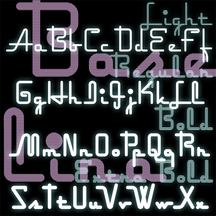
Baselina is a stylish, squarish font that hugs the baseline, suggestive of Art Deco and neon signs. In four weights: Light, Regular, Bold and Extra Bold. Inspired by the hand-lettered titles of the Fleischer brothers’ animated film “Mr. Bug Goes to Town” (1941)
ROYAL WEDDING is set of 4 fonts that let you create custom 3-letter monograms in an elegant, somewhat Versal style with a choice of decorative frames. The set includes Solid, Inline, Outline and Engraved variations which can be mixed for even more variety. The design was inspired in part by the trailer for the 1951 film Royal Wedding.