
-Movie-Inspired-
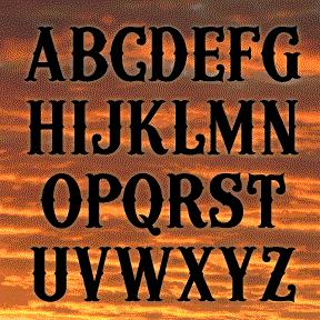

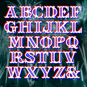
WOODWIND was inspired by the opening titles of the classic 1939 film Gone With The Wind, directed by Victor Fleming, production designed by William Cameron Menzies, art direction by Lyle R. Wheeler. As you can see from the frame at left, the title appears on screen very large, a word at a time, blowing from right to left. WOODWIND is an ornate 19th-century style font that can suggest the Old South as well as Western Saloon or Circus Wagon. For flexible use, I’ve created a Regular font plus West and East “moving” fonts. Includes caps, lowercase, numbers, punctuation and international… continued
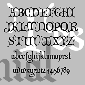
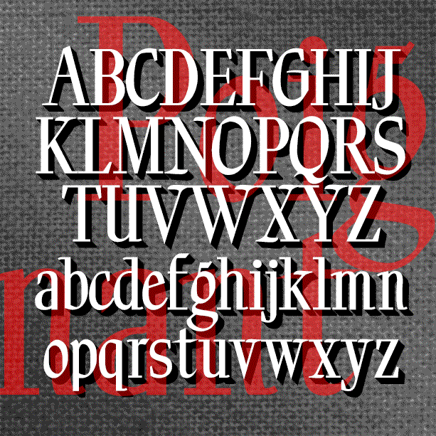
Formerly called “Christmas Card,” TESTIMONIAL was inspired by the hand-lettered titles of the classic holiday film It’s a Wonderful Life (1946, directed by Frank Capra, art direction by Jack Okey.) The caps are in a decorative versal style, the lowercase a more traditional blackletter. Pair it with Director’s Script for the total look of the original. This font retired a while ago but, at Jordi’s prompting, it’s back with a more complete character set including Arabic numbers. (The Roman numerals have been moved; please see the Read Me file.) Includes caps, lower case, numbers, punctuation, and international characters.
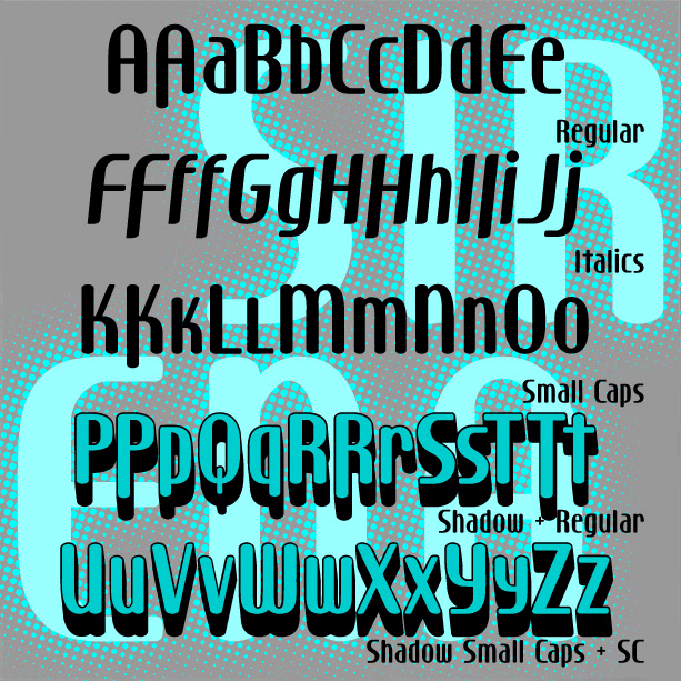
Sleek and stylish with modern curves, SIRENA was inspired by the hand-lettered opening titles of the film I Married a Witch (1942, art directed by Hans Dreier and Ernst Fegté, starring iconic screen siren Veronica Lake. I’ve expanded the font to include lowercase and created Small Caps and 3-D Shadow versions. And now there’s a companion Italic version! Version 1.5 includes an expanded character set including alternate letterforms as shown.
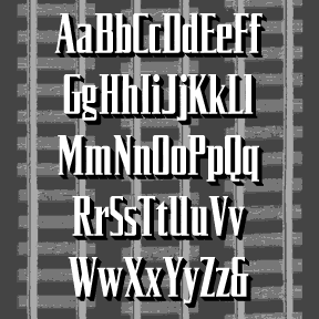
The SILVERLINER fonts were inspired by the opening titles of (and trailer for) Strangers on a Train, a 1951 Warner Bros film directed by Alfred Hitchcock, art directed by Ted Haworth. The fonts–Regular, Oblique, Wide and Wide Oblique–suggest the sleek style of rail travel of the period. Each font includes upper and lower case, numbers, punctuation, and international characters.
SEAFARE is a jolly 19th-century style font. It’s bold and decorative with a hint of sea waves was inspired by the hand-lettered titles of Alfred Hitchcock’s 1949 costume drama Under Capricorn, art directed by Thomas N. Morahan. Available in solid, outline and beaded varieties which can be layered as in the image on this page. Includes caps, numbers, punctuation and international characters After creating the font, I found these examples of a similar but sloped font in Rob Roy Kelly’s “American Wood Type 1828-1900.” You could create this effect with Seafare, if desired.
The Retrospace font was inspired by the hand-lettered opening credits of the film Some Came Running (1958). The Long, Hot Summer (another 20th Century Fox production from 1958) has similar credits; the films do not share directors or art directors. Font includes large and small caps, numbers, punctuation, and international characters.
The REBECCA font was inspired by the distinctive and stylish handwriting of the title character of the classic film. Rebecca (1940) was based on the novel by Daphne du Maurier and directed by Alfred Hitchcock. The title character is dead and not even a portrait of her is ever seen. Her handwriting appears several times in the film and is perhaps the thing that most personalizes her. Her large initial R appears embroidered on a number of her possessions, including the pillow in flames at left. Rebecca’s signature, address book, and correspondence all appear in closeups as evidence of her… continued
The five PROJECT fonts were inspired by the hand-lettered titles of the film Project Moon Base (1953). Tucker brought them to my attention with a couple of very clean stills. I only knew the film from a grainy tape of when they lampooned it on Mystery Science Theater 3000. It’s my favorite kind of scifi: laughably dated, fake, and earnest. (Also used in Crash of Moons.) I’ve made a set of five fonts–Light, Medium, Bold, Bold Inline, and 3000 (the 3-D style)–for a variety of uses. Out of the Moon Base context, it can have a very diferent feel, almost… continued
POIGNANT is an elegant titling font that combines aspect of a “modern” or Didone font with calligraphic flourishes. Available in roman and italic. Poignant was inspired by the hand-lettered titles of certain Twentieth Century dramatic films, including All About Eve (1950), Gentleman’s Agreement (1947), and Niagara (1953), all art-directed by Lyle Wheeler, perhaps a clue to the original hand. Version 1.5 features an expanded character set and improved spacing and kerning.
VICARAGE, RECTORY and PARSONAGE are separate but related decorative fonts, each with a romantic, historical feel and inspired by hand-lettered film titles. Each could also be used to suggest Olde Worlde gentility, holiday festivity, or spirituality. Each font is all caps with many alternate forms for more variety and looks great as LARGE and SMALL CAPS. VICARAGE, the boldest of the three, was inspired by the trailer of the film The Private Lives of Elizabeth and Essex (1939), art directed by Anton Grot. RECTORY, suggestive of pen calligraphy, was inspired by the opening credits of Going My Way (1944), art… continued