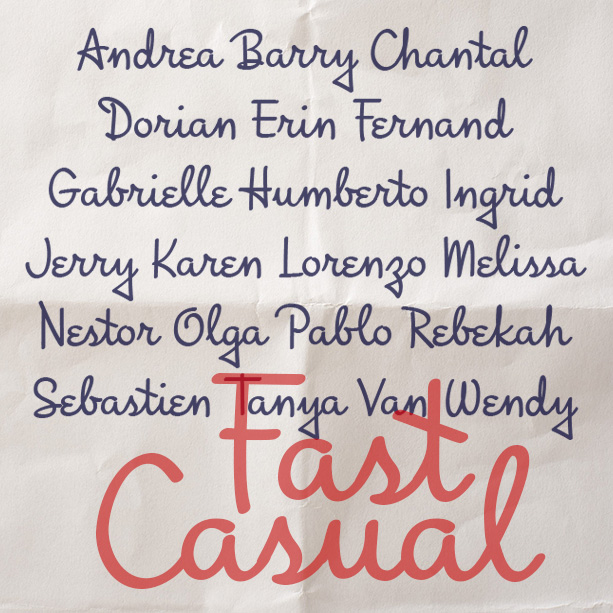
Fast Casual looks like the cursive handwriting of a smart and creative individual who takes pride in their writing, but they also include many quirky touches to show their personality.
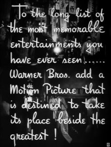
Fast Casual was inspired by the hand-lettered titles of the trailer of the classic 1940 Bette Davis film “The Letter”. I’ve kept many of the quirks—the triangular descenders, the epsilon e’s, the diagonal crossbars—while modernizing and harmonizing it altogether.


