
-Retro-
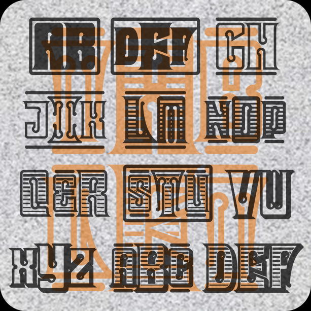

Tablet Monograms have a bold and commanding look. Inspired by the kinds of lettering often found on old stock certificates and bank notes, Tablet Monogram come in 6 varieties including Solid, Outline, Shaded, and Shadow. It’s easy to type your own custom monogram using any combination of large and small initials and a choice of decorative elements.
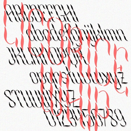
Licorice Whip was inspired by an example from a 1920 book: “A most novel alphabet by Mr. G. E. Gustafson, Penman, Inter-State Commercial College, Reading, Pa.” It was once important for a professional to use the pen well, the visual equivalent of elocution. The neat thin-thick strokes show good control of the pen; along with the gaps, a shimmering effect is created, or perhaps the look of twisted ribbon. A full-alphabet companion to Cascade Monograms.
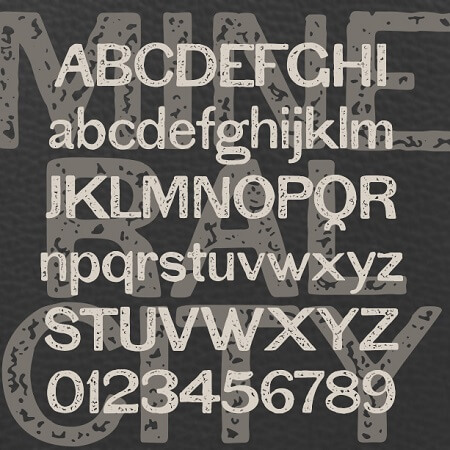
Mineral City was inspired by an example of 19th-century sans serif typography. Around that time, type designers took a cue from sign painters, omitting the finicky serifs and making the strokes more uniform. These early sans serifs fonts were categorized as “grotesques” or “gothics” and this is a particularly awkward one. (Later these would be refined into fonts like Franklin Gothic, and then neo-grotesques like Helvetica.) I’ve added more texture to give it the rustic flavor of crude printing, rough paper, worn surfaces, or even a hand-panted sign.
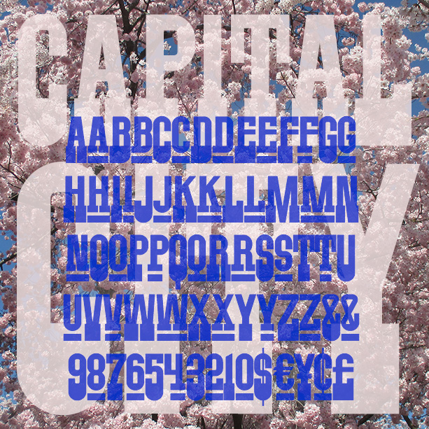

CAPITAL CITY is a bold font with an all-American spirit. Inspired by a poster from the 1960s or 70s, Capital City has heavy slab serifs at the bottom but is sans-serif at the top. With superscript small caps in the lowercase positions. Using the stylistic alternates feature of Opentype, you can also access superscript numbers and currency symbols. Version 1.1 has an expanded character set.
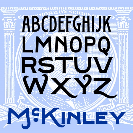
McKinley is a series of fonts with the bold but graceful style of hand-painted signs, inspired by the titles of several early silent films, including The Great Train Robbery, The Kleptomaniac, and others directed by Edwin S. Porter for Edison Studios. Available in Narrow, Regular, and Wide, with a separate Swash Caps font.
Bootstrap has a rough-hewn Western feel, like letters were made by an old-time blacksmith. The letterforms are bold and simple, with spurs and a rough texture. Bootstrap’s roots are in my Tapeworm font, reimagined for a new old look.
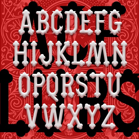
ACE OF CLUBS is a decorative display font with its roots in the 19th century. The unique trefoil or club-shaped terminals give it a certain jolliness, inspired by the former “lollipop” logo of the A&P supermarket chain. Starting with just 2 letters, I expanded it into a complete font with upper- and lowercase, numbers, punctuation, and the rest.

The Gilded Age is a set of ornate fonts with decorative details reminiscent of that period, the late 19th century in the US. Tricked out with “mustachio” serifs, spurs, and inlines, the Gilded Age captures the flashy ornamentation the name suggests. The set includes upper- and lowercase, with and without the engraved lines, and a large and small caps version including extra fancy large caps. Gilded Age was inspired by the titles of the film “Casque d’Or” (1952, directed by Jacques Becker). The film is set in La Belle Époque, the French equivalent of the Gilded Age.

The ALBANITA fonts were inspired by the city of Albany, New York, my hometown for over 30 years. Albany has a distinctive look and character that has often influenced my work, and that I’ve deliberately tried to capture here, if not literally. There are no “Egg” shaped letters, no Dutch-style peaks, no bricks. Albany includes many remarkable historic buildings, including the State Capitol and City Hall, repurposed railroad and industrial buildings, rows of brownstones and tree-lined streets, and an overall design that encompasses 4 centuries. Albany’s skyline is symbolized by the once-futuristic Empire State Plaza. Often the contrast between old… continued
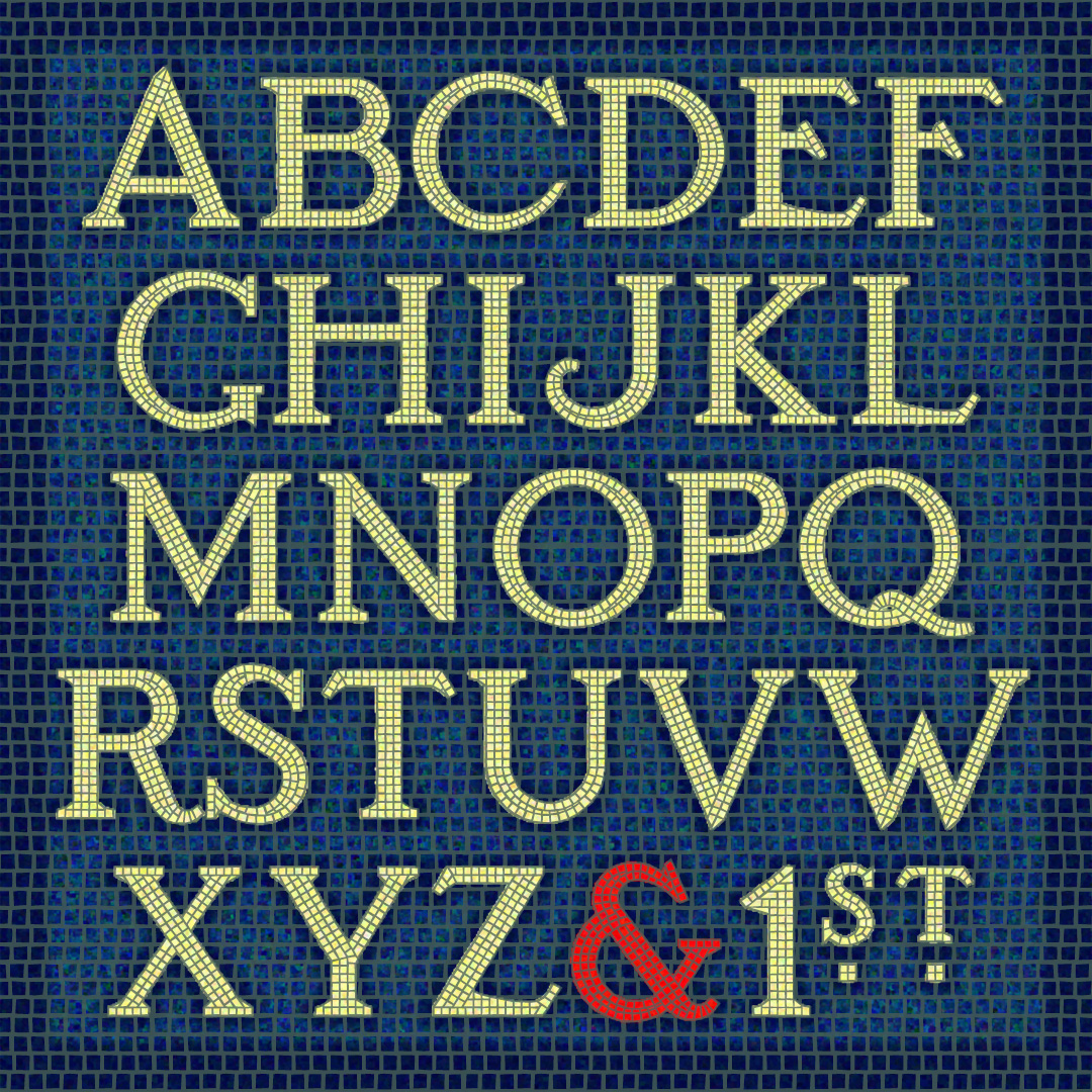
The SUBWAY MOSAIC fonts were inspired by the classic mosaic tile signs of the New York City subway system, dating to the early 20th century. I’ve tried to maintain the somewhat quaint letterforms while regularizing them for contemporary use. There are 3 fonts (White, Black and Solid) that can be used independently or layered in different colors for endless variation. Version 1.5 includes an expanded character set and improved kerning. If you prefer to have the wall space around the letters tiled too, check out the new SUBWAY MOSAIC WALL fonts!