
-Retro-
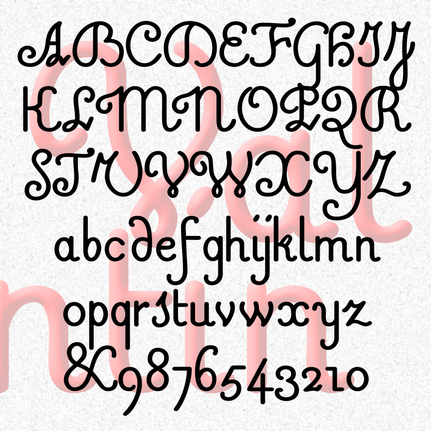

VALENTIN is a sweet and simple cursive font. A mix of friendly and formal, Valentin’s vertical letterforms are in the French style. Valentin was inspired by 18th-century experiments in raised-letter printing for the blind. Designed by Valentin Haüy, this style is beautiful on the page and could be read by both blind and untrained sighted readers. Later designers would create more simplified raised-letter designs, eventually leading to the dot grid of the Braille system. VALENTIN 1.5 has an expanded character set and improved spacing and kerning. More legible versions of a few characters have been substituted and the originals moved… continued
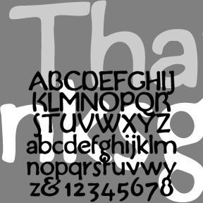
THANKSGIVING was inspired by this handlettered “Buzza-type” motto (left). Grandma would have had a couple of these homilies tacked up in little frames. My partner, Al, collects them and I became interested in the lettering on this one in particular. The feel is of handlettering in imitation of print, rather than the other way around. Includes upper and lowercase, numbers, punctuation, and international characters.
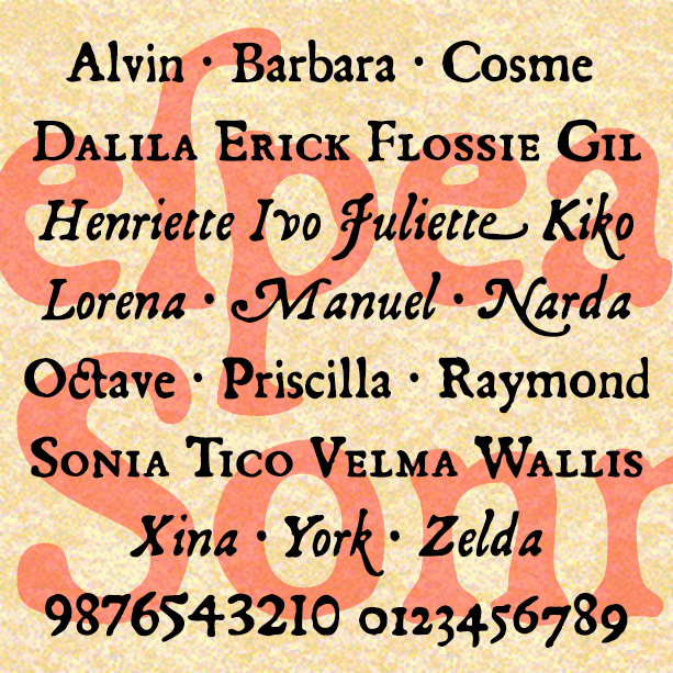
SONNET is a set of fonts with the look of early letterpress printing; the bold and beautiful letterforms contrast with the roughness of the technology and paper of the time. This would be a good alternative to the overused and ahistoric Caslon Antique. Sonnet was inspired by a facsimile of Shakespeare’s First Folio as published by Thomas Thorpe in 1609. The full series includes many typographic features of the original, including italics, swash italics, small caps, old-style figures, long s, and more. Version 2.0 makes use of Opentype features for easier use. Now the Regular font also includes the Small… continued
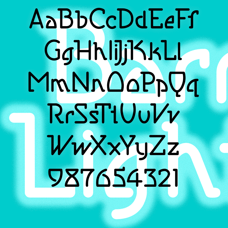
BARRYMORE is a sleek and stylish geometric font with an Art Deco influence. With rounded ends that suggest neon tubes, BARRYMORE comes in 3 weights. Inspired by vintage Pepsodent packaging. Formerly known as Sanitary.
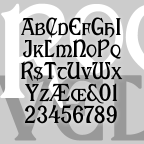
My version of ROOSEVELT began with a request by Rob Case for the font once used on Aeolian pianos and organs. I drew the letters from analog examples, regularizing and filling out the set. Subsequently another correspondent, Richard Vance, told me the history of the design (at right) and showed me more examples of the original font in action, prompting the revised version which now includes small caps and a more conventional T. (The curvy one is now located at | and \.) If you like this font, please see my Celtic Knot Monograms. According to Rollin Smith’s “The Aeolian… continued
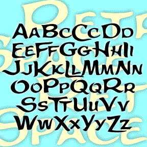
The Retrospace font was inspired by the hand-lettered opening credits of the film Some Came Running (1958). The Long, Hot Summer (another 20th Century Fox production from 1958) has similar credits; the films do not share directors or art directors. Font includes large and small caps, numbers, punctuation, and international characters.
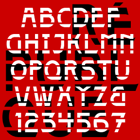
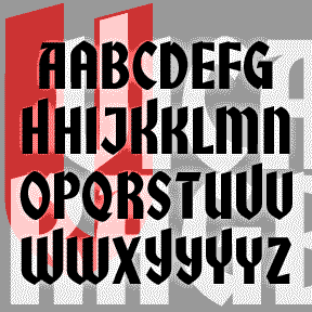
The 4 RÉPUBLIQUE fonts were inspired by the lettering on this style of Paris Metro sign, designed by the architect Adolphe Dervaux and first installed in 1924. This design coexists with the more famous Art Nouveau “Metropolitain” signs, designed by Hector Guimard in 1900 and made of sinuous wrought iron. The “Candelabra Dervaux” uses simpler Art Deco letterforms, cut out of red metal, and illuminated from the back. The double row of stencil-style supports resembles train tracks. For fun, I’ve included a few alternate characters in the lowercase positions and created a Solid font without the horizontal lines, and two… continued
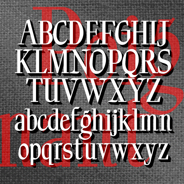
POIGNANT is an elegant titling font that combines aspect of a “modern” or Didone font with calligraphic flourishes. Available in roman and italic. Poignant was inspired by the hand-lettered titles of certain Twentieth Century dramatic films, including All About Eve (1950), Gentleman’s Agreement (1947), and Niagara (1953), all art-directed by Lyle Wheeler, perhaps a clue to the original hand. Version 1.5 features an expanded character set and improved spacing and kerning.
VICARAGE, RECTORY and PARSONAGE are separate but related decorative fonts, each with a romantic, historical feel and inspired by hand-lettered film titles. Each could also be used to suggest Olde Worlde gentility, holiday festivity, or spirituality. Each font is all caps with many alternate forms for more variety and looks great as LARGE and SMALL CAPS. VICARAGE, the boldest of the three, was inspired by the trailer of the film The Private Lives of Elizabeth and Essex (1939), art directed by Anton Grot. RECTORY, suggestive of pen calligraphy, was inspired by the opening credits of Going My Way (1944), art… continued

NATIONAL DEBT is a bold, squarish design with the solid curves of a vintage car or a retro refrigerator. I originally designed this back in 1998 for a 1940s-themed event when I couldn’t find quite what I was looking for. Now there are three versions: the solid original, Hilite, and ThreeD that can be used separately or layered together. Version 1.5 includes an expanded character set, improved spacing and kerning. Another one of Dennis’ Font Play creations.