
-Retro-
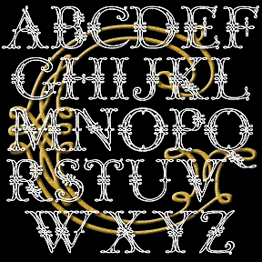

This ornamental, calligraphic font was suggested to me by Bruce Baryla, who also proposed the name GRACEFUL GHOST. Here is all the information I have about the original: Completely redrawn–not traced–for very smooth lines. Looks great reversed and, of course, BIG. Includes caps, limited punctuation, and international characters.
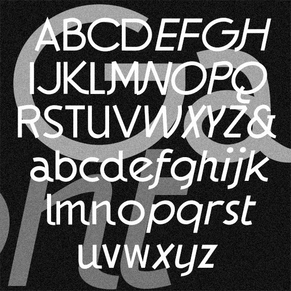
The GAUMONT fonts are elegant sans serif fonts in the Art Deco style. These were inspired by the hand-lettered titles of Alfred Hitchcock’s 1935 The 39 Steps, a Gaumont-British Picture. I’ve taken a few liberties, regularizing the characters but preserving the quirkier letterforms and rounding out the font in the same spirit. In Regular, Italic, and Light varieties. Version 1.5 has the alternate characters accessed as Stylistic Alternates, an expanded character set, and improved spacing and kerning.
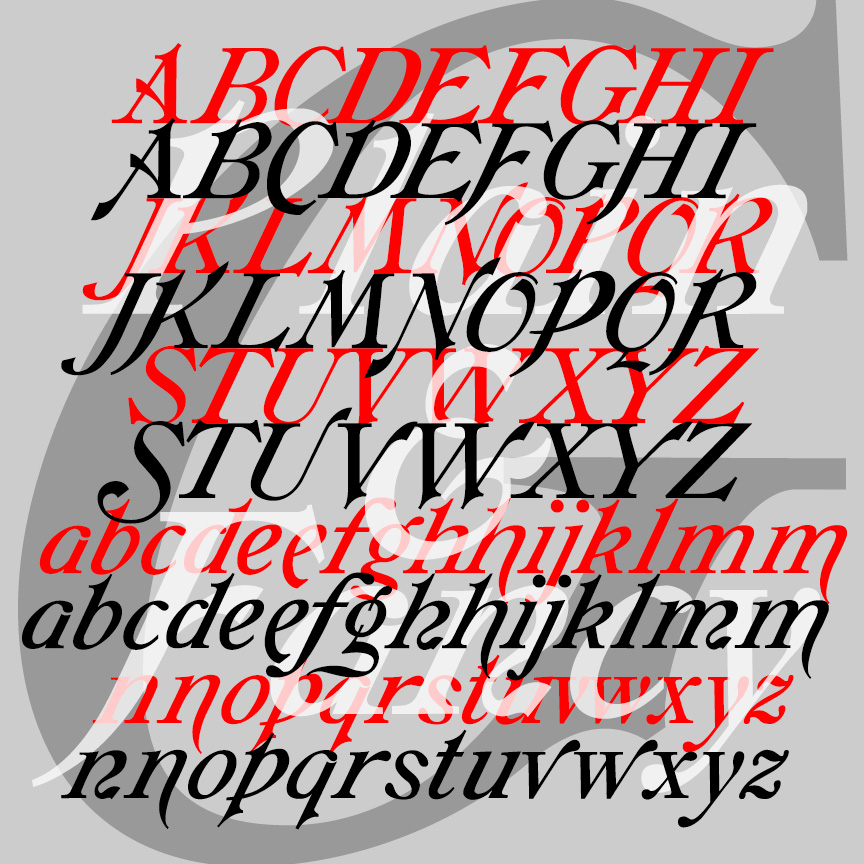
GALATHEA is an elegant italics-only font. My digital font was inspired by a 19th-century typeface from Schelter & Giesecke. After designing my version of Galathea, I found examples of another, very similar S&G font called “Italique Moyen-Age Demi-Grasse.” I’ve now recreated that second font, calling it simply GALATHEA PLAIN, as it shares so much with its sister, now called GALATHEA FANCY.
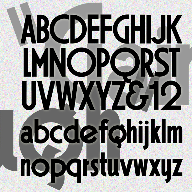
GAINSBOROUGH is a bold geometric font in a high Art Deco style. I was attracted to the extreme distortion in some of the letters, emblematic of the style, and preserved that in my design. Gainsborough was inspired by the hand-lettered titles of the 1938 Alfred Hitchcock film, The Lady Vanishes, “A Gainsborough Picture,” produced by a sister company of Gaumont-British, namesake of Gaumont. Version 1.5 includes an expanded character set and improved spacing and kerning.
EPICURUS was inspired by Roman manuscripts on papyrus from Herculaneum. I’ve modernized the forms of the distinctive capitals, adding the “new” letters, lowercase and non-Roman numerals. Epicurus has a clean stroke and the feel of a contemporary sans serif. The example is just for reference. The texts I actually used are in Oxford’s Bodleian Library and cannot be reproduced here. The font is named for the Greek philosopher, not the recipe website. Includes upper and lowercase, numbers, punctuation, and international characters.
COMFY has the bold but friendly look of cutout letters. Inspired by an example of “Pinselschrift” (brush lettering) by Wilhelm Dechert*. Has the feel of a handlettered version of a 20th-century geometric font like Paul Renner’s Futura* or Rudolf Koch’s Kabel. *Reproduced in Iron Fists: Branding the 20th-Century Totalitarian State by Steven Heller (thanks, John, for bringing this to my attention.) This font, of course, is much more gemütlich (comfortable, homey, informal, cozy, approachable, good-natured) than that title suggests. Includes upper and lower case, numbers, punctuation, and international characters.
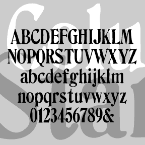
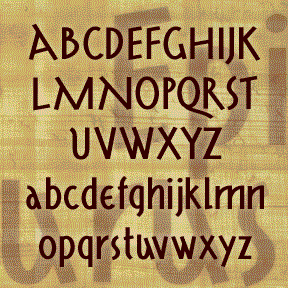
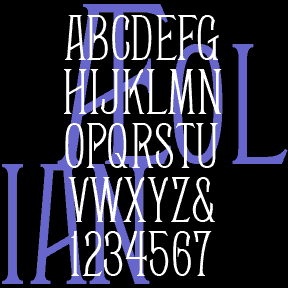
COLUMBIA STAMP was suggested by my correspondent Marsha, who sent me scans and lots of encouragement. It’s based on her set of vintage rubber stamps and has a smoother edge and straighter alignment than my other stamp fonts. Upper and lower case, numbers, punctuation, and international characters.
BRUCE MIKITA is my digital version of an analog font of the same name. It has a rustic, hand-crafted feel and suggests East Asian calligraphy. The highlight is a distinctive feature; I’ve also made an un-highlighted version, which Dan X. Solo identifies as “Lantern.” At long last, its origin has been revealed to me by Herman: “Since you ask, there is no Bruce Mikita. The type you digitized was issued by George Bruce’s Son & Co’s New-York Type-Foundry. It was patented 12 Feb 1867. It was called by them Ornamented no. 1048. When Phoenix typefounders got some mats they invented… continued

BENSGOTHIC was inspired by the work of the artist Ben Shahn. (See also Bensfolk) This style–which Shahn applied to psalms, Christmas cards, posters, and many other item—suggests inscriptional capitals like those of Byzantine mosaics, the Bayeux tapestry, or medieval manuscripts. He made great use of fanciful ligatures, which are included in the font for a totally hand-lettered feel. The new OpenType version of Bensgothic allows you to access the ligatures easily. In applications that support OpenType features, enable “discretionary ligatures.” Type your text in ALL CAPS to automatically use the ligatures as available. Type in lowercase (or MiXeD cAsE) to… continued
AEOLIAN is a narrow, elegant font that was inspired by the lettering on a pipe organ manufactured by the Aeolian Company. My friend Nelson got me started with scans of the various stop labels, like the one at left, found on the amazing Longwood Gardens Aeolian organ which he has worked to restore. I invented missing letters and numbers, then created two additional weights, Demi and Bold. Always grateful for posts like this: “Thanks for digitizing Aeolean for posterity. The original tradename was Façade, and it was introduced by the Boston Type Foundry in 1881. John F. Cumming cut certain… continued