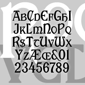
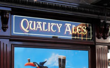
My version of ROOSEVELT began with a request by Rob Case for the font once used on Aeolian pianos and organs. I drew the letters from analog examples, regularizing and filling out the set. Subsequently another correspondent, Richard Vance, told me the history of the design (at right) and showed me more examples of the original font in action, prompting the revised version which now includes small caps and a more conventional T. (The curvy one is now located at | and \.) If you like this font, please see my Celtic Knot Monograms.
 According to Rollin Smith’s “The Aeolian Pipe Organ and its Music”, the font was originally designed for the Roosevelt Organ Company. Later that firm was absorbed by Farrand & Votey in 1893, which in turn was merged into The Aeolian Company. But Aeolian kept using the Roosevelt font, because it was so elegant. The name comes from Hilborne L. Roosevelt and his brother Frank Roosevelt, famous organ builders, not Theodore, their first cousin.
Includes large and small caps, punctuation, numbers, and international characters.


