
-Color-
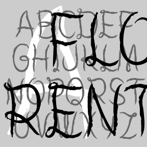

The FLORENT fonts are bursting with beautiful, floral detail. The four fonts are designed to be used separately or layered together in different colors and combinations. Florent A (green in the animation at right) is bare branches or vines. Florent B (yellow) has white flowers on the branches. Florent C (blue) is the flowers alone, perfect for use alone or as a “fill” with B or D. Florent D (red) has the branches full of light and dark flowers. Florent was inspired by an analog font called “Garland” in Dan X. Solo’s 100 Ornamental Alphabets. I’ve completely redrawn the font,… continued
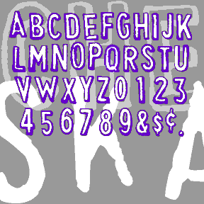
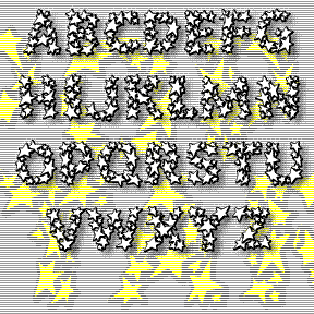
CHEAPSKATE is based on my first rubber-stamp alphabet. I purchased it in a toystore in the 70s and threw out the packaging. I used these A LOT. Love the slight shadow effect and the awkward letterforms. The outline font is the way the stamps look, the fill font can be separately or underlapped to fill in the letters with another color or percentage. This updated version has improved letterforms and greatly expanded character set, including 2 of each letter, plus lower case, numbers, punctuation, and international characters.
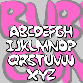
BUBBLE GUM ROCK is based on a kind of graffiti lettering that kids do. Each letter is a big fat outline that underlaps the one to its left. My friend Kate Lee helped me remember it. To Create The Underlapping Effect, Type Your Sentences Like This Because The Caps Are Designed As Initial Letters And The Lowercase To Follow.This is a set of two fonts that work together. The Outline font contains pseudo brush-drawn outlines; the Fill font is the solid part that goes inside. In a program that allows layering, set the same bit of text in each of… continued
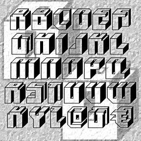
BLOCKED is my reconstruction of a “lost” Letraset font. The original, called “Block Up,” was designed by Sally Ann Grover and was issued in 1974 by Letraset. Block Up is one of countless fonts that didn’t make the technological transition from transfer letters to digital. My digital version was constructed point by point, not autotraced, so it’s very clean. I’ve used all the available characters (except the 4) and rounded it out with more punctuation and international characters. I’m especially fond of my @. The Regular above; that’s what the original looked like. I’ve also created a series of four… continued

POPSTARS was inspired by the hand lettering on the cover of the classic Beatles album, Magical Mystery Tour. The B from Beatles is about actual size at left; weren’t vinyl album covers great? This pair of fonts can be used separately or layered as in the animation on this page. Each font includes caps, lower case, numbers, punctuation, and international characters.
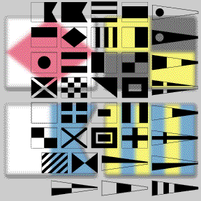
The MARITIME FLAGS fonts are based on the international flag code. Each flag represents a letter or number. These would be flown on board a vessel, not printed. However, the monochrome font can be used to add a decorative or nautical motif. The set includes the single-color font as shown in black on this page; plus separate red, yellow, blue and black fonts. It’s not possible to make a real color TrueType or OpenType font. But you can fake it by layering separate fonts! In a program that allows layering, type your text, then change it to the Black flag… continued
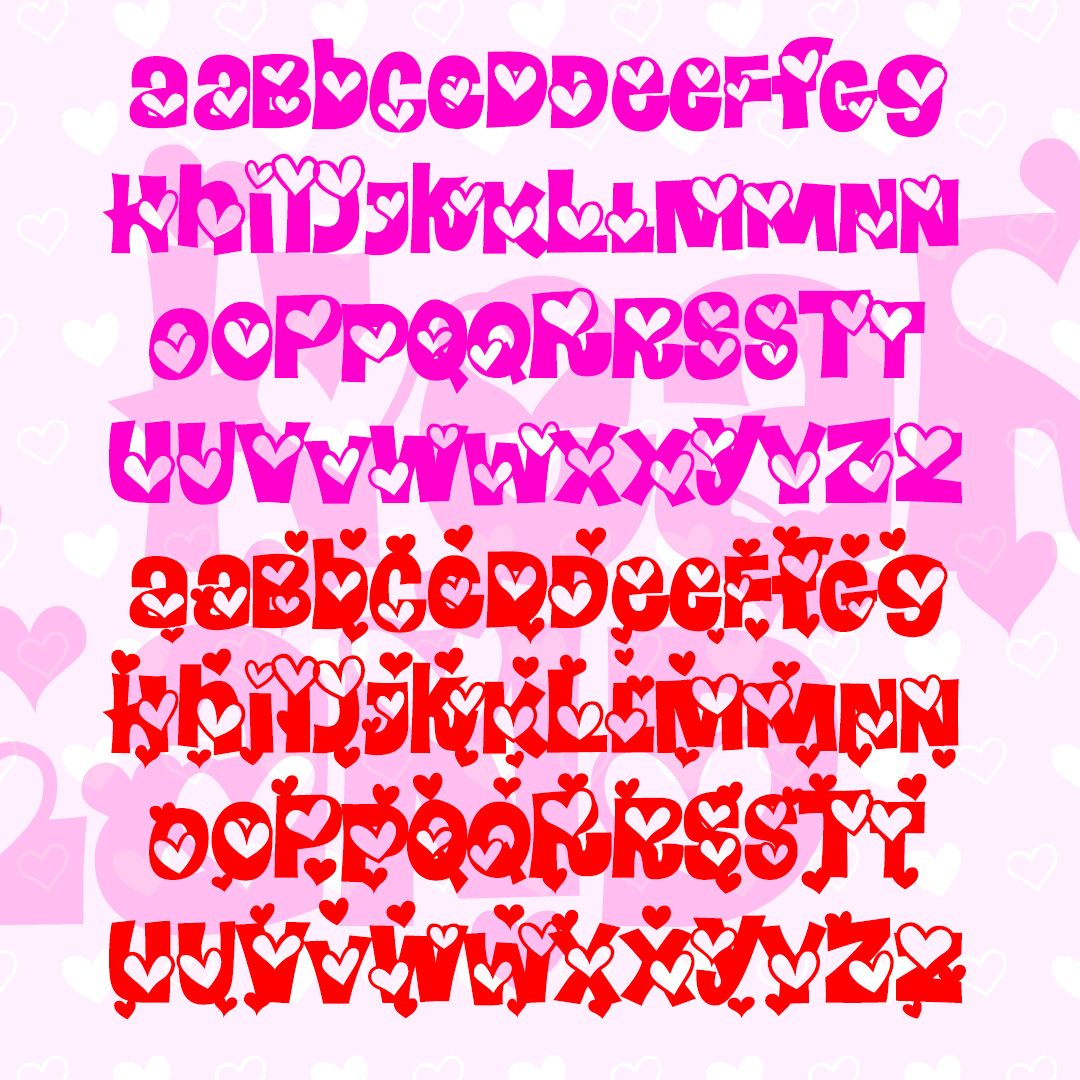
HEARTLAND is a fun and playful font full of heart. The Regular font has outlined hearts on each character, the Extra font adds even more hearts and can be layered together. These mixed-case fonts have 2 versions of each letter for even more bounce. Inspired by the letterforms of the classic font Daisyland. Version 1.5 has an improved and expanded character set and improved kerning.
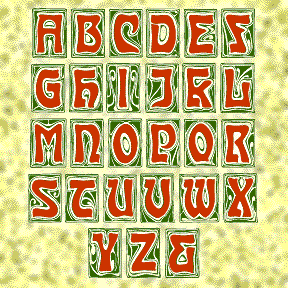
CARMEN CAPS is my digital interpretation of an Art Nouveau font of the same name, as illustrated in the Dan X. Solo books. The swirly backgrounds have great detail; use big as drop caps!