
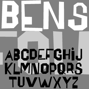

The BENSFOLK fonts were inspired by the work of the artist Ben Shahn. He was a political activist, a painter, and a calligrapher, among many talents.
One of the lettering styles Shahn used was derived from the work of amateur sign painters. As trained artists often react to the work of so-called naive or folk artists, he found their crude beauty to be “cacophonous and utterly unacceptable. Being so it is irresistibly interesting.”
 Shahn used this lettering to represent the speech of the common person, and it blended perfectly with his pen work Shahn also lived to see his work–itself derived from earlier sources–used as a starting point by others.
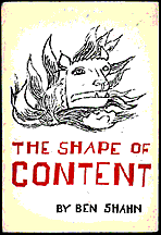
Shahn’s prints and other work were once widely popular. His book, The Shape of Content, was required reading for me in college and still seems to be in print.
Each complete font includes two of each capital letter, punctuation, numbers, and international characters.
BENSFOLK was originally created in 1997 for the The Arts Center of the Capital Region.
![]()
![]()