
-Premium-
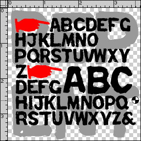

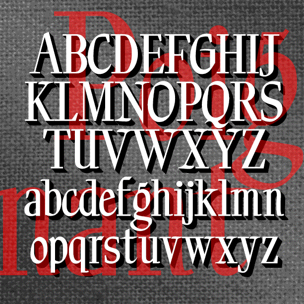
REPENT was inspired by the work of Jesse Howard (1885-1983), a folk/outsider/naive artist. I first saw his work in Self-Taught Artists of the 20th Century, published as an exhibition catalog by the Museum of American Folk Art. What is striking to me about Howard’s work is the intense effort contained in his paintings-as-rants, and the overall texture of their deliberate lettering. Howard’s work can be seen in the collection of the Kansas City (MO) Art Institute. Jesse Howard’s obsessively lettered paintings and sculptures are the cousins of these signs (left) which appear from time to time nailed to telephone poles… continued
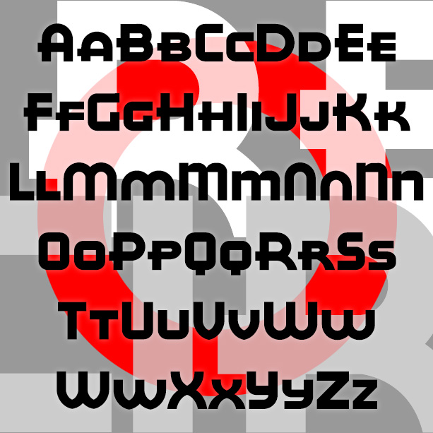
RED CIRCLE is a bold and stylish geometric sans serif with its roots in Art Deco design. It was inspired by the hand lettering formerly used on Eight O’Clock coffees. Once associated with A&P stores, Eight O’Clock coffees, including Bokar and Red Circle varieties, were the most popular brand in the US from the 1930s, the age of Art Deco. Version 2.0 is a large and small caps font; alternate letterforms are accessed thru Opentype feature. It also features an expanded character set and improved spacing and kerning.
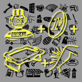
REBUS FONT is a dingbat font that contains a quirky variety of images in a snazzy retro style. They’re drawn from a couple of 1960s editions of the home version of the TV game show Concentration that featured rebus puzzles that had to be revealed and then solved. The rebus is as old as Egyptian hieroglyphics; a simple picture is substituted for all or part of a word. The new OpenType version of Rebus Font allows you to easily access any of the 130 images by simply typing its name. Easily accessed for use as clip art or to make… continued
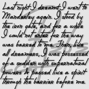
The REBECCA font was inspired by the distinctive and stylish handwriting of the title character of the classic film. Rebecca (1940) was based on the novel by Daphne du Maurier and directed by Alfred Hitchcock. The title character is dead and not even a portrait of her is ever seen. Her handwriting appears several times in the film and is perhaps the thing that most personalizes her. Her large initial R appears embroidered on a number of her possessions, including the pillow in flames at left. Rebecca’s signature, address book, and correspondence all appear in closeups as evidence of her… continued
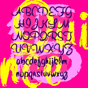
QUINCE is a brush script with a different attitude. The basic letterforms were inspired by Murray Hill (Emil J. Klumpp, 1956). I’ve completely redrawn the letterforms with a rough “art brush” to produce an expressive, painterly line, rather than a pen line. Could be crayon, lipstick, of graffiti. More “Bratz®” than “Barbie®”. Includes upper and lowercase, numbers, punctuation, and international characters. Although Linotype says Murray Hill was named for a “small town in New Jersey”, I’m certain it was named for the Manhattan neighborhood of the same name (as was the NJ town.) To me, the original Murray Hill font… continued
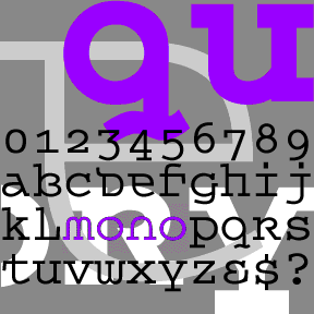
QUEER THEORY is my attempt to make a monospaced font with a less predictable feel. I was thinking about fonts like Envision, Democratica and Rotis Semi Serif, with their hybrid letterforms and irregular application of serifs. The basic letterforms of Queer Theory were derived from the invisible classic Courier, fusing upper and lowercase in a way that suggests an uncial. Unlike your average Courier though, this font has very square–not rounded–slab serifs. Includes single case letters, numbers, punctuation, and international characters.
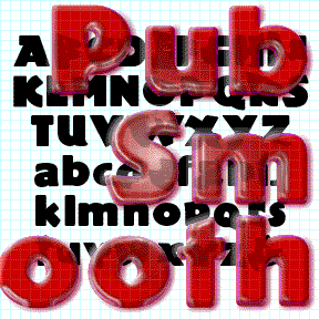
PUB SMOOTH was inspired by the classic font Publicity Gothic, which was “based on the sturdy woodcut display faces of the late 19th century.” Remarkable for its fat, friendly letterforms and bumpy outline. Adobe sells a fine version and if that’s what you want, buy it from them, as I did. In using Publicity Gothic, I realized that the bumpy outlines didn’t work well on-screen and at smaller sizes in print. So I completely redrew the font with smooth clean edges and corners. I’ve tried to remain faithful to the spirit of the original design. Just for fun, the set… continued
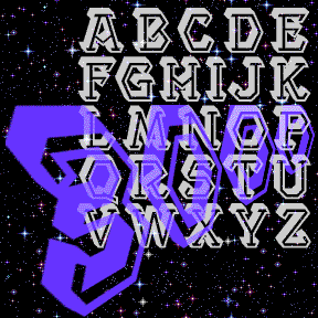
The five PROJECT fonts were inspired by the hand-lettered titles of the film Project Moon Base (1953). Tucker brought them to my attention with a couple of very clean stills. I only knew the film from a grainy tape of when they lampooned it on Mystery Science Theater 3000. It’s my favorite kind of scifi: laughably dated, fake, and earnest. (Also used in Crash of Moons.) I’ve made a set of five fonts–Light, Medium, Bold, Bold Inline, and 3000 (the 3-D style)–for a variety of uses. Out of the Moon Base context, it can have a very diferent feel, almost… continued
POIGNANT is an elegant titling font that combines aspect of a “modern” or Didone font with calligraphic flourishes. Available in roman and italic. Poignant was inspired by the hand-lettered titles of certain Twentieth Century dramatic films, including All About Eve (1950), Gentleman’s Agreement (1947), and Niagara (1953), all art-directed by Lyle Wheeler, perhaps a clue to the original hand. Version 1.5 features an expanded character set and improved spacing and kerning.
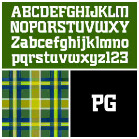
Plumber’s Gothic is my digital interpretation of the font formerly used by 3M to brand its products. According to their excellent corporate history, the “boxy, serifed…decidedly industrial” logo and font were designed by Gerald Stahl & Associates in 1960 and used throughout their product line until the late 1970s. “Unfortunately ‘plumber’s gothic’ no longer accurately reflected the image of the more sophisticated, higher-tech company that 3M had become.” (Thanks, John, for getting me started on this!) Includes upper- and lowercase, numbers, punctuation, and international characters.