
-Special Effects-

SAFETY PIN was inspired by the cover of the June 1946 Ladies Home Journal. Click on the O at left to see the whole word. From the mildewy examples I found, it appears their logotype was different for each issue in those days. I started with J-O-U-R-N-A-L and imagined safety pins bent and twised to form the other characters. May be the first font that appeals to both crafters and punks. The Regular version of the font has white highlights like Ringpin; the Solid version does not so you can create your own effects and shadows.

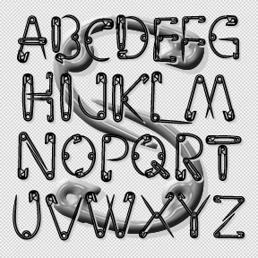
RINGPIN was inspired by the style of body piercing. Not my own style, but interesting to observe. In designing this font, I was rather limited to geometric components, and drew each with a crisp highlight. Most letters take the lowercase form, sometimes with alternates. The letters did not want to align neatly, so they assume a variegated arrangment. Includes 1-3 versions of each letter, plus numbers, punctuation, international characters, and many fanciful extras.
Obviously, RICECAKES was designed to look like grains of rice arranged to form letters. It was my very first font design, planned for an event at Albany’s Rice Gallery, but was not completed in time. The letterforms are patterned after the classic Franklin Gothic, although I did alter the 1 (not gothic enough!) Use it big, reverse it, color it to suggest flower petals, overlap it. Now there’s a second font with white grains on black. Each font includes caps, numbers, punctuation, and international characters. Another one of Dennis’ Font Play creations
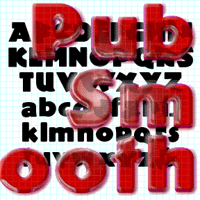
PUB SMOOTH was inspired by the classic font Publicity Gothic, which was “based on the sturdy woodcut display faces of the late 19th century.” Remarkable for its fat, friendly letterforms and bumpy outline. Adobe sells a fine version and if that’s what you want, buy it from them, as I did. In using Publicity Gothic, I realized that the bumpy outlines didn’t work well on-screen and at smaller sizes in print. So I completely redrew the font with smooth clean edges and corners. I’ve tried to remain faithful to the spirit of the original design. Just for fun, the set… continued
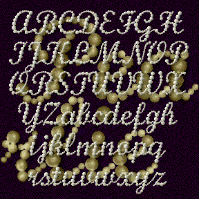
PEARLIE is a script font designed to look like a string of graduated pearls. This is the kind of font I wanted a couple years ago for a Debutante Ball; now I’m ready! The basic letter forms were inspired by those of Monotype Script. Links without kerning; looks especially good reversed or with 3-D effects. Includes upper and lowercase, numbers, punctuation, international characters, and a few flourishes for the beginnings and ends of words.
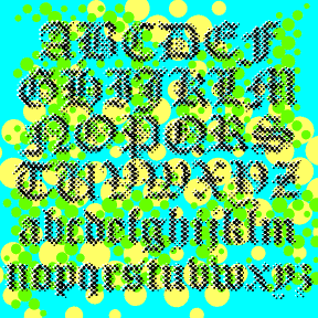
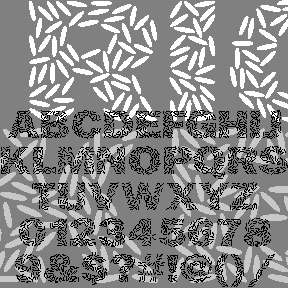
PALIMPSEST is an experimental font combining the letterforms of a traditional blackletter font with the texture of a Benday or halftone dot screen. Modern + Medieval. Pop + Parchment. At first glance it appears somewhat blurred or faded but is very cleanly rendered from vector drawings for smooth edges at any size. (Bigger is better.) Includes upper and lowercase, numbers, punctuation, and international characters. PALIMPSEST comes in four weights: Light, Regular, Dark, and Black, which can be mixed and matched for interesting effects. The graphics above show only the Regular weight; at left are all four for comparison.

MOCKINGBIRD was inspired by the opening title for the classic film, To Kill a Mockingbird (1962), designed by Stephen Frankfurt. A child’s hands browse a cigar box of treasures and make this crayon rubbing that forms the title. I modeled my letterforms on Franklin Gothic as the closest match. I didn’t fake the texture which comes from an actual rubbing of a photopolymer plate. Includes upper-and lowercase, punctuation, numbers, international characters, plus special end-caps and space for a complete look.
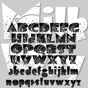
MILKY WAY was inspired by an Art Deco alphabet seen in late 1930s Speedball lettering books by Ross F. George. A “future past” look, like the 1939 Worlds Fair and Tomorrowland. Originally, George directed that the distinctive white dots were to be made by spattering white ink with a toothbrush. The degree of detail in the Regular version of this font means it should be used fairly big, and that it’s a big file. At Jeff Levine’s insistence, I’ve added a second font without the stars but retaining the rings. Both fonts include caps and lowercase, plus numbers, punctuation, and… continued
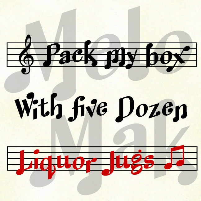
MELODY MAKER lets you set type that looks like musical notation. The set includes 3 fonts that you can use separately or together. Melody Maker Regular includes both notes and staff, like the top line in the graphic above. Melody Maker Notes includes only the notes, as in the second line. Melody Maker Staff includes only the staff and can be layered behind the same text set in Notes in a different color. Version 1.5 has an expanded character set and uses Opentype features to enable alternate characters and pairs, for a more “musical” look.
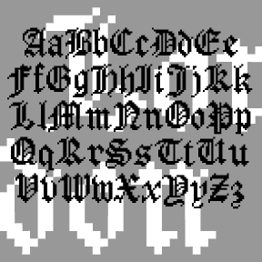
LONDON BITMAP is a recreation of the classic Apple font London, originally designed by the great Susan Kare. (She also designed the wonderful icons at right, so familiar to us old appleheads.) The city-named fonts (Chicago, etc.) were a big improvement over previous computer typography, although they may now seem a bit quaint. Most have made the transition to scaleable fonts, such as my own L.A. fonts; now you can again enjoy London’s contrast between “Old English” style and bitmap texture. While I was at it, I also made a Harlequin, Cross-stitch and Shaded version; the initials at left show… continued