
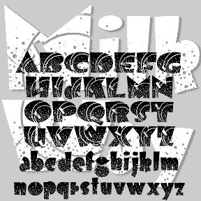

MILKY WAY was inspired by an Art Deco alphabet seen in late 1930s Speedball lettering books by Ross F. George. A “future past” look, like the 1939 Worlds Fair and Tomorrowland. Originally, George directed that the distinctive white dots were to be made by spattering white ink with a toothbrush. The degree of detail in the Regular version of this font means it should be used fairly big, and that it’s a big file.
At Jeff Levine’s insistence, I’ve added a second font without the stars but retaining the rings.
Both fonts include caps and lowercase, plus numbers, punctuation, and international characters.
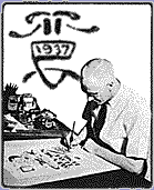 Probably most people with an interest in calligraphy or lettering have seen one of the many editions of the Speedball book. Ross F. George’s name and whimsical monogram (with his photo at left) are all over the 1938 edition, and his talent is immense and seemingly effortless. For subsequent editions, the alphabets and layouts were cut up and rearranged, often losing the artist’s name.
In the 1938 edition, the prototype of the Milky Way caps are shown alone (without the rings) and what would become the Milky Way lowercase paired with other capitals. In an abridged layout in a later edition (reproduced without attribution but clearly including the RG mark, in Heller and Fili’s excellent book Typology) the caps have acquired the futuristic rings and have been “married” to this slight modification of the earlier lowercase.
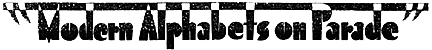
This charming heading accompanied the alphabet in both editions referenced:
![]()