
-Special Effects-
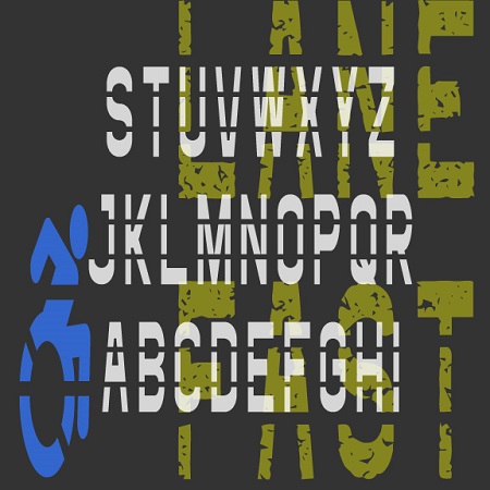

The Fast Lane fonts were inspired by roadway and parking lot markings, reflecting both the stencil style and the stretched form that looks normal when viewed at an angle. The Icons fonts includes symbols and arrows to accompany the letters and numbers. The regular fonts could be used to make printable stencils; I’ve also created Rough versions with a pavement texture for other applications.
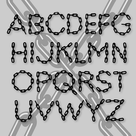
LINX is a pair of fonts designed to look like letters formed with chain. A companion to my Bead Chain font, this one is looser and feels more like it’s been arranged by hand. One version is solid, the other has highlights for a more three-dimensional look.
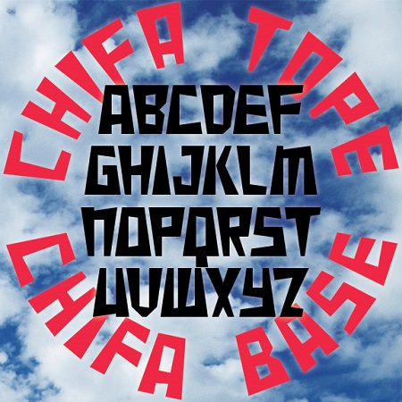
Chifa is a set of fonts combining the trapezoid of Inca architecture with wedge-shaped strokes. Chifa Base has the wide side at the base and Chifa Tope has the weight at the top, making them well-suited for arranging text in a circle. Chifa Combo combines both styles in a single, easy-to-use font; if you TyPe LiKe ThIs—that is, alternating caps and lowercase—the letters automatically fit together. In Peru, I saw several examples of lettering that used the trapezoid, such as this monument in Cusco seen below that also incorporates a trapezoidal aperture like those at Machu Picchu and elsewhere. “Chifa”… continued
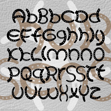

HORSE SENSE is a fun font with all the letters made out of horse shoes. The shoe sizes vary, some are whole and some are cut and “welded” together, as in the original sign that inspired it. And there are many alternates for extra fun. Here’s the original sign, seen in a shop in Cave Creek, AZ.
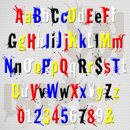
SPLUNGE is the font to use when you want to make a splash. It was inspired by the classic font Franklin Gothic, but each letter has been redrawn, then rounded, splashed and splattered. Depending on your choice of color, it could go from playful to rebellious to horrific. The set includes the companion font Splunge Dry without the splatters. The name will be known to Monty Python fans; it means “it’s a great idea but possibly not.”

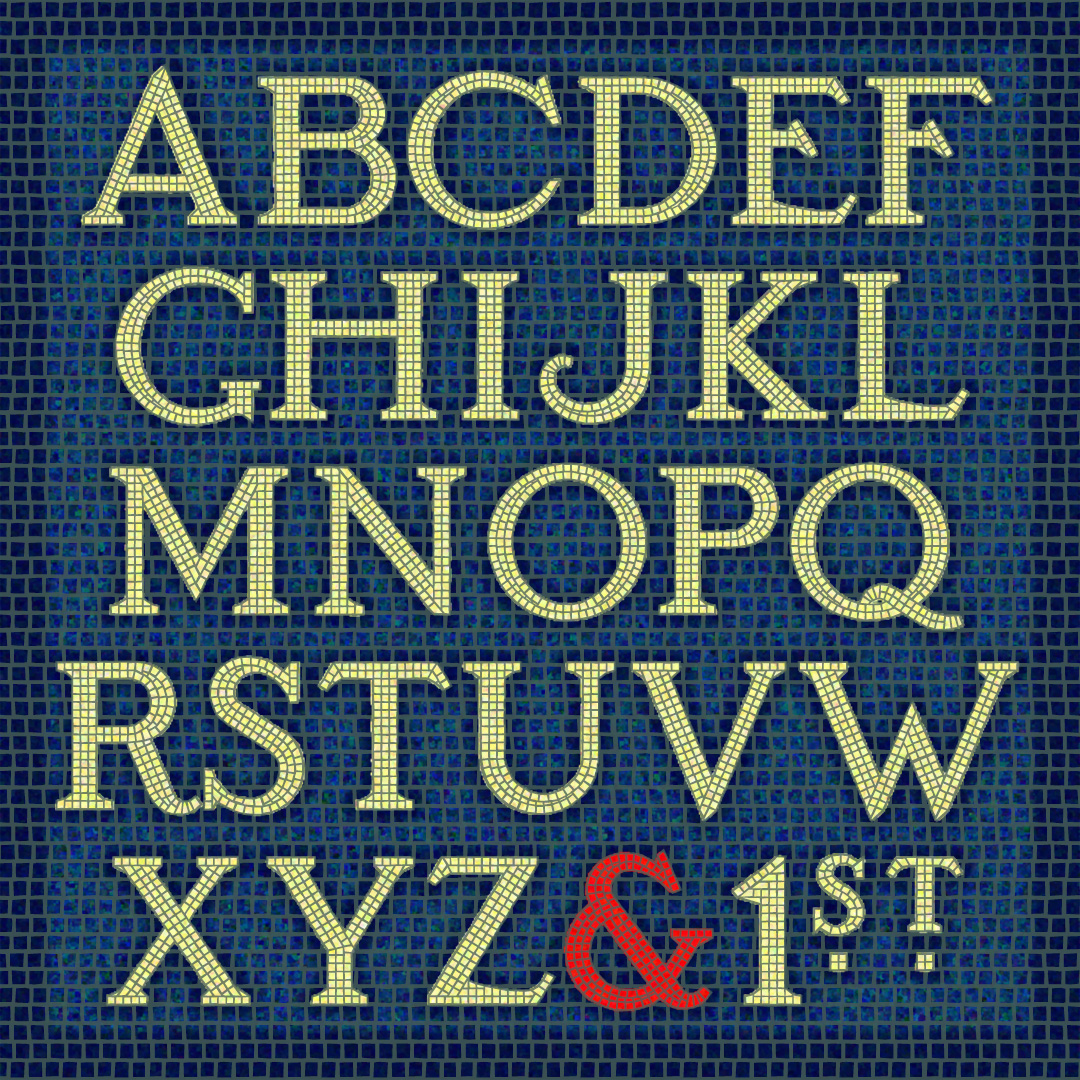
Set of 4 fonts that lets you create custom 2- and 3-letter monograms in a mosaic tile design. There’s a choice of black tile on white or white tile on black, and a variety of optional frames. Also works for “A&B” style monograms.
The SUBWAY MOSAIC fonts were inspired by the classic mosaic tile signs of the New York City subway system, dating to the early 20th century. I’ve tried to maintain the somewhat quaint letterforms while regularizing them for contemporary use. There are 3 fonts (White, Black and Solid) that can be used independently or layered in different colors for endless variation. Version 1.5 includes an expanded character set and improved kerning. If you prefer to have the wall space around the letters tiled too, check out the new SUBWAY MOSAIC WALL fonts!

HANGOVER SQUARE is a set of 3 fonts with an early-1960s style. They were inspired by the handlettered titles of the 1964 mad-ventriloquist thriller Devil Doll, set in London as it was beginning to swing. The Regular font is a smooth sans serif with offbeat details. Hangover Square Stones has the same distinctive letterforms, with a rocky edge suggestive of horror or decay. Hangover Square Sticks is a condensed version, composed of rough vertical lines with a hand-drawn feel. Each font lends itself to all-caps or mixed-case usage.
WOODWIND was inspired by the opening titles of the classic 1939 film Gone With The Wind, directed by Victor Fleming, production designed by William Cameron Menzies, art direction by Lyle R. Wheeler. As you can see from the frame at left, the title appears on screen very large, a word at a time, blowing from right to left. WOODWIND is an ornate 19th-century style font that can suggest the Old South as well as Western Saloon or Circus Wagon. For flexible use, I’ve created a Regular font plus West and East “moving” fonts. Includes caps, lowercase, numbers, punctuation and international… continued
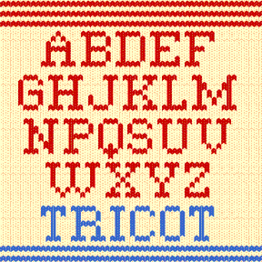
TRICOT was inspired by the 2007 US holiday stamps, designed by Nancy Stahl (left). I liked them so much that I designed my Christmas cards to match (at right) and developed the Tricot font for the greeting inside. A knitted design has much in common with a bitmap image, but the pairs of oval stitches combine to suggest the warm and fuzzy feeling of a handmade sweater. Includes upper and lowercase, numbers, punctuation and international characters. No accent marks on uppercase. Plus knit-style patterns using special keys (below).