
-Special Effects-
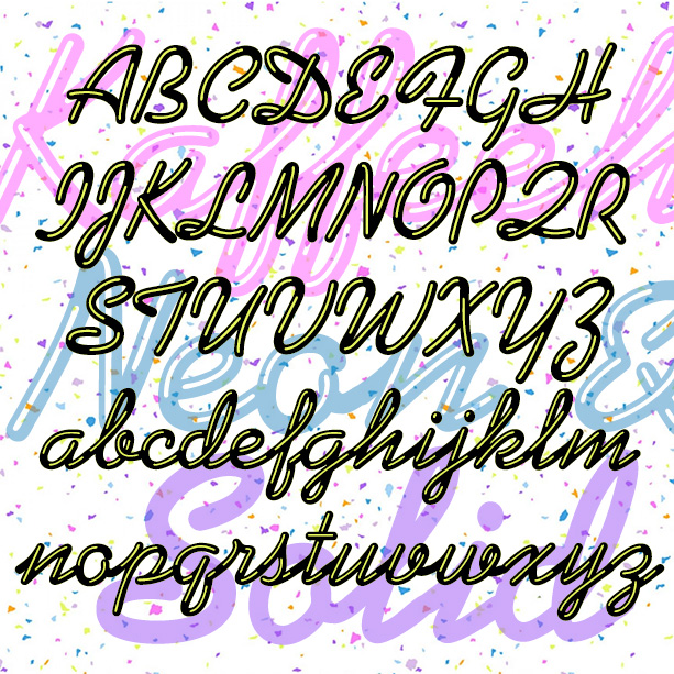

KAFFEEHAUS NEON looks like sleek retro neon cursive, linked and highlighted. And there’s a Solid version that you can layer with the Neon in an accent color, or use separately perhaps with your own effects. The basic letterforms were inspired by the classic script font KAUFMANN®, which was designed by Max Kaufmann in 1936 and remains popular. For my interpretation, I completely redrew the font to make the letters better resemble neon tubes with open loops and rounded ends. I have adapted the basic letterforms to better resemble tubular neon lettering. The ends of characters are all rounded, and there… continued
JOGGLE was inspired by a book jacket that I once saw, half remembered, and couldn’t find again. The illustration was a colorful 50s, jazz-style composition, and the hand-drawn, outlined letters joined up. Couldn’t find it again; hope I did it justice. The letters link up as you type. There are end caps, blank spaces, and flourishes to finish up names and headings, and two of each letter so you have a little more variety. A second font (the pink part of the illustration above) provides a loose fill that be placed behind the outlines for another effect. Includes 2 of… continued
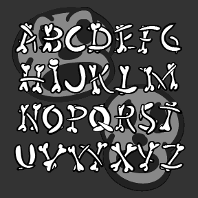
HUMERUS is a spooky/funny font with letters formed of loosely arranged bones, more in the spirit of a Halloween party than real horror. Think of “funny bone”, “rib tickling” and “numbskulls,” all appropriate to the inspiration for this font, the opening credit sequence of Abbott and Costello Meet Frankenstein (1948, directed by Charles Barton, art directed by Hilyard M. Brown and Bernard Herzbrun, with animated sequences by the great Walter Lantz, who may have had a hand in the credits as well. The Regular font has the bone shapes defined by calligraphic outlines; there’s also a Solid font that can… continued
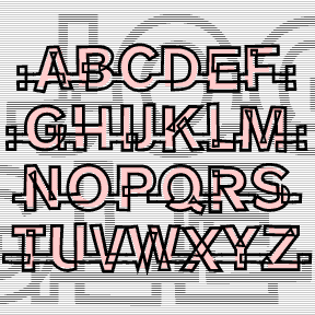
HARDLINE is an Op art font with a groovy, 60s/70s vibe, all geometric forms composed of parallel lines. It was inspired by the 3-letter logo at right, from an envelope my friend Dan gave me. (USU has apparently changed their logo.) This font is really fun when it’s used big and kerned so tightly that the letters overlap, creating cool moiré patterns as in the animation above. I’ve included a number of alternate letterforms in the lowercase positions for greater flexibility. Includes uppercase and alternates, punctuation, numbers, and international characters.
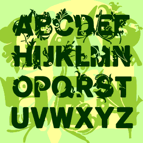
The GARDEN fonts began with a sans serif, then sprouted and grew! Inspired in part by the early Walt Whitman cover at left. Plant motifs were adapted from a variety of historic sources* and incorporated into bold, wide grotesque letters in three degrees of vegetation: Full, Two-Thirds, and One-Third. Set also includes Empty (without sprouts) for cross-pollination. (Shown in descending lines above.) Each font includes capitals, punctuation, numbers, and international characters. PATTERN SOURCES Pattern Design: An Introduction to the study of formal ornament, Archibald H. Christie Palm from a woven silk fabric. Italian, 13th century. Berlin, p117 Pattern from a… continued
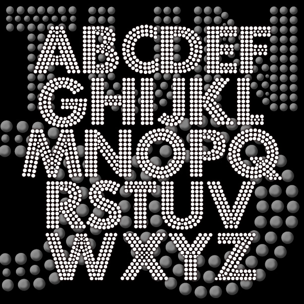
FORTUNA DOT gives your words the effect of being written with tiny lights or beads. This revival of a “lost” analog font was suggested by Bruce Baryla, the bold geometric letterforms were inspired by Paul Renner’s classic Futura®*. The open structure of the font makes it ideal for layering and laser-cutting, available in three weights. Version 1.5 includes an expanded character set, improved spacing and kerning. *Futura® is a registered trademark of Fundicion Tipografica Neufville S.A. The name is used here for reference only; my font was completely redrawn from analog sources. This is NOT a Futura® font.
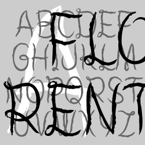
The FLORENT fonts are bursting with beautiful, floral detail. The four fonts are designed to be used separately or layered together in different colors and combinations. Florent A (green in the animation at right) is bare branches or vines. Florent B (yellow) has white flowers on the branches. Florent C (blue) is the flowers alone, perfect for use alone or as a “fill” with B or D. Florent D (red) has the branches full of light and dark flowers. Florent was inspired by an analog font called “Garland” in Dan X. Solo’s 100 Ornamental Alphabets. I’ve completely redrawn the font,… continued
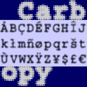
CARBON COPY is a dot-matrix take on Courier, the invisible classic with roots in typewriter style. Could be used to suggest the effect of screen display or of blurry old carbon paper. Includes 3 weights, plus one font with a full background of dots. Each font includes upper and lower case, numbers, punctuation, and international characters.
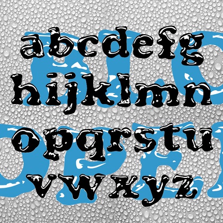
BLOOPER and BLOOP SCRIPT were created to have the look of letters formed by puddles of shiny liquid. The general form of each was inspired by a classic font. Blooper takes after Cooper Black (Oswald Cooper, 1921), Bloop Script after Brush Script * (Robert E. Smith, 1942). I also made a solid version of each (without highlights) for use in layering and with effects filters. BLOOPER 2.0 now contains upper and lowercase letters, plus numbers, punctuation, and international characters. BLOOP SCRIPT includes caps, lower case, numbers, punctuation, and international characters. More information: Although I probably could have just faked… continued
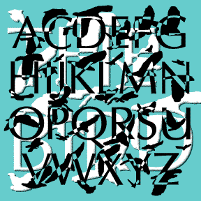

Alfred Hitchock’s The Birds (1963) is one of my favorite films. This font was inspired by its opening titles which were designed by James S. Pollak. Each name appears in a serifless roman font, then is broken up and reassembled by the images of birds flapping past. The letterforms are my own variation on Optima with certain letters altered to match the film’s. The bird shapes are based on my own photos of swarming crows on Thanksgiving 2004. The result doesn’t match the individual film titles, but suggests the entire sequence of breaking letters and passing birds. An interesting contrast… continued