
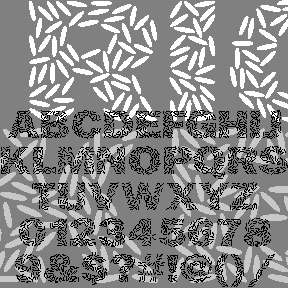

 Obviously, RICECAKES was designed to look like grains of rice arranged to form letters. It was my very first font design, planned for an event at Albany’s Rice Gallery, but was not completed in time. The letterforms are patterned after the classic Franklin Gothic, although I did alter the 1 (not gothic enough!)
 Use it big, reverse it, color it to suggest flower petals, overlap it. Now there’s a second font with white grains on black.
Each font includes caps, numbers, punctuation, and international characters.
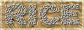 Another one of Dennis’ Font Play creations
![]()
