-Special Effects-
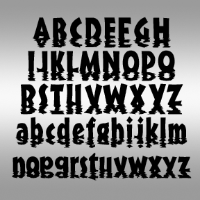

SUNSET is another special effects font, simulating letters sinking into water and making rippled reflections. The basic letterforms are based on an unreleased condensed version of my Bride of the Monster font. It pushes legibility but could be very effective in the right context. Includes caps, lower case, numbers, punctuation, numbers, and international characters. Oops! Sometimes these special effects fonts have letterforms that can be misread. I was honored and embarrassed to see the Photoshop Disaster at left, in which Sunset played a role. Not every font is good for every word or phrase!
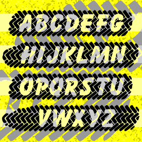
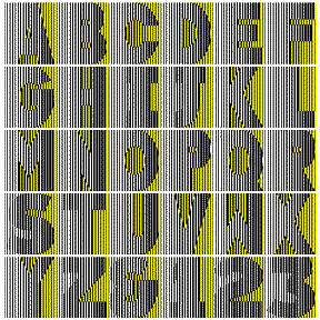
SKIDZ was inspired by a sticker in which the letters where superimposed over a tire tread pattern. I’ve created my own tread pattern, subtracting letters based on Max Kaufmann’s classic font Balloon. When you type, the letters align to form an entire tire mark with white letters. The brackets and underscore can be used to create natural-shaped ends and patterned space between words. SKIDZ contains caps, numbers, punctuation, and international characters. But they’re a bit lost in the edge of the tread, so I’ve made a separate font, SKIDZ EXTRA, with an extra line of somewhat sharper tread pattern to… continued
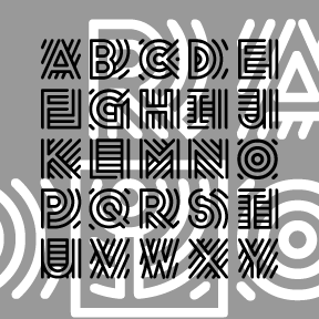
RADIO was inspired by the old logo of NPR, National Public Radio. Obviously, the line pattern suggests broadcasting. The letters are square and of a uniform width, great for short headings, drop caps, and the like. Includes caps, numbers, punctuation, and international characters.
POPSTARS was inspired by the hand lettering on the cover of the classic Beatles album, Magical Mystery Tour. The B from Beatles is about actual size at left; weren’t vinyl album covers great? This pair of fonts can be used separately or layered as in the animation on this page. Each font includes caps, lower case, numbers, punctuation, and international characters.

PIECES is designed to look like a partially assembled jigsaw puzzle. The letters interlock automatically as you type. Use _ | or \ instead of a space to connect your words. The basic letterforms are my “unicase” takeoff on Freeman Craw’s ubiquitous Ad Lib font (1961). This font has the letters on the white background in the uppercase positions and with the black background in the lowercase positions. TyPiNg LiKe ThIs creates an alternating effect. Due to space limitations, it does not contain the complete character set in both black and white. There’s a separate complete font in Black and… continued
PESSIMA combines elegance and corrosion. It was inspired by the opening titles of the film Invasion of the Body Snatchers (the 1978 version, my favorite, directed by Philip Kaufman, titles by Pacific Title). It appears to be a corroded, bold version of Optima*, Hermann Zapf’s classic “serifless roman” from 1958. In the film, the corrosion varies from letter to letter and cleverly suggests the biologic horror to come. This is not the original Optima* of gentle curves, but my jagged re-drawing of it. Despite the battering, the overall shapes are still somewhat recognizable. My font is more striated, less randomly… continued
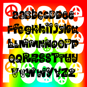
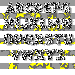
Like its predecessors Calaveras and Heartland, PEACE is a take-off on the classic 60s flower font Daisyland*. Includes 2 versions of each letter, plus numbers, punctuation, and international characters. Inspired by Albany’s 15 minutes of fame; read about it at thesmokinggun.com. *The Daisyland font appears under that name in the Dan X. Solo font books from Dover. There is a nice shareware version called FLORALIES by Keith Field and a free but bumpy adaptation (called Daisyland and uncredited) in FontPak1.zip. (Thanks to Frogii for the information!)
NEUROTOXIN is designed to look like the letters are breaking up or forming from pixels. It was inspired by the Xerox Corporation’s former X logo, designed in 1994 by Landor Associates. The basic letterforms are modeled after a bold Didone-type font. Pairs with a nice Bodoni or even Times Roman. Version 2.0 includes an expanded character set with lowercase and improved spacing and kerning.
GOOD VIBES is my digital version of the Letraset font “Good Vibrations” designed by Trevor Hatchett and released in 1973. Janet Wilson, one of my dear font correspondents, sent me a scan of an unused sheet of the Letraset original. In redrawing the font, I’ve maintained the same number of lines per character and the uniform width of the Hatchett design. Not entirely successful here–the gradient stripes can turn to strobing, dithering detail onscreen. It’s much better used BIG in print (>60 pt.) With rub-down Letraset you would have been able to choose to use parts of letters; I haven’t… continued