
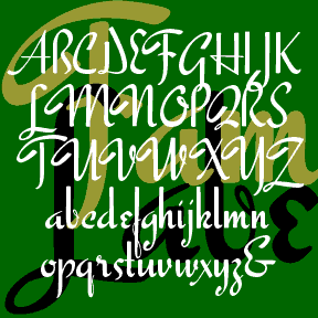
-Script-
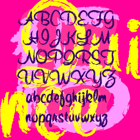

QUINCE is a brush script with a different attitude. The basic letterforms were inspired by Murray Hill (Emil J. Klumpp, 1956). I’ve completely redrawn the letterforms with a rough “art brush” to produce an expressive, painterly line, rather than a pen line. Could be crayon, lipstick, of graffiti. More “Bratz®” than “Barbie®”. Includes upper and lowercase, numbers, punctuation, and international characters. Although Linotype says Murray Hill was named for a “small town in New Jersey”, I’m certain it was named for the Manhattan neighborhood of the same name (as was the NJ town.) To me, the original Murray Hill font… continued
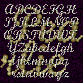
PEARLIE is a script font designed to look like a string of graduated pearls. This is the kind of font I wanted a couple years ago for a Debutante Ball; now I’m ready! The basic letter forms were inspired by those of Monotype Script. Links without kerning; looks especially good reversed or with 3-D effects. Includes upper and lowercase, numbers, punctuation, international characters, and a few flourishes for the beginnings and ends of words.
NEW ENGLAND was inspired by the handlettered titles of the film The Devil and Daniel Webster(1941). I fell in love with this handsome script; it’s not too fancy, too stylized, or too contrasty, problems I find with too many script fonts The film itself is excellent and the restored version is well worth watching if only for Bernard Herrmann’s score. The unusual opening credits group the names by those “in front of the camera” and “in back of the camera.” Directed by William Dieterle, Art Direction by Van Nest Polglase, Associate Art Direction by Alfred Herman. Includes caps, lowercase, punctuation,… continued
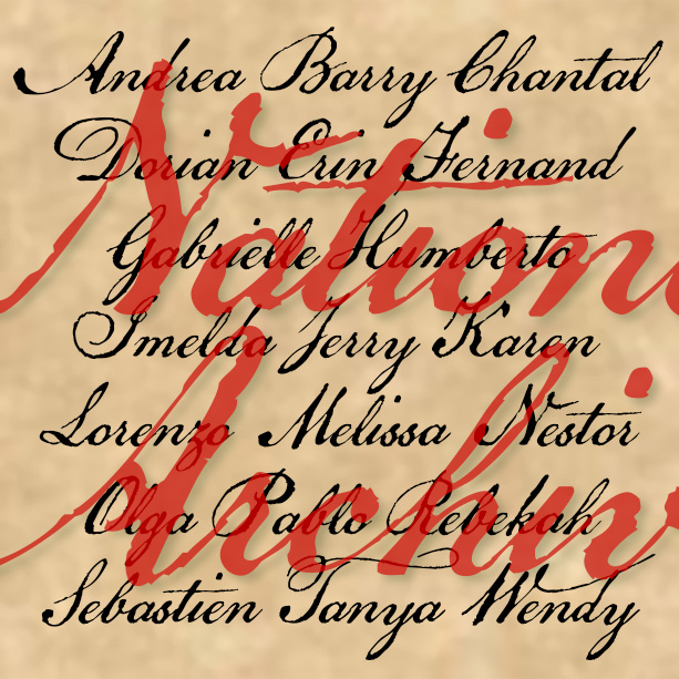
NATIONAL ARCHIVE has the feel of a historic script: elegant penmanship paired with the roughness of quill on paper. National Archive was inspired by the familiar look of the Declaration of Independence. Although the text was composed by Thomas Jefferson and others, Timothy Matlack is the person who inscribed it on vellum so beautifully, creating an indelible symbol of our nation’s founding. Version 4.0 includes all new numbers as well as an expanded character set and improved spacing and kerning.
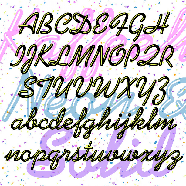
KAFFEEHAUS NEON looks like sleek retro neon cursive, linked and highlighted. And there’s a Solid version that you can layer with the Neon in an accent color, or use separately perhaps with your own effects. The basic letterforms were inspired by the classic script font KAUFMANN®, which was designed by Max Kaufmann in 1936 and remains popular. For my interpretation, I completely redrew the font to make the letters better resemble neon tubes with open loops and rounded ends. I have adapted the basic letterforms to better resemble tubular neon lettering. The ends of characters are all rounded, and there… continued
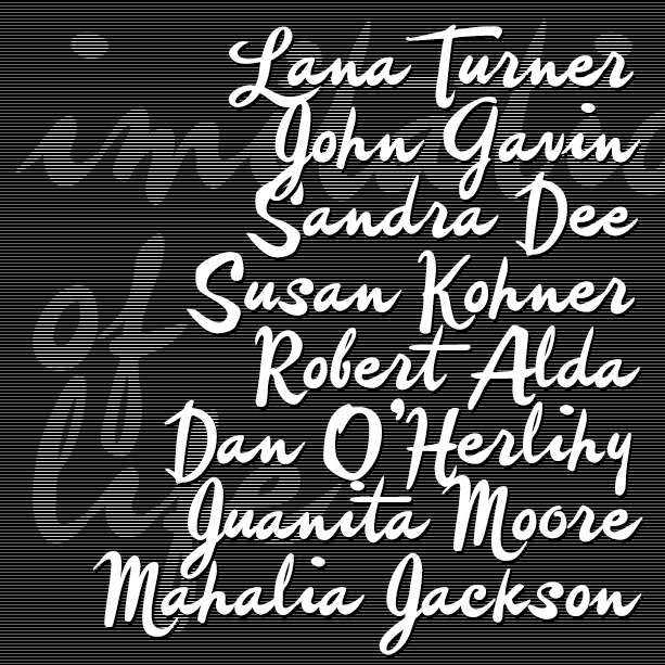
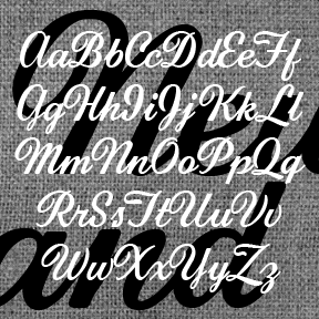
IMITATION is a free-spirited brush script, more a fashion statement than the work of a diligent signpainter. Imitation was inspired by the credits of two soapy Lana Turner films, Imitation of Life (1959) and Madame X (1963). They are credited to different art directors so I don’t know who originated the style. IMITATION includes many alternate characters so you can do an all-lowercase look that looks more hand-lettered, or choose from two sets of caps. VERSION 4.0 uses Opentype features to make these useful alternates easier to use, as well as an expanded character set and improved spacing and kerning…. continued
HONEYMOON is a retro, backhand script with a hand-written feel. It was inspired by the classic logo of the Holiday Inn hotel chain. Uniform weight, almost completely linking. Italicized it becomes a vertical script. Includes upper and lowercase, numbers, punctuation, and international characters.
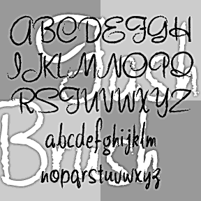
FASHION SCRIPTS are fraternal twins. The letterforms of each were inspired by an example of 1940s department store lettering. FASHION BRUSH has a rough, art brush texture; FASHION MARKER has the smooth line of a Sharpie®. The inspiration was this example of wood type formerly used by Thalheimers department stores. From examples in the collection of Virginia Commonwealth University, Richmond, VA. According to their information, “The type follows handlettering styles of the 1940s and is unique compared to 20th-century script typefaces in metal.” My Pen Script Monograms were also inspired by this wood type. Each font includes upper and lowercase,… continued
FAMOUS LABEL is another vertical script with the retro-posh feel of a department store logo. Inspired by a style of pen lettering illustrated in Alphabets: Ancient & Modern, compiled by J. B. Russell and published in 1945 by Padell Book Co. A number of letters were altered to make a more consistent and complete font. As seen in the Script Font Identification Guide! Includes caps, lowercase, punctuation, numbers, and international characters.
ESQUIVEL is a sleek near-script inspired by an older Esquire magazine logo. Working from this December 1968 issue (with Lauren Hutton on the cover) I had only the title and one short heading inside to work from. The title evokes the original source, but pays homage to Juan García Esquivel, the Mexican emigré “multi-threat talent: quirky composer, eccentric arranger, enchanting performer, dashing showman” according to the liner notes (by Irwin Chusid) of Esquivel’s 1995 greatest-hits CD Cabaret Mañana. Works well italicized too. And there’s also the Engraved and Condensed versions too. Each font includes upper and lowercase, numbers, punctuation and… continued