
-Script-

Empress Monograms is a unique font that lets you create custom 1- and 3-letter monograms in a distinctive script style inspired by classic embroidery.
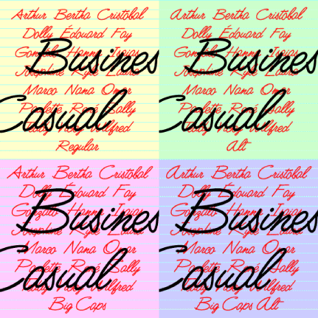
Business Casual is a lively, legible script font that can be both professional and informal. It was inspired by the “lost” analog font Delight (or Delite), produced by Formatt in the 1970s. I’ve kept the basic letterforms, but went for a more uniform stroke with rounded ends, like a felt-tip. The set includes Big Caps and Alternate variations, more closely resembling the original forms but somewhat less contemporary in feel.
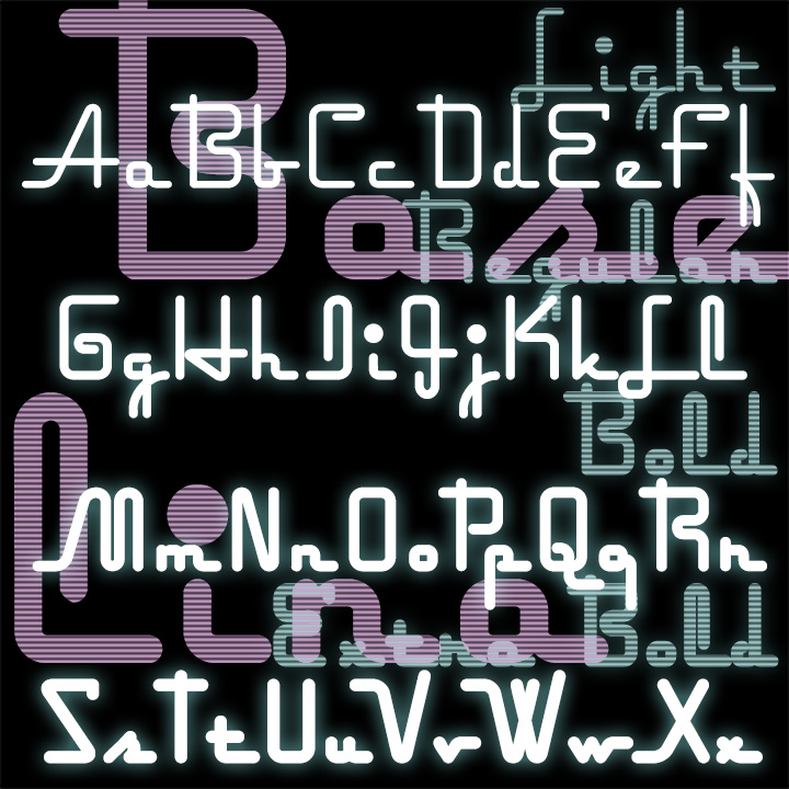
Baselina is a stylish, squarish font that hugs the baseline, suggestive of Art Deco and neon signs. In four weights: Light, Regular, Bold and Extra Bold. Inspired by the hand-lettered titles of the Fleischer brothers’ animated film “Mr. Bug Goes to Town” (1941)
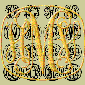
VINE MONOGRAMS® are my most intricate and interwined monograms yet! The design was inspired by letters made for machine “pantograph” engraving (see brass A at left.) I’ve completely redrawn each letter and developed a series of 6 related fonts that can be used to create original 3-letter monograms with or without decorative frames.
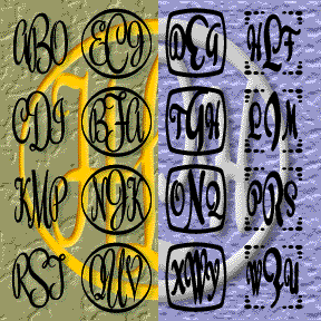
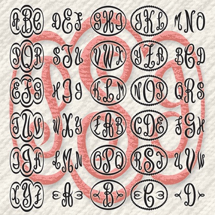
These fonts lets you easily type 1-, 2-, and 3-letter script monograms–with and without a variety of decorative frames–in most any program. Each font includes all 26 letters in all three positions, plus & in the middle.
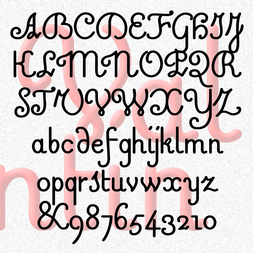
VALENTIN is a sweet and simple cursive font. A mix of friendly and formal, Valentin’s vertical letterforms are in the French style. Valentin was inspired by 18th-century experiments in raised-letter printing for the blind. Designed by Valentin Haüy, this style is beautiful on the page and could be read by both blind and untrained sighted readers. Later designers would create more simplified raised-letter designs, eventually leading to the dot grid of the Braille system. VALENTIN 1.5 has an expanded character set and improved spacing and kerning. More legible versions of a few characters have been substituted and the originals moved… continued
SYNCOPATED SCRIPT was loosely inspired by the work of the painter Stuart Davis. His jazzy canvases bridge Cubism and Pop Art, often featuring words, written in this style and others. Davis’s work always seems fresh and inventive to me. After looking at all the reproductions of Davis’s paintings I could find, I used some of his writings and my own intuition to fill out the alphabet. I’ve tried to maintain both the erratic, jumpy quality and the continuous linking. The originals were painted; these feel as if they were cut out of paper. Includes caps, lowercase, punctuation, numbers, several alternates… continued
SCARLET RIBBONS is a fancy, friendly script, inspired by a Speedball lettering book from the 30s by Ross F. George. The original was called simply Vertical Script and needed a lot of work. As seen in the Script Font Identification Guide! Its name comes from an old song (words and music by Jack Segal and Evelyn Danzig), performed by Jo Stafford, Harry Belafonte, Sinéad O’Connor, and many others. This favorite font is part of a series of retro vertical scripts, Easter Parade, Roselyn, and Famous Label. Includes caps, lowercase, punctuation, numbers, and international characters.
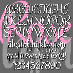
ROSELYN is one of a series of four vertical script fonts, including Scarlet Ribbons, Famous Label and Easter Parade. (As seen in the Script Font Identification Guide!) This one has sharp, pen-like edges, a lighter color, and the most elegance of the three. It’s based on an unnamed style of hand-lettering in Lettering and Alphabets by J. Albert Cavanagh, 1946, reprinted in 1955 by Dover. I’ve named my font after my mother. Includes caps, lowercase, punctuation, numbers, and international characters.
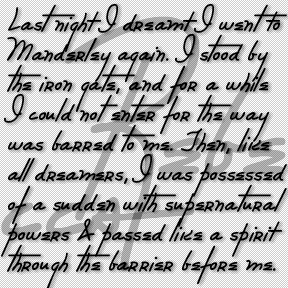
The REBECCA font was inspired by the distinctive and stylish handwriting of the title character of the classic film. Rebecca (1940) was based on the novel by Daphne du Maurier and directed by Alfred Hitchcock. The title character is dead and not even a portrait of her is ever seen. Her handwriting appears several times in the film and is perhaps the thing that most personalizes her. Her large initial R appears embroidered on a number of her possessions, including the pillow in flames at left. Rebecca’s signature, address book, and correspondence all appear in closeups as evidence of her… continued