
-Script-

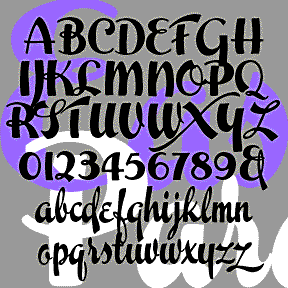
ESPANGLES is a bold and stylish cursive font that makes a bold statement. It was inspired by the logo of the great, ubiquitous Spanish department store, El Corte Inglés, in the tradition of other great store logos (i. e. Harrods, Marshall Field, Neiman-Marcus) that suggest fashion and flair. Version 2.0 features improved linking for a more realistic script, making use of the discretionary ligatures feature of Opentype. There are also some alternate characters and an expanded character set.
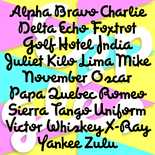
EASTER PARADE is one of four vertical script fonts, along with Scarlet Ribbons, Roselyn, and Famous Label. As seen in the Script Font Identification Guide! This one has the most contrast in stroke weight and some crazy swashes. It was inspired by a sample of hand-lettering called simply “Modern Brush Script” in Alphabets: Ancient & Modern, compiled by J. B. Russell and published in 1945 by Padell Book Co. Includes caps, lowercase, punctuation, numbers, and international characters.
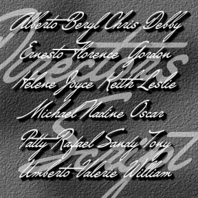
DIRECTORS SCRIPT was inspired by the sort of dramatic hand-drawn script used in 1940s film credits. As seen in classics like Crossfire, Laura, and Gilda, a very sloped cursive (about 45 degrees) is paired with a heavy roman. To approximate the style at left (from Crossfire), you could use Directors Script paired with my National Debt, Impact or similar. Add a drop shadow, and voilà. A second font has capitals that are 50% larger than the regular caps, re-weighted and aligned to harmonize with the lowercase for an even more dramatic look. Includes upper and lower case, numbers, punctuation, and… continued
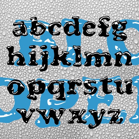
BLOOPER and BLOOP SCRIPT were created to have the look of letters formed by puddles of shiny liquid. The general form of each was inspired by a classic font. Blooper takes after Cooper Black (Oswald Cooper, 1921), Bloop Script after Brush Script * (Robert E. Smith, 1942). I also made a solid version of each (without highlights) for use in layering and with effects filters. BLOOPER 2.0 now contains upper and lowercase letters, plus numbers, punctuation, and international characters. BLOOP SCRIPT includes caps, lower case, numbers, punctuation, and international characters. More information: Although I probably could have just faked… continued
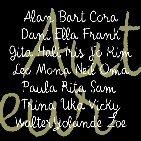
AUTEUR was inspired by the work of Jean Cocteau (1889-1963), the French writer, filmmaker, and artist. At left, he can be seen handwriting the opening titles of his fantastic film Beauty and the Beast (1946) on a blackboard. He also made many drawings and paintings, often including a variation of this expressive, whimsical script. In researching this font, I looked at hundreds of pages of his drawings and letters. There was a range of clarity and character-formation; I’ve patterned this after his more deliberate lettering rather than that of his correspondence; the latter was useful for numbers and other characters…. continued
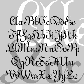
ALSACE-LORRAINE is an experiment. My idea was to combine aspects of a vertical French script and a German fraktur. For the most part, the top is the German and the bottom is the French. A font “mash-up” before that word was coined. Named for the region from which my father’s father’s family emigrated. Includes caps, lower case, numbers, punctuation, and international characters.