
-Fun-

SPREZZATURA is a fun, casual font with the whimsy of a love note and the boldness of a protest sign. Sprezzatura looks like brush and ink lettering because that’s how it started. The OpenType font also makes use stylistic alternates and ligatures for a totally hand-lettered effect. Available with and without the spatters.
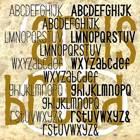
ARTISAN BREAD is a set of three fonts with the feel of earnest, informal hand-craftsmanship. Each combines an “organic” texture with a whimsical approach to letter shapes and case. Available in 3 weights, Thin, Thick and Regular.
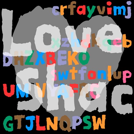
LOVE SHACK is a playful font with the handmade texture of roughly painted sign. To design the letters, I tore them from construction paper, giving them a quirky design and an irregular edge. The original inspiration for the font came from the logo for Rubio’s chain of restaurants. I loved the casual letterforms and the crunchy edge.
POPSTREET is a pair of fonts inspired by the work of Keith Haring (1958-1990) an artist whose work referenced both Pop and street art. Haring first became known for his graffiti-style drawings done in the subway, but was also respected for his gallery work and public art, his accessible, affordable design, and his social activism. The set includes an Outline and a Fill font that can be used separately or layered together in different colors.
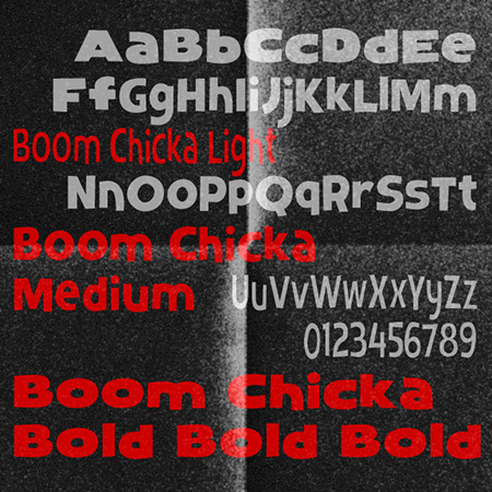
BOOM CHICKA is a set of three fonts with a friendly, bouncy informality, inspired by a the poster for the film The Prince and the Showgirl (1957) designed by Bill Gold. Comes in 3 weights, Light, Medium and Boom Chick Bold.
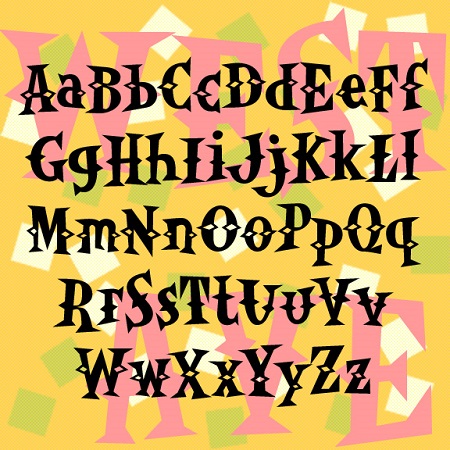
WESTERN AVENUE is a pair of fun fonts with triangular “latin” serifs and spurs. The bouncy irregularity befits their inspiration: the unsigned 1950s album cover at left. Includes upper and lowercase, numbers, punctuation and international characters. OpenType features include stylistic alternates and discretionary ligatures for a more random, hand-lettered feel. An earlier caps-only version in this style was called Western Egg.
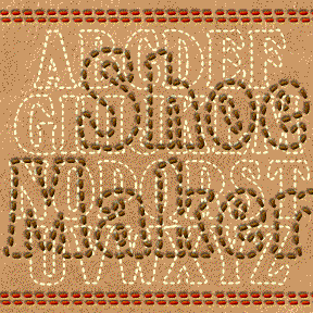
SHOEMAKER is designed to look like top-stitched letters, great for a fun, friendly, hand-crafted look. The basic letterforms were inspired by the classic Windsor fonts, favored by Woody Allen (most all his films’ title-cards) and Timberland (logotype). I’ve reduced it to a carefully “stitched” outline. Includes upper and lowercase, numbers, punctuation and international characters. For more fun, I’ve included top-stiched versions of some Harold’s Pips (below, with key locations in red).
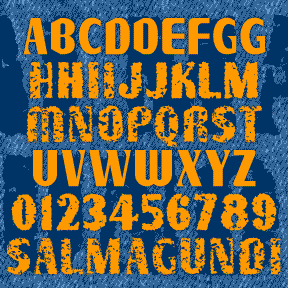
SALMAGUNDI is a quirky font, a tasty melange of various typestyles, tossed together for homemade flavor. SALMAGUNDI was inspired by the sign on the left, on the bus line between Oakland and Berkeley. After staring at it every day, intrigued by the earnest signmaker’s combination of various fonts and his own imagination, I had to get a picture of it and later expand it to a full font. The Regular is very clean. I’ve also made Chewy and Crispy varieties for those who like some texture. I should have named this after a Mexican dish, but they’d all been used… continued
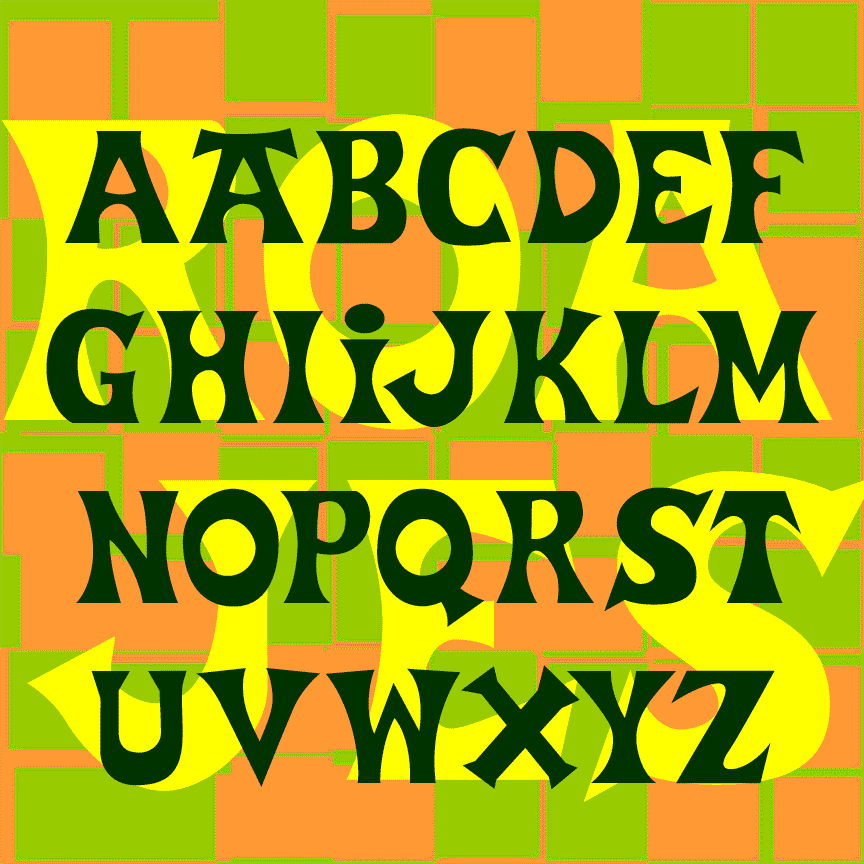
ROAD JESTER is bold and playful, suggesting the hand-lettered signs you might find in a sleepy beach town. Road Jester was inspired by the logo of Trader Joe’s, the offbeat grocery chain; additional characters were inspired by Basque-style lettering. A matching stencil font provides an exotic shipping crate feel. Don’t use this font to create your own Trader Joe’s merchandise as that would certainly be trademark infringement. “Road Jester” is an anagram of Trader Joe’s. ROAD JESTER 2.1 has an expanded character set and improved spacing and kerning.

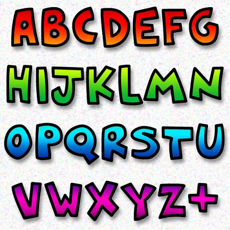
MARKERMAN is comic-book style font that is highly legible and able to be italicized and bolded. Its inspiration is the same as my Frank the Architect fonts, if you’re looking for something more formal, less “comic.” Version 4.5 has an expanded character set that includes a few special comic glyphs in place of ^ ~ { } and improved spacing and kerning.