
-Fun-

LAUGHTRACK is a set of 3 fonts in a quirky, cartoon style that says “funny”. Inspired by the work of Jerry Robinson, whose “True Classroom Flubs and Fluffs” was a highlight of the Sunday News comics section when I was a kid. Robinson also did a panel called “Still Life” in a similar humorous drawing and lettering style. Although he’s better known for his work in superhero comics, the “funnies” interest me more. His papers are archived at Syracuse University. Each font includes caps, lower case, numbers, punctuation, and international characters.
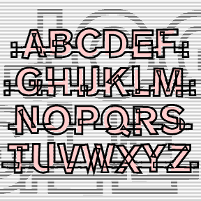
JOGGLE was inspired by a book jacket that I once saw, half remembered, and couldn’t find again. The illustration was a colorful 50s, jazz-style composition, and the hand-drawn, outlined letters joined up. Couldn’t find it again; hope I did it justice. The letters link up as you type. There are end caps, blank spaces, and flourishes to finish up names and headings, and two of each letter so you have a little more variety. A second font (the pink part of the illustration above) provides a loose fill that be placed behind the outlines for another effect. Includes 2 of… continued
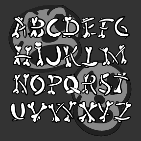
HUMERUS is a spooky/funny font with letters formed of loosely arranged bones, more in the spirit of a Halloween party than real horror. Think of “funny bone”, “rib tickling” and “numbskulls,” all appropriate to the inspiration for this font, the opening credit sequence of Abbott and Costello Meet Frankenstein (1948, directed by Charles Barton, art directed by Hilyard M. Brown and Bernard Herzbrun, with animated sequences by the great Walter Lantz, who may have had a hand in the credits as well. The Regular font has the bone shapes defined by calligraphic outlines; there’s also a Solid font that can… continued
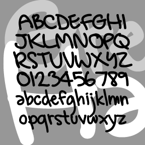
GREG’S HAND was developed in collaboration with artist GREG SMITH. Greg did the original lettering in Illustrator and then I made the font, adding and adjusting as needed. Looks like it was written with a Sharpie. Includes caps, lower case, numbers, punctuation, and international characters.
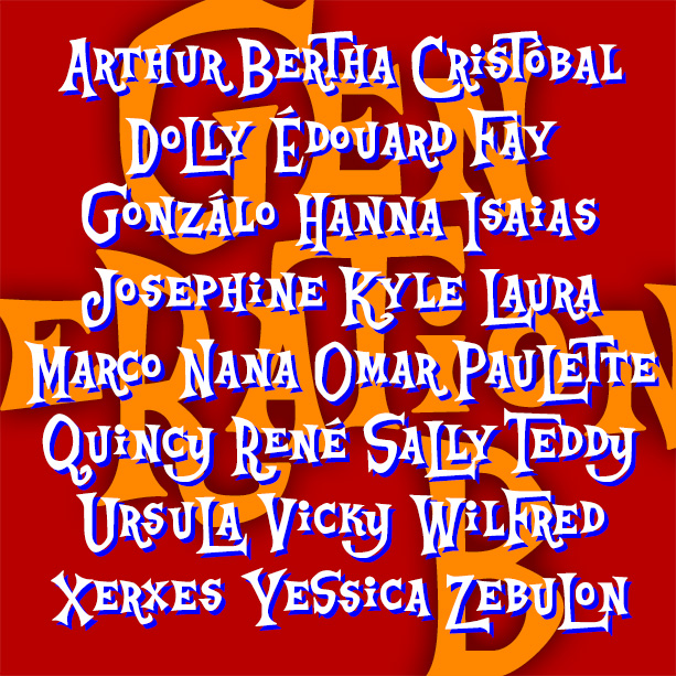
Playful and offbeat GENERATION B has a late 50s-early 60s vibe that goes from beatnik coffeehouse to rustic beach shack and beyond. It’s basically an all-caps font, with big and small versions of each letter plus some alternates, easily giving you the look of quirky hand-lettering. Inspired by the animated opening titles of the classic live-action Disney film, The Parent Trap (1961), designed by T. Hee, Bill Justice and Xavier Atencio. With its irregular alignment, letter shapes and pairs, this kind of lettering could be seen as a descendant of naïve sign painting or of the deliberate nonconformity of Beat… continued
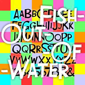
FISH OUT OF WATER is the perfect comedy font, inspired by the opening titles of Billy Wilder’s Some Like It Hot (1959, art direction by Ted Haworth). Loose-shaped large and small caps suggest unpredictable fun. In 3 weights for greater flexibility. The FISH OUT OF WATER fonts include large and small caps, numbers, punctuation, and international characters.
DON SEMIFORMAL is a little joke about the font Dom Casual.* I’ve added serifs to my approximation of the handwritten-style classic, which was originally designed by Peter Dombrezian for American Type Founders in 1952. Somewhat more formal than the original, but with the same lively quality. The “formal” would be then be a straight serif font, I suppose. Includes upper- and lowercase, numbers, punctuation, and international characters.
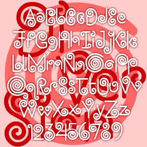
DIVERSION is a little amusement, all swirls and spirals. It was inspired by this handlettered logo for an Italian restaurant in Mexico. Could add a lot of whimsy if used carefully; may cause dizziness if overused. Includes caps, numbers, punctuation, and international characters.
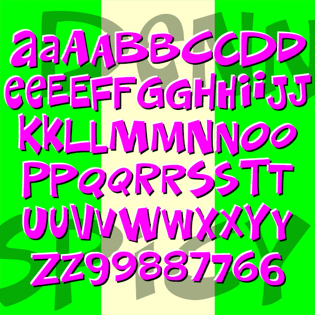
DENNEY SALTY and DENNEY SPICY are playful, comical, and quirky fonts, inspired by the work of Alan Denney for the Barker Greeting Card Company of Cincinnati, OH, circa 1969–74. DENNEY SALTY (formerly Denney One) has the bumpy edges and whimsical letterforms of hand lettering done with a crayon. DENNEY SPICY (formerly Denney Two) is more dynamic, like bold pen or brush lettering. Both fonts are essentially unicase, but have alternate letterforms in the upper-and lowercase positions for more variety. Version 2.0 of both fonts includes an expanded character set and improved spacing and kerning. Alternate characters are now accessed as… continued
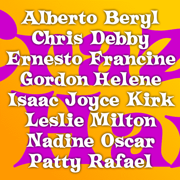
CRAZY HAROLD is a fun, retro-festive font. Inspired by an example of this name, as reproduced in Paul E. Kennedy’s 1974 Modern Display Alphabets, I’ve redrawn the font and expanded the set to include useful Condensed and groovy Flair varieties as well. And Condensed Flair too! Version 2.0 uses the Stylistic Alternates feature of Opentype to make the alternate characters easier to access, and includes an expanded character set and improved spacing and kerning.