
-Fun-
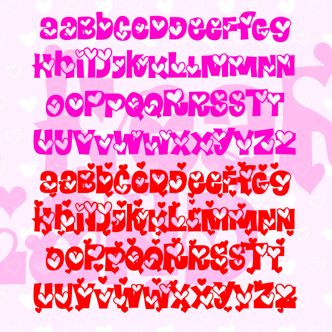

HEARTLAND is a fun and playful font full of heart. The Regular font has outlined hearts on each character, the Extra font adds even more hearts and can be layered together. These mixed-case fonts have 2 versions of each letter for even more bounce. Inspired by the letterforms of the classic font Daisyland. Version 1.5 has an improved and expanded character set and improved kerning.


HARLEQUIN was inspired by this poster from the 1953 film Kiss Me Kate (detail at left). It has a jolly jester’s hat feel and also resembles turned wooden spindles. Includes caps, numbers, punctuation, and international characters. As seen in use in these “personalized totes for the eco-check girl,” from Label Me Lisa.
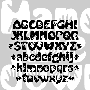
A fun little font with a second-hand history. The basic idea came from my recollection of a rough sketch.* The handprints are combined with a knockoff version of Morris Fuller Benton’s classic Hobo font. Besides the hands, it differs from regular Hobo in that it is much bolder and has descending lowercase letters. Includes caps, lowercase, numbers, punctuation, ligatures, international characters, and several pairs of black handprints. *A proposal for a “hands on” event, the sketch came from a brainstorming session of the “Young Turks Committee” at The Arts Center of the Capital Region, which included Lisa Roche, Donna Brunig,… continued
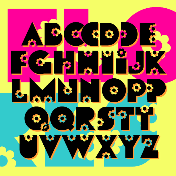
FLORES is my digital creation of a “flower power” style font from the late 60s or early 70s. I started this in 2001, inspired by a florist’s sign in Valencia, Spain. I had only the letters F L O R E S and made up the rest; later I was given examples FLEURDON and SACHET DISCRET and expanded the font accordingly. But I still have not tracked down the original font or its name. Version 1.5 has an expanded character set and improved spacing and kerning.
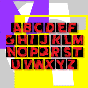
COMET was inspired by the (former) logo of Country Music Television. Clicking past this cable channel, I was attracted to its logo and set out to make a font that would allow you to type anything with that back-and-forth-within-blocks look. There are really two fonts: Negative with white letters, and Positive with black letters, each with black outlines. In both fonts the uppercase letters are turned to the left, and the lowercase to the right, So YoU hAvE tO tYpE lIkE tHiS tO gEt tHe RiGhT eFeEcT. The fonts can be used separately, or layered together. Now includes numbers and… continued
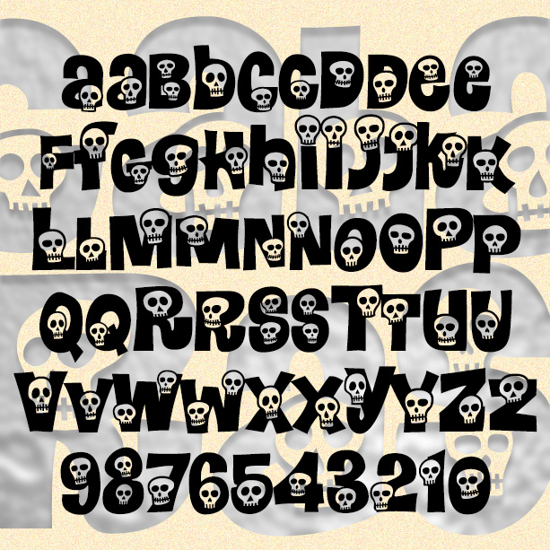
CALAVERAS is a take-off of the classic 1960s flower font Daisyland. In redrawing the letters, I’ve kept the basic shapes, added more variants, and swapped out the flowers for cartoon skulls to create a mix of happy and spooky. A memento mori font: great for Halloween, Día de los Muertos, or any time. Version 1.5 features an expanded character set. *The Daisyland font appears under that name in the Dan X. Solo font books from Dover. There is a nice shareware version called FLORALIES by Keith Field and a free but bumpy adaptation (called Daisyland and uncredited) in FontPak1.zip. (Thanks… continued
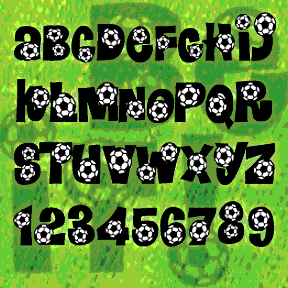
BEND IT is a my fourth and final take-off on the classic 60s flower font Daisyland*. The others are Calaveras, Heartland, and Peace. One of my font correspondents (Nancy, the soccer mom) suggested this and it was a nice diversion. Parodied on Something Awful as “Clipart Clutter…An excellent choice for the proud mom with more free time than things to say.” Includes 2 versions of each letter, plus numbers, punctuation, and international characters. And a few extra balls in the { } | [ ] \ ^ positions. *The Daisyland font appears under that name in the Dan X. Solo… continued