
-Fun-
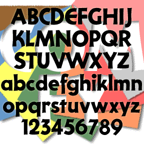

COMFY has the bold but friendly look of cutout letters. Inspired by an example of “Pinselschrift” (brush lettering) by Wilhelm Dechert*. Has the feel of a handlettered version of a 20th-century geometric font like Paul Renner’s Futura* or Rudolf Koch’s Kabel. *Reproduced in Iron Fists: Branding the 20th-Century Totalitarian State by Steven Heller (thanks, John, for bringing this to my attention.) This font, of course, is much more gemütlich (comfortable, homey, informal, cozy, approachable, good-natured) than that title suggests. Includes upper and lower case, numbers, punctuation, and international characters.
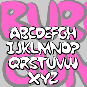
BUBBLE GUM ROCK is based on a kind of graffiti lettering that kids do. Each letter is a big fat outline that underlaps the one to its left. My friend Kate Lee helped me remember it. To Create The Underlapping Effect, Type Your Sentences Like This Because The Caps Are Designed As Initial Letters And The Lowercase To Follow.This is a set of two fonts that work together. The Outline font contains pseudo brush-drawn outlines; the Fill font is the solid part that goes inside. In a program that allows layering, set the same bit of text in each of… continued
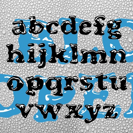
BLOOPER and BLOOP SCRIPT were created to have the look of letters formed by puddles of shiny liquid. The general form of each was inspired by a classic font. Blooper takes after Cooper Black (Oswald Cooper, 1921), Bloop Script after Brush Script * (Robert E. Smith, 1942). I also made a solid version of each (without highlights) for use in layering and with effects filters. BLOOPER 2.0 now contains upper and lowercase letters, plus numbers, punctuation, and international characters. BLOOP SCRIPT includes caps, lower case, numbers, punctuation, and international characters. More information: Although I probably could have just faked… continued
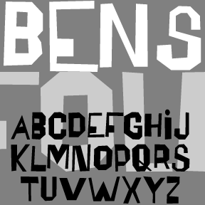
The BENSFOLK fonts were inspired by the work of the artist Ben Shahn. He was a political activist, a painter, and a calligrapher, among many talents. One of the lettering styles Shahn used was derived from the work of amateur sign painters. As trained artists often react to the work of so-called naive or folk artists, he found their crude beauty to be “cacophonous and utterly unacceptable. Being so it is irresistibly interesting.” Shahn used this lettering to represent the speech of the common person, and it blended perfectly with his pen work Shahn also lived to see his work–itself… continued


ZITZ is my second cartoon font, based on the hand lettering in the King Features daily strip Zits by Jim Borgman and Jerry Scott. According to Robert C. Harvey’s thoughtful Children of the Yellow Kid: The Evolution of the American Comic Strip, “Zits” is a “teenage strip…ostensibly drawn by Borgman and written by Scott…. Borgman produces the final art.” The tall, tight lettering and expressive drawing style of Borgman’s political cartoons has long appealed to me; since 1997, “Zits” has represented a daily dose of his art. The scratchy outlines of the letters reflect both the artist’s pen and the… continued
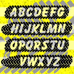
SKIDZ was inspired by a sticker in which the letters where superimposed over a tire tread pattern. I’ve created my own tread pattern, subtracting letters based on Max Kaufmann’s classic font Balloon. When you type, the letters align to form an entire tire mark with white letters. The brackets and underscore can be used to create natural-shaped ends and patterned space between words. SKIDZ contains caps, numbers, punctuation, and international characters. But they’re a bit lost in the edge of the tread, so I’ve made a separate font, SKIDZ EXTRA, with an extra line of somewhat sharper tread pattern to… continued
SCREWBALL looks like whimsical hand-lettering. It’s unpredictable with lots of close-fitting pairs. It was inspired by the hand-lettered titles of the movie What’s Up, Doc? (1972), designed by The Golds West Inc. Version 1.5 includes an expanded character set and many alternate characters that make use of Opentype features to create a more hand-lettered look, as well as improved spacing and kerning. What’s Up, Doc? is a personal favorite, directed by Peter Bogdanovich, starring Barbra Streisand, Ryan O’Neal, and, in her first film, the late Madeline Kahn, to whose memory this font is dedicated.
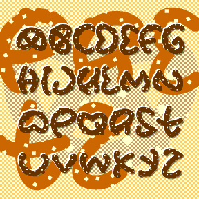
Instead of making something that people want, that I could sell, I made this silly experiment: PRETZ. The idea is that each letter has been broken, cut, or chewed out of a conventional twisted pretzel shape. As I only cheated on a couple of characters ($ ¢ ¥ Œ Æ), you have to use a bit of imagination to read them all. It comes in both Salted and Unsalted varieties. Each font contains caps, numbers, punctuation, and international characters.
POPSTARS was inspired by the hand lettering on the cover of the classic Beatles album, Magical Mystery Tour. The B from Beatles is about actual size at left; weren’t vinyl album covers great? This pair of fonts can be used separately or layered as in the animation on this page. Each font includes caps, lower case, numbers, punctuation, and international characters.

PIECES is designed to look like a partially assembled jigsaw puzzle. The letters interlock automatically as you type. Use _ | or \ instead of a space to connect your words. The basic letterforms are my “unicase” takeoff on Freeman Craw’s ubiquitous Ad Lib font (1961). This font has the letters on the white background in the uppercase positions and with the black background in the lowercase positions. TyPiNg LiKe ThIs creates an alternating effect. Due to space limitations, it does not contain the complete character set in both black and white. There’s a separate complete font in Black and… continued