
-Famous Artists-
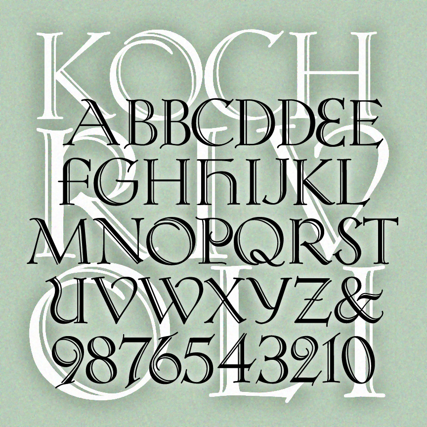

KOCH RIVOLI is a strong and graceful titling font. It was inspired by Rudolf Koch’s original “Zierbuchstaben” (decorative book initials) intended as a companion font to Koch Antiqua. If you like Koch, see also Koch Quadrat and Bride of the Monster. Version 1.5 has an expanded character set including numbers and punctuation not in Koch’s original design, and improved spacing and kerning.
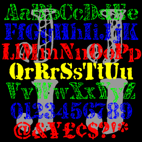
JJ STENCIL was inspired by the work of the great American Pop artist Jasper Johns. Perhaps best known for his flag and target series, Johns has also used the “found” look of stencils in many drawings and paintings, including “0-9” at left. My fonts were not made directly from Johns’ work, but from scans of my own similar stencil scratchings. There are four complete fonts, each with a different treatment of the letters. The fonts are designed to be mixed or layered or both. JJ STENCIL 3.0 now includes upper and lowercase. I finally found an appropriate lowercase stencil and… continued
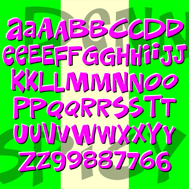
DENNEY SALTY and DENNEY SPICY are playful, comical, and quirky fonts, inspired by the work of Alan Denney for the Barker Greeting Card Company of Cincinnati, OH, circa 1969–74. DENNEY SALTY (formerly Denney One) has the bumpy edges and whimsical letterforms of hand lettering done with a crayon. DENNEY SPICY (formerly Denney Two) is more dynamic, like bold pen or brush lettering. Both fonts are essentially unicase, but have alternate letterforms in the upper-and lowercase positions for more variety. Version 2.0 of both fonts includes an expanded character set and improved spacing and kerning. Alternate characters are now accessed as… continued
BRIDE OF THE MONSTER is a bold and rustic font that grabs your attention. Companion fonts offer eye-catching inlines or the look of stencils. The uppercase was inspired by Rudolph Koch’s classic font Neuland from the 1920s, originally hand-carved and still popular under various names. From hand-lettered film titles of the 1930s, such as this example from the Bride of Frankenstein trailer, I got the idea to expand the style to include lowercase. Version 3.0 incorporates alternate characters using Opentype, as well as an expanded character set and improved spacing and kerning.

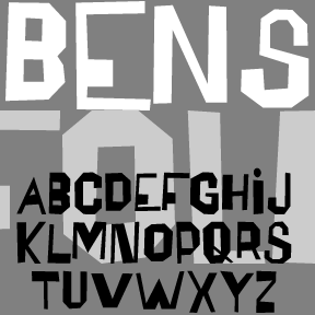
BENSGOTHIC was inspired by the work of the artist Ben Shahn. (See also Bensfolk) This style–which Shahn applied to psalms, Christmas cards, posters, and many other item—suggests inscriptional capitals like those of Byzantine mosaics, the Bayeux tapestry, or medieval manuscripts. He made great use of fanciful ligatures, which are included in the font for a totally hand-lettered feel. The new OpenType version of Bensgothic allows you to access the ligatures easily. In applications that support OpenType features, enable “discretionary ligatures.” Type your text in ALL CAPS to automatically use the ligatures as available. Type in lowercase (or MiXeD cAsE) to… continued
The BENSFOLK fonts were inspired by the work of the artist Ben Shahn. He was a political activist, a painter, and a calligrapher, among many talents. One of the lettering styles Shahn used was derived from the work of amateur sign painters. As trained artists often react to the work of so-called naive or folk artists, he found their crude beauty to be “cacophonous and utterly unacceptable. Being so it is irresistibly interesting.” Shahn used this lettering to represent the speech of the common person, and it blended perfectly with his pen work Shahn also lived to see his work–itself… continued
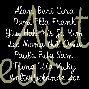
AUTEUR was inspired by the work of Jean Cocteau (1889-1963), the French writer, filmmaker, and artist. At left, he can be seen handwriting the opening titles of his fantastic film Beauty and the Beast (1946) on a blackboard. He also made many drawings and paintings, often including a variation of this expressive, whimsical script. In researching this font, I looked at hundreds of pages of his drawings and letters. There was a range of clarity and character-formation; I’ve patterned this after his more deliberate lettering rather than that of his correspondence; the latter was useful for numbers and other characters…. continued

The 2 ALÚMINO fonts were inspired by font designed for Alcoa, the aluminum company. Sleek, clean, modern, light and flexible. I’ve also made a narrower version with the same stroke weight, although it appears somewhat darker overall. Bob Trogman writes, “I worked on the Alcoa font while working for Saul Bass. The Alcoa project lasted over a year and a half. Half way through the project a presentation was made to the board in Pittsburgh and one of the board members said the logo looked too much like ALCAN’s logo and we started all over. Don Handel did the actual… continued


ZITZ is my second cartoon font, based on the hand lettering in the King Features daily strip Zits by Jim Borgman and Jerry Scott. According to Robert C. Harvey’s thoughtful Children of the Yellow Kid: The Evolution of the American Comic Strip, “Zits” is a “teenage strip…ostensibly drawn by Borgman and written by Scott…. Borgman produces the final art.” The tall, tight lettering and expressive drawing style of Borgman’s political cartoons has long appealed to me; since 1997, “Zits” has represented a daily dose of his art. The scratchy outlines of the letters reflect both the artist’s pen and the… continued

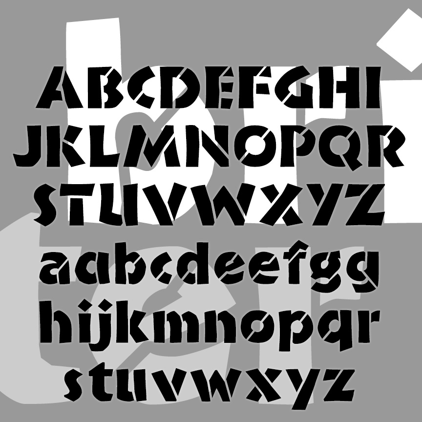
TAPEWORM was inspired by the work of the great L.A.-based American artist Ed Ruscha. His characteristic work includes drawings and paintings of words: a single word, found language, and the like. This is one of the styles he’s used, which he has referred to as “Boy Scout utility modern.” It’s precise but awkward and looks like the letters an obsessive amateur sign painter would make with masking tape, of uniform weight but curious formation. Version 1.9 features and expanded character set.