
-Crafty-


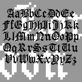
MOCKINGBIRD was inspired by the opening title for the classic film, To Kill a Mockingbird (1962), designed by Stephen Frankfurt. A child’s hands browse a cigar box of treasures and make this crayon rubbing that forms the title. I modeled my letterforms on Franklin Gothic as the closest match. I didn’t fake the texture which comes from an actual rubbing of a photopolymer plate. Includes upper-and lowercase, punctuation, numbers, international characters, plus special end-caps and space for a complete look.
LONDON BITMAP is a recreation of the classic Apple font London, originally designed by the great Susan Kare. (She also designed the wonderful icons at right, so familiar to us old appleheads.) The city-named fonts (Chicago, etc.) were a big improvement over previous computer typography, although they may now seem a bit quaint. Most have made the transition to scaleable fonts, such as my own L.A. fonts; now you can again enjoy London’s contrast between “Old English” style and bitmap texture. While I was at it, I also made a Harlequin, Cross-stitch and Shaded version; the initials at left show… continued
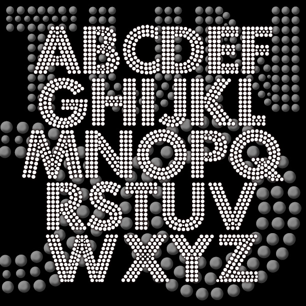
FORTUNA DOT gives your words the effect of being written with tiny lights or beads. This revival of a “lost” analog font was suggested by Bruce Baryla, the bold geometric letterforms were inspired by Paul Renner’s classic Futura®*. The open structure of the font makes it ideal for layering and laser-cutting, available in three weights. Version 1.5 includes an expanded character set, improved spacing and kerning. *Futura® is a registered trademark of Fundicion Tipografica Neufville S.A. The name is used here for reference only; my font was completely redrawn from analog sources. This is NOT a Futura® font.
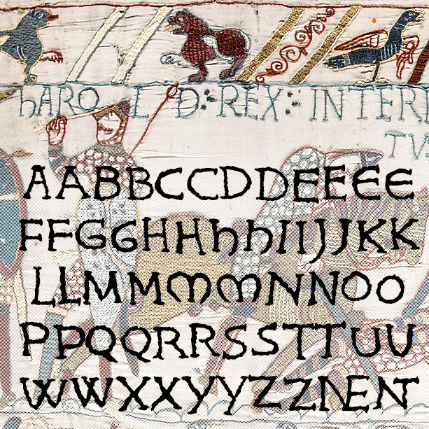

KING HAROLD looks like hand-embroidered lettering and was inspired by the Bayeux Tapestry. To get it just right, I drew, embroidered, and scanned all the characters. Version 1.5 makes use of Opentype features for alternate letterforms and ligatures, an expanded character set and improved spacing and kerning. The Bayeux Tapestry was made c.1073-83 and records King Harold’s adventures and loss at the Battle of Hastings to William the Conqueror, with a special appearance by Halley’s Comet. It measures 230 feet long (69 meters) and is one of the great examples of Romanesque art.
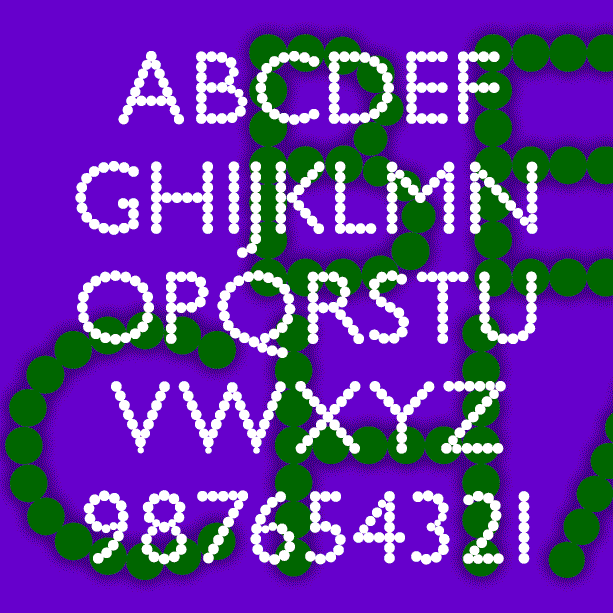
BEAD CHAIN and MARQUEE are a pair of fonts that are made up of dots. BEAD CHAIN suggests a string of pearls while MARQUEE offers your name in lights. Inspired by a book jacket from the 1920s or 30s, I’ve used the stately letterforms of Gill Sans as my guide, although most letters had to be reshaped to fit the beads. Version 1.5 includes an expanded character set, improved spacing and kerning.