
-Logo-Inspired-
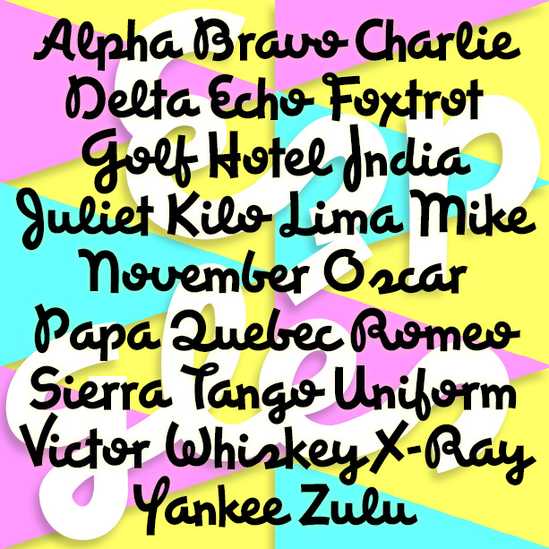

ESPANGLES is a bold and stylish cursive font that makes a bold statement. It was inspired by the logo of the great, ubiquitous Spanish department store, El Corte Inglés, in the tradition of other great store logos (i. e. Harrods, Marshall Field, Neiman-Marcus) that suggest fashion and flair. Version 2.0 features improved linking for a more realistic script, making use of the discretionary ligatures feature of Opentype. There are also some alternate characters and an expanded character set.

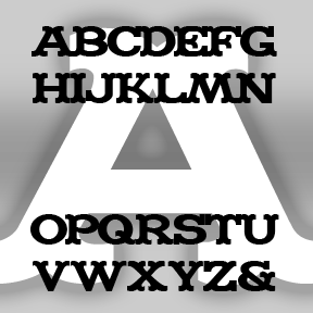
CAPTAIN HOWDY was inspired by the font often seen on classic Ouija® boards. Yet another woodtype, “circus,” or “Western” font. Cleanly redrawn using my 70s-vintage wooden Ouija® board as a model. I never cared much for playing with it, I just liked the way it looks! Includes caps, numbers, punctuation, and international characters.

The 2 ALÚMINO fonts were inspired by font designed for Alcoa, the aluminum company. Sleek, clean, modern, light and flexible. I’ve also made a narrower version with the same stroke weight, although it appears somewhat darker overall. Bob Trogman writes, “I worked on the Alcoa font while working for Saul Bass. The Alcoa project lasted over a year and a half. Half way through the project a presentation was made to the board in Pittsburgh and one of the board members said the logo looked too much like ALCAN’s logo and we started all over. Don Handel did the actual… continued


ZITZ is my second cartoon font, based on the hand lettering in the King Features daily strip Zits by Jim Borgman and Jerry Scott. According to Robert C. Harvey’s thoughtful Children of the Yellow Kid: The Evolution of the American Comic Strip, “Zits” is a “teenage strip…ostensibly drawn by Borgman and written by Scott…. Borgman produces the final art.” The tall, tight lettering and expressive drawing style of Borgman’s political cartoons has long appealed to me; since 1997, “Zits” has represented a daily dose of his art. The scratchy outlines of the letters reflect both the artist’s pen and the… continued
RADIO was inspired by the old logo of NPR, National Public Radio. Obviously, the line pattern suggests broadcasting. The letters are square and of a uniform width, great for short headings, drop caps, and the like. Includes caps, numbers, punctuation, and international characters.
POPSTARS was inspired by the hand lettering on the cover of the classic Beatles album, Magical Mystery Tour. The B from Beatles is about actual size at left; weren’t vinyl album covers great? This pair of fonts can be used separately or layered as in the animation on this page. Each font includes caps, lower case, numbers, punctuation, and international characters.
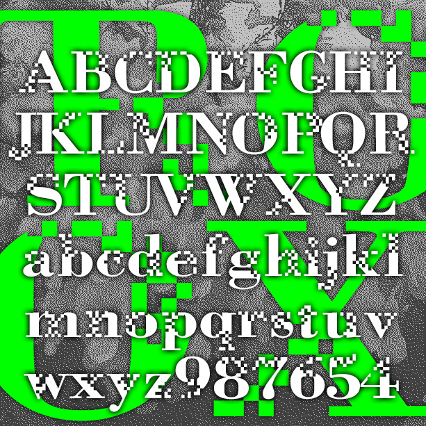
NEUROTOXIN is designed to look like the letters are breaking up or forming from pixels. It was inspired by the Xerox Corporation’s former X logo, designed in 1994 by Landor Associates. The basic letterforms are modeled after a bold Didone-type font. Pairs with a nice Bodoni or even Times Roman. Version 2.0 includes an expanded character set with lowercase and improved spacing and kerning.
MADFONT was one inspired by the great MAD magazine logo, the older, un-italicized one of course. It was one of my first fonts, released back in 1998, the work of a fan who grew up reading MAD and loving its parodies and graphics. MADFONT was retired but now it’s come back and brought two friends: Bars and Thorns. The two previously unreleased fonts are standard wood type variations that increase the value of this cheerful, circus, Wild West design. Each font includes caps, numbers, punctuation and international characters. Check out this fun furniture commercial. It’s worth watching all the way… continued
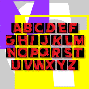
COMET was inspired by the (former) logo of Country Music Television. Clicking past this cable channel, I was attracted to its logo and set out to make a font that would allow you to type anything with that back-and-forth-within-blocks look. There are really two fonts: Negative with white letters, and Positive with black letters, each with black outlines. In both fonts the uppercase letters are turned to the left, and the lowercase to the right, So YoU hAvE tO tYpE lIkE tHiS tO gEt tHe RiGhT eFeEcT. The fonts can be used separately, or layered together. Now includes numbers and… continued
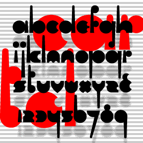
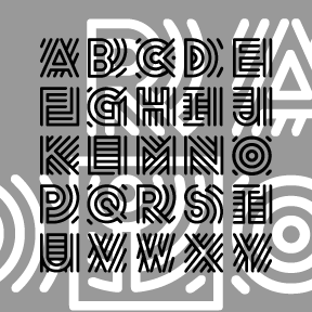
CARTEL was inspired by the logo of OPEC, Organization of the Petroleum Exporting Countries. Rigorously geometric to the point of near illegibility, Cartel could add an exotic touch in a futuristic or retro context. Includes lowercase (including long and short ascenders and descenders), numbers, punctuation, and international characters.